
Left rectangle ads redesigned


Robert Ripps book
History of Tribeca Buildings
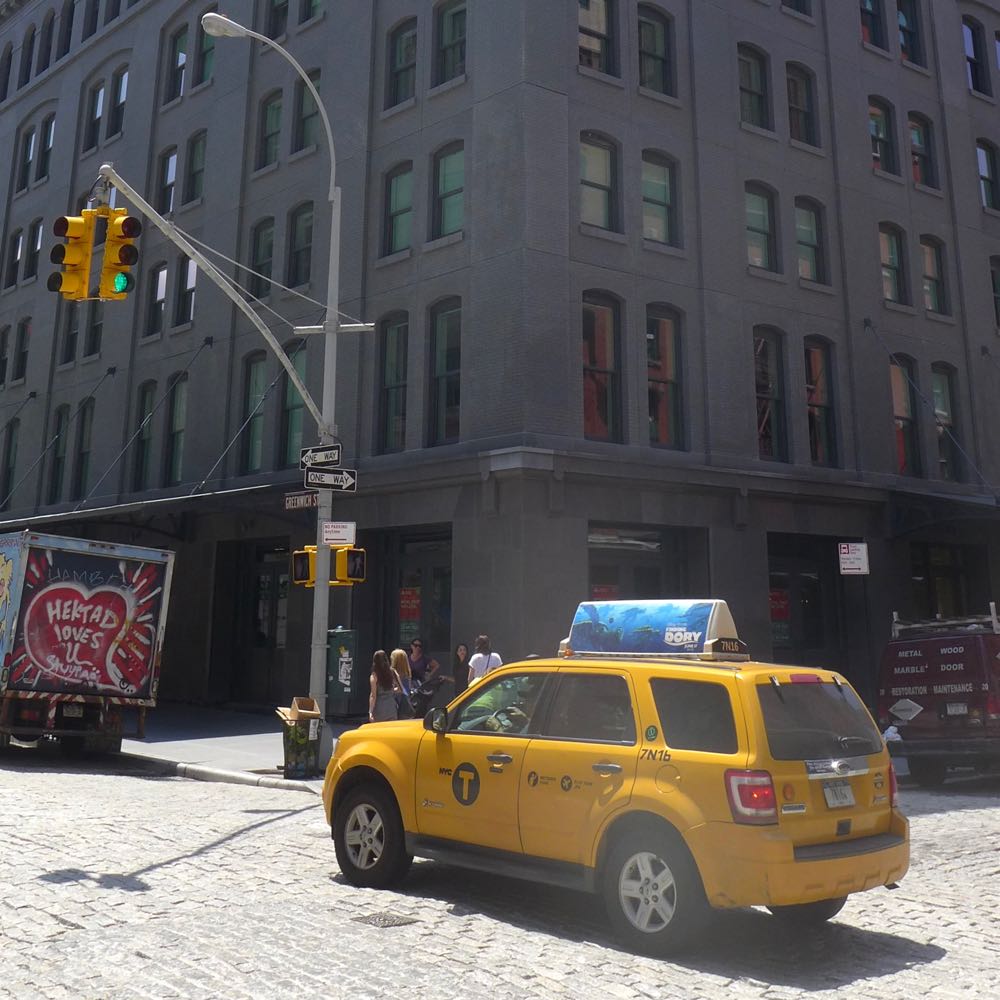
New Building Report Card: The Sterling Mason
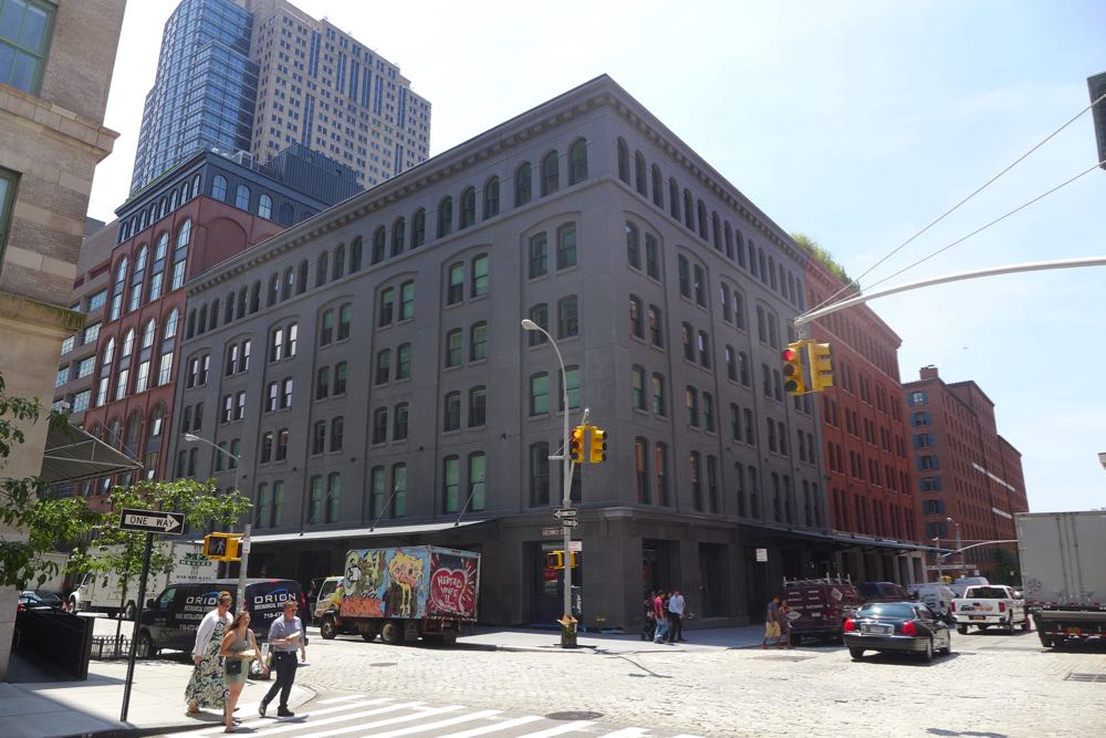 Only residents may care how new buildings turn out on the inside, but we all have to live with the outside. So let’s review the Sterling Mason, the half-new-build, half-conversion condominium at 71 Laight. The building was developed by Taconic Investment Partners; the architect is Morris Adjmi Architects. Please don’t let the fact that you’re not an architecture expert (either) stop you from weighing in.
The design in general
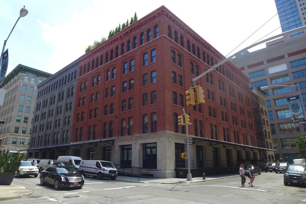
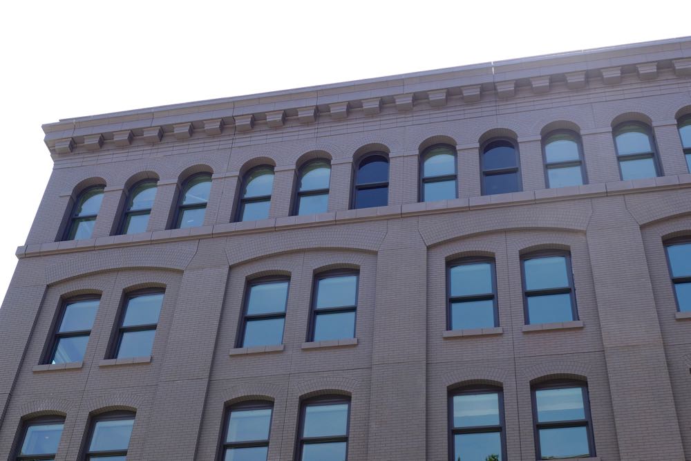
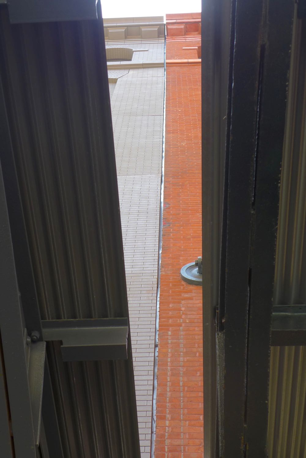
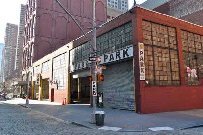
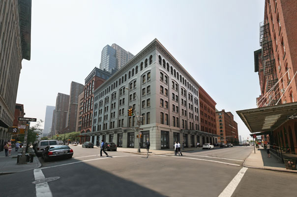
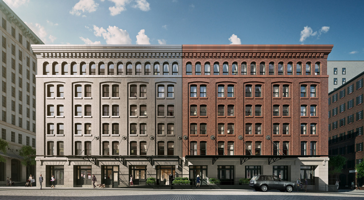
The idea was ingenious: Leave the old building at 401 Washington alone—it’s a fine example of Tribeca commercial architecture—and pair it with a new building that’s the mirror image of the old one. (Alas, this came at the expense of the big warehouse of a garage at 412 Greenwich.) Because the new half so clearly resembles its partner, from a distance, it fits in better than any other contemporary building in the area. Not attempting to match the materials was a wise move; instead, Adjmi designed a façade of dark gray concrete cast to resemble brick, with aluminum sheathing on the ground floor.
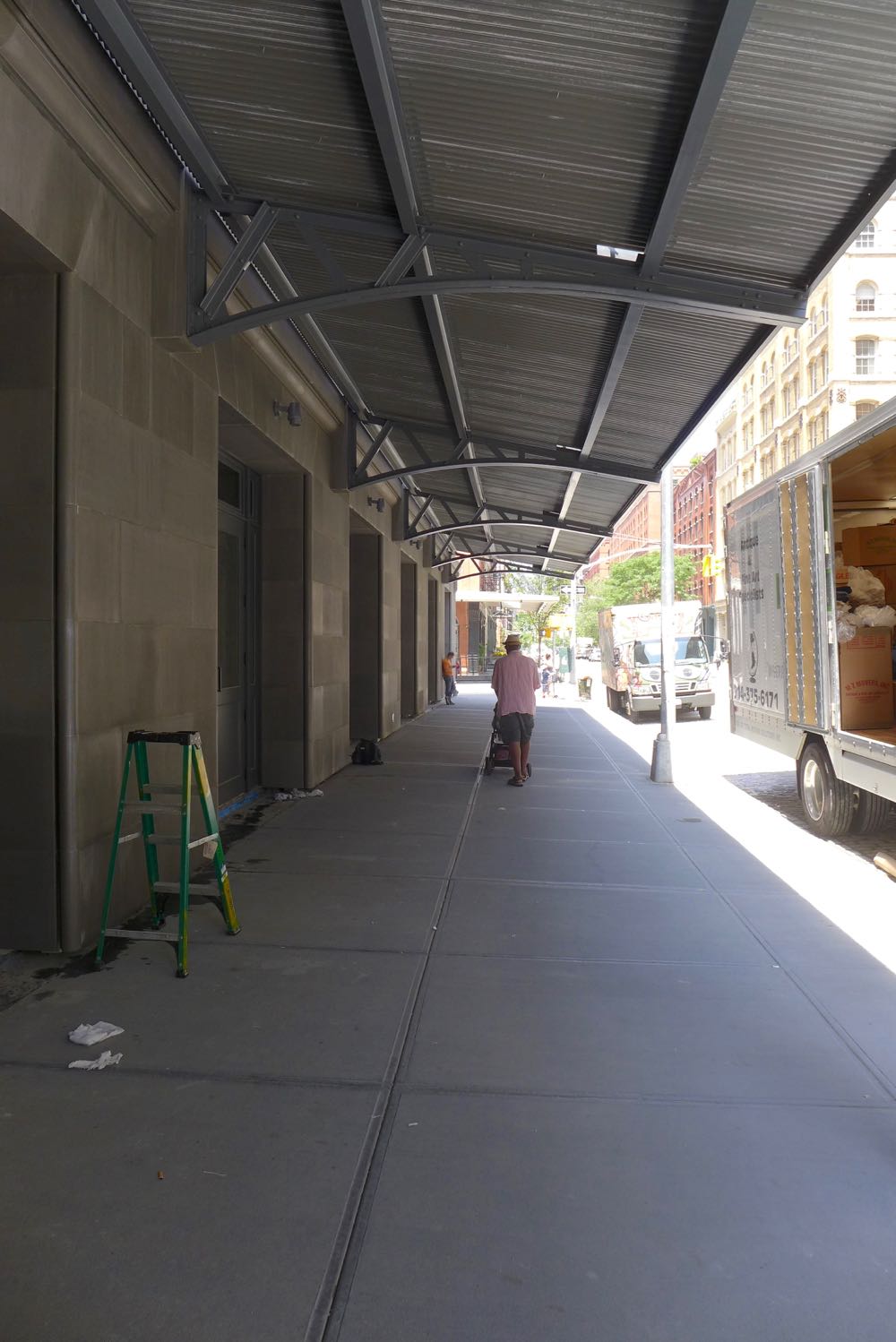
At street level
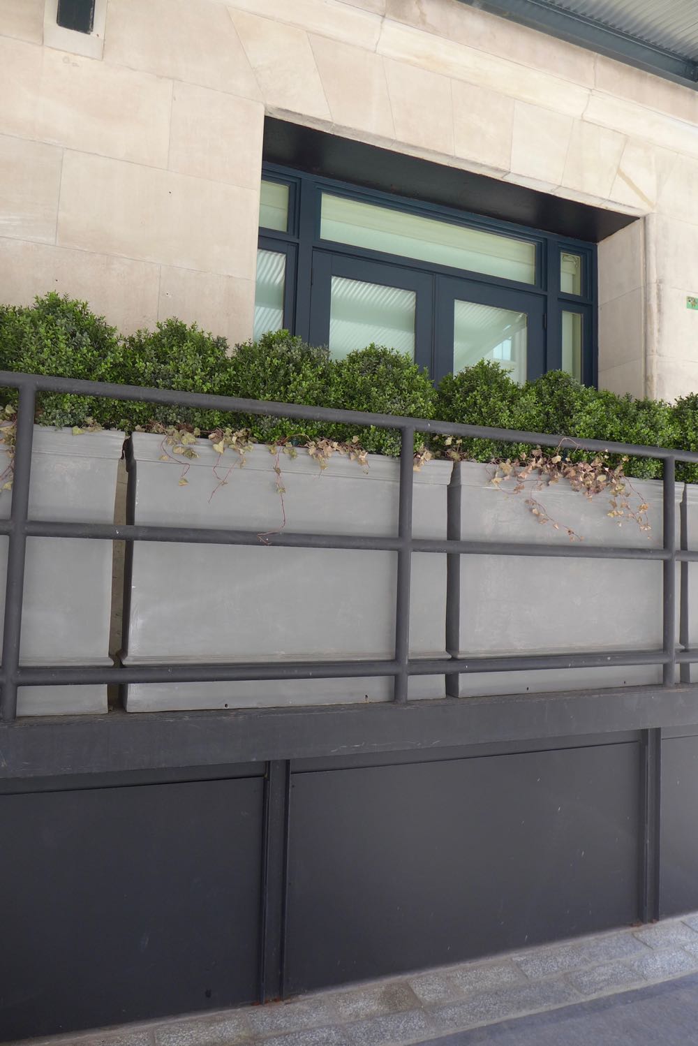
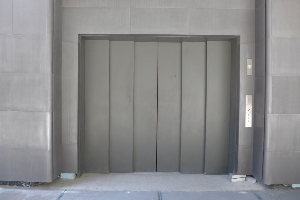
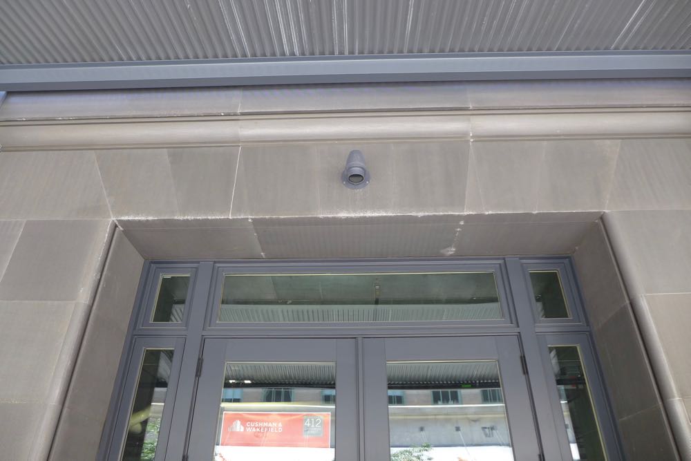
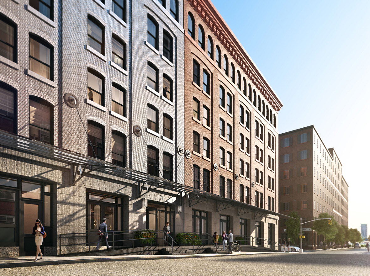
The aluminum-sheathed ground floor is less contemporary than expected, and its impact is damped by being in the shadow of the metal canopies that extend nearly to the curb. Let’s hope that the retail tenants on Greenwich, should they materialize, add planters or other ornamentation. The west side of the ground floor, meanwhile, is residential, and lined with loading docks on which one owner has installed planters that make it into a bit of a fortress. The freight elevator opening onto Greenwich is a pleasant reminder of the way things used to be in Tribeca.
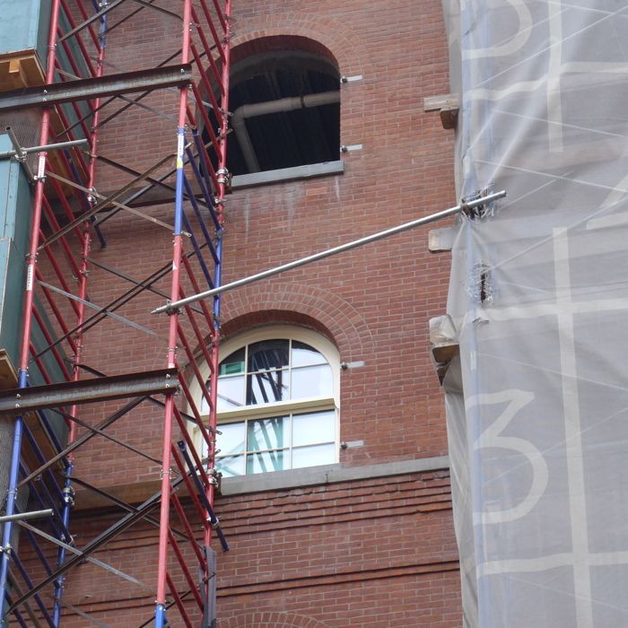
Upon closer viewing…
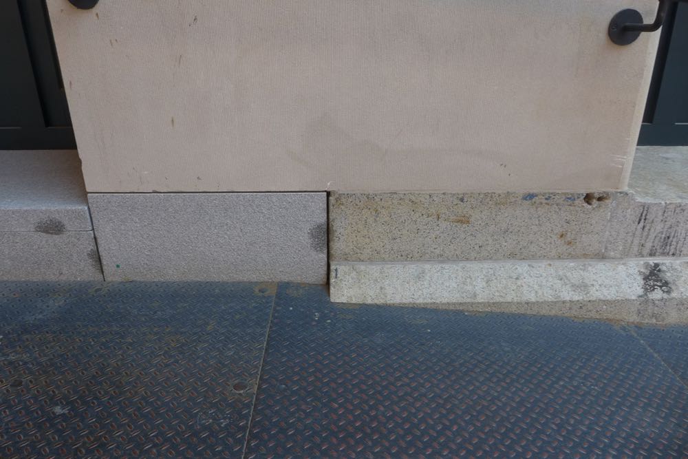
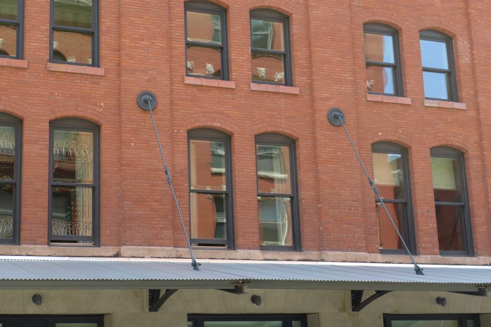
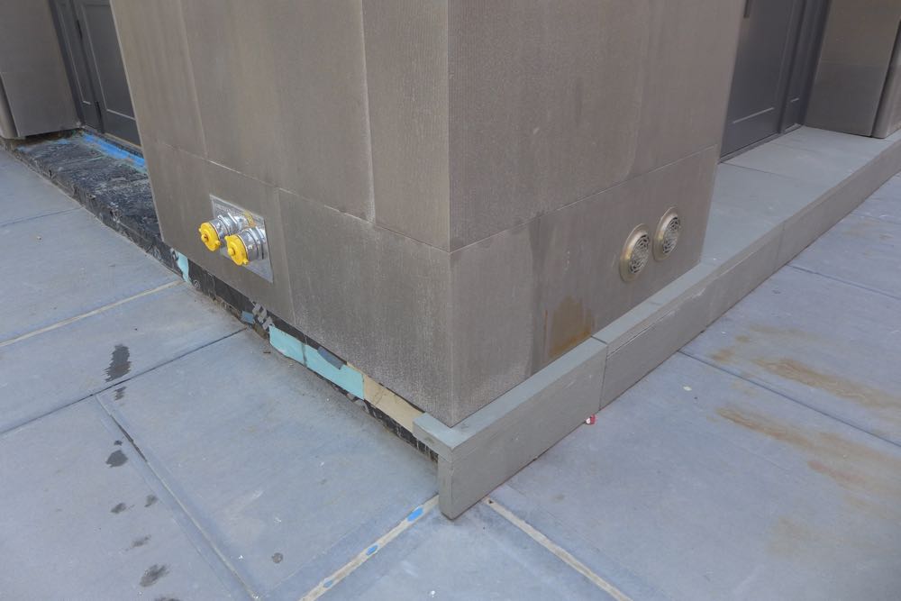
The old half does not benefit from a close inspection: In the photos below, you’ll see mismatched stone along the loading-dock ramp; patchy concrete work; and sloppily applied black caulking above the loading dock. Last but certainly not least, rectangular windows with metal infill were used in the arched window frames throughout the building. Back in June of 2015, someone involved with the building said that the Landmarks Preservation Commission insisted on these windows. I never tried checking that out, but it has always seemed odd to me that 443 Greenwich, a block to the north, would be allowed to have arched windows.
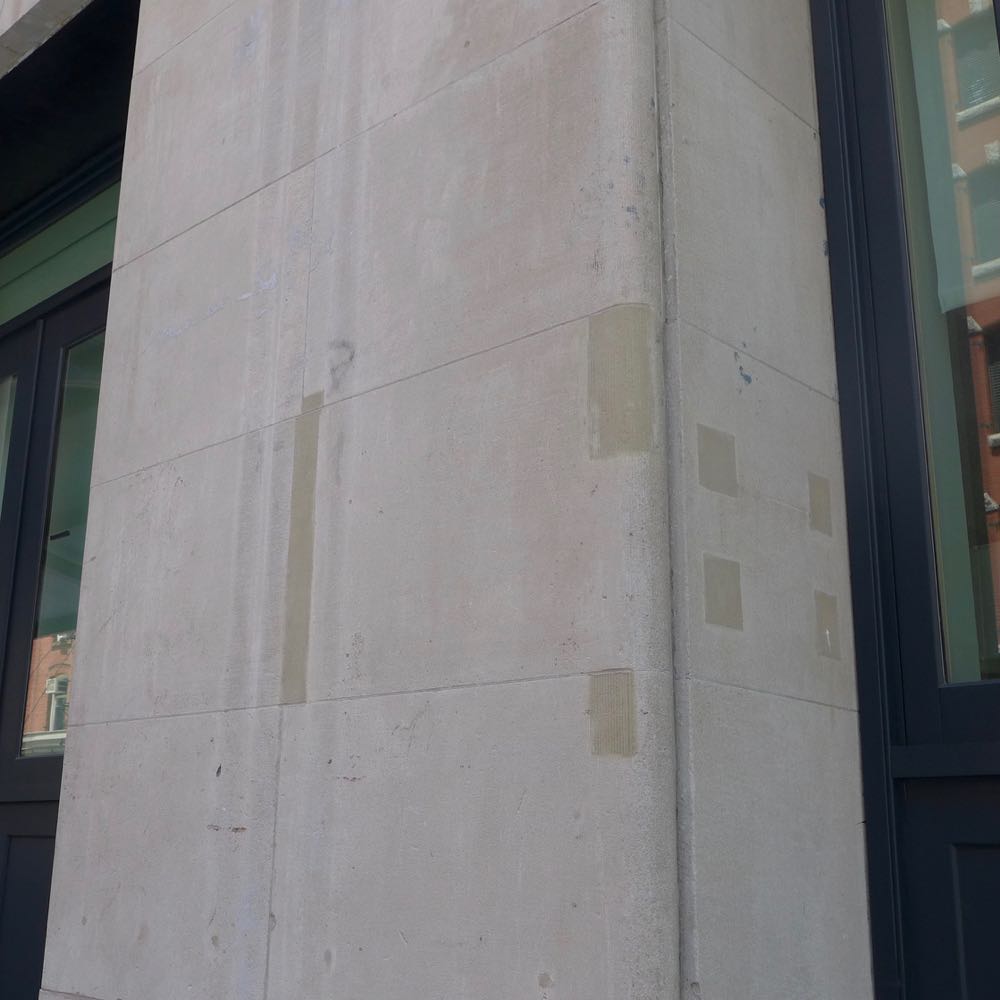

 The downside of the mirror-image design is that it’s awfully easy to compare the new and the old. New buildings shouldn’t just look like they belong in historic districts; they should feel like it, too, with an appropriate sense of quality, as if they were built back when construction wasn’t so cheaply achieved. Even leaving aside areas that might be incomplete, the new building is a Monet, and I mean that in the Clueless sense: the splotchy metal and concrete panels; the prominent corner piece that’s a different color than everything around it; the already worn areas around the retail door frames; the rust stains.

And the top?
The new penthouse level is set back far enough that it’s not visible from the street. Neither are any mechanicals. But what’s the story with the eerie blacked-out windows at the top? I don’t recall seeing that in any other building around here. And wouldn’t someone want to do something about the gaps in the concrete panels, especially at the cornice?


Is the building an improvement?
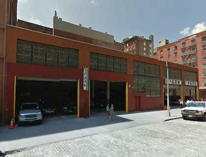
The old half is in better shape than it was pre-conversion, but I had a soft spot for the garage that was demolished to make way for the new half of the condo. It had actual character. One upshot: The new building blocks most of the trompe l’oeil arches on the north side of 408 Greenwich.
Rendering vs. reality
In renderings, the new half is much lighter, with more of a distinction between the ground floor and the rest—which certainly would’ve better mimicked the old building. (My hunch is that these dark façades are going to seem very dated in a few years.) And some of the metal canopies in the renderings are translucent. It seems entirely possible that the LPC insisted they be opaque; no matter who did it, pedestrians and retail tenants were not well served.
Pass or fail?
If we take it on faith that the gaps get caulked and the materials age into harmony, the building passes. If these issues only worsen, what was such a promising design will tilt toward becoming a disappointment, another victim of flawed execution.
Previously:
••• 15 Renwick
••• 456 Washington
••• 11 N. Moore
••• 290 West
••• The Reade Chambers (71 Reade/87 Chambers)
2 Comments
Comment:
Medium rectangle #1 (top)

Right column rectangle ads


Mega rectangle

Restaurant guide icon


Shopping Guide icon


They sure don’t build them like they used to. The juxtaposition of the design highlights this and the execution flaws.
http://www.nytimes.com/2016/09/04/realestate/a-tribeca-duplex-for-22-2-million.html