
Left rectangle ads redesigned


Robert Ripps book
History of Tribeca Buildings
New Building Report Card: 15 Leonard
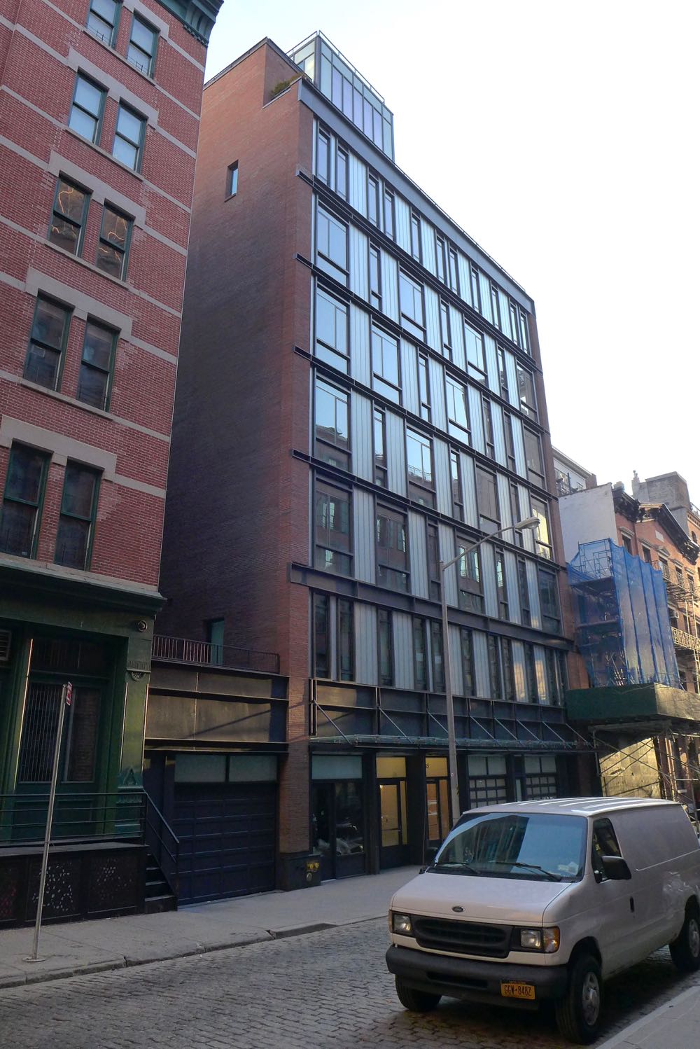
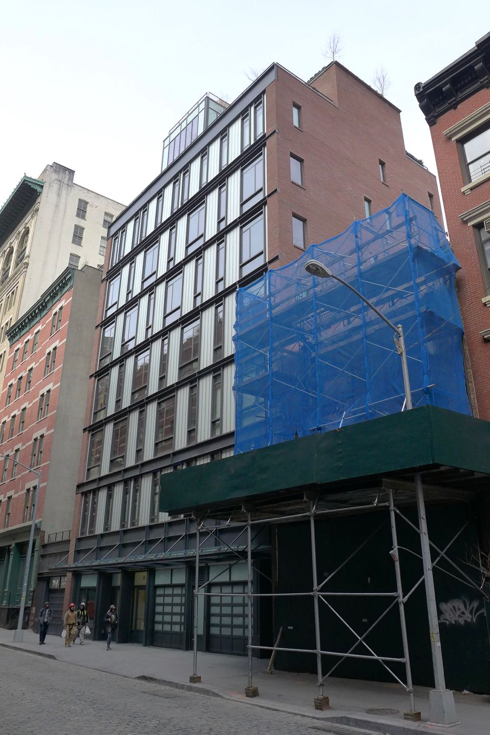 Only residents may care how new buildings turn out on the inside, but we all have to live with the outside. So let’s review the new condominium at 15 Leonard. The building was developed by Steven Schnall; the architect is Turett Collaborative Architects. Please don’t let the fact that you’re not an architecture expert (either) stop you from weighing in.
The design in general
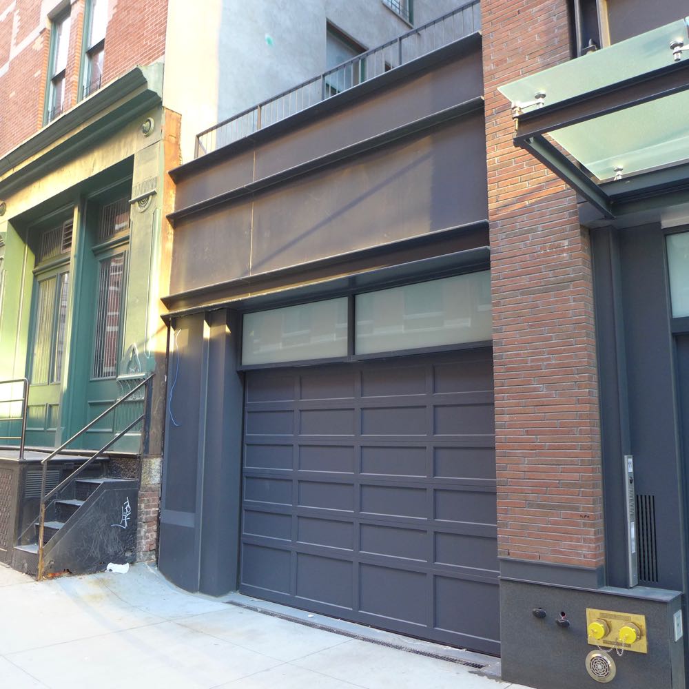
The nine-story building—the top two stories are set back—sits on the east side of the lot, with a single-story garage on the western edge. The sides are brick, while the front is a black-and-gray grid of industrial-ish metal and opaque glass (or at least I think it’s glass). The windows and opaque glass panels are each two different widths; sometimes the many vertical rectangles line up, and sometimes they don’t.
At street level
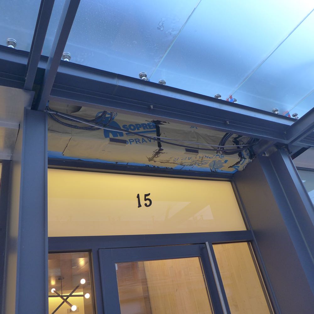
The first floor abandons the general design scheme, emphasizing horizontal rectangles rather than vertical ones. There’s no retail, just five entrances (one for the “11 Leonard” maisonette) and three garages. A glass canopy hangs over all but the westernmost garage.

Upon closer viewing…
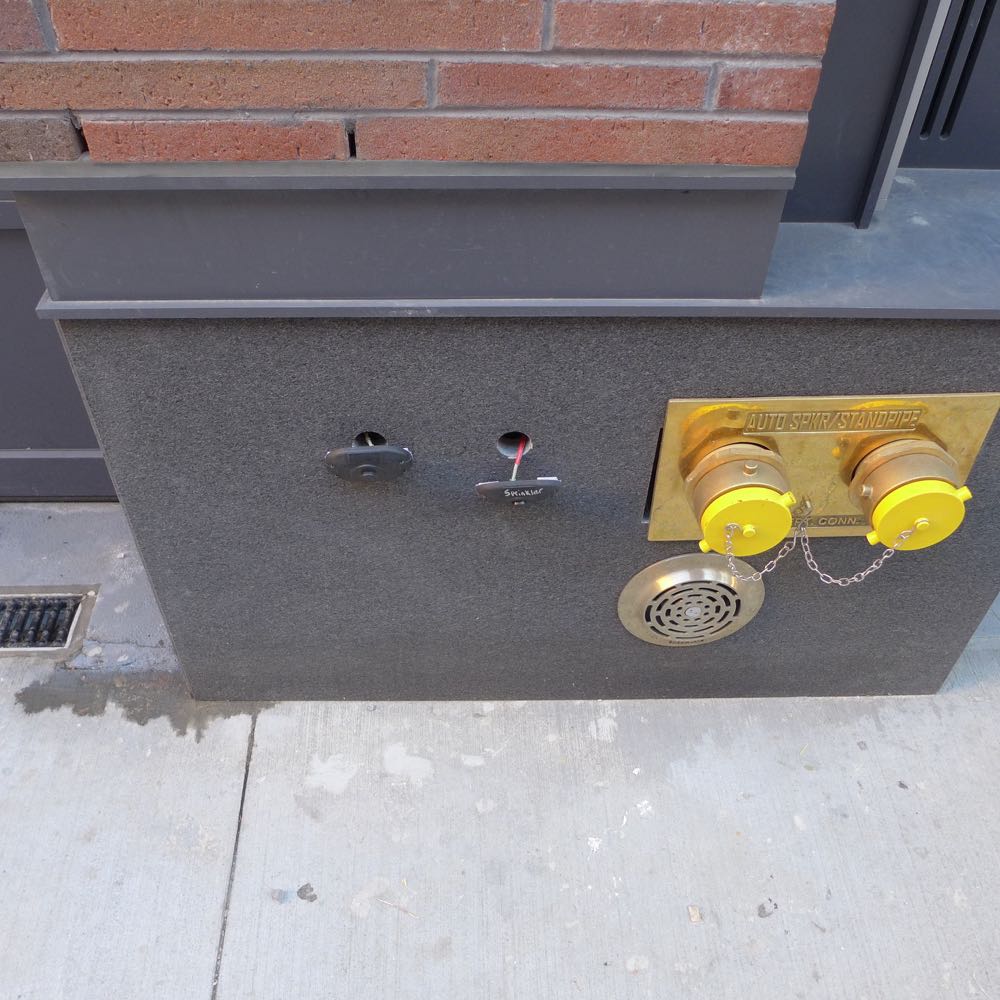
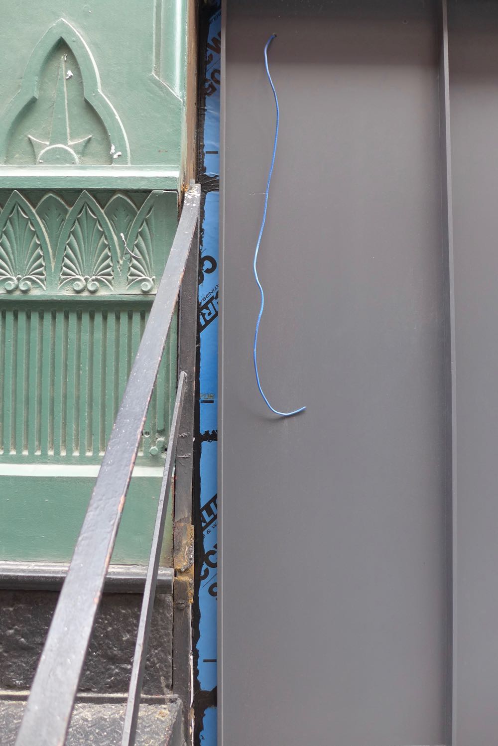
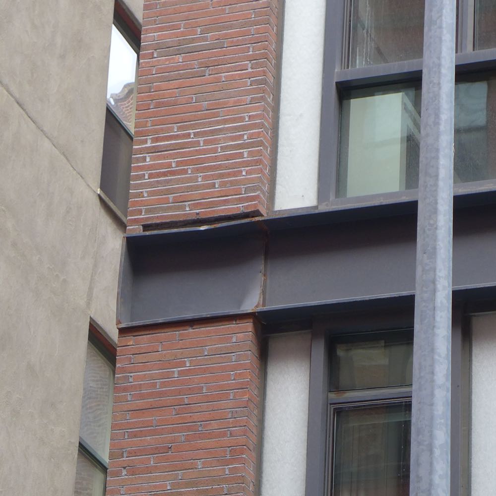
In the building’s favor, it feels solid and generally well made. That said, as you can see below, the punch list clearly has a few items on it. The exposed area above the front door remains a mystery, and the missing bricks on the west side are a concern. (Did they fall off?) The street numbers are cheap—let’s hope they’re temporary.
And the top?
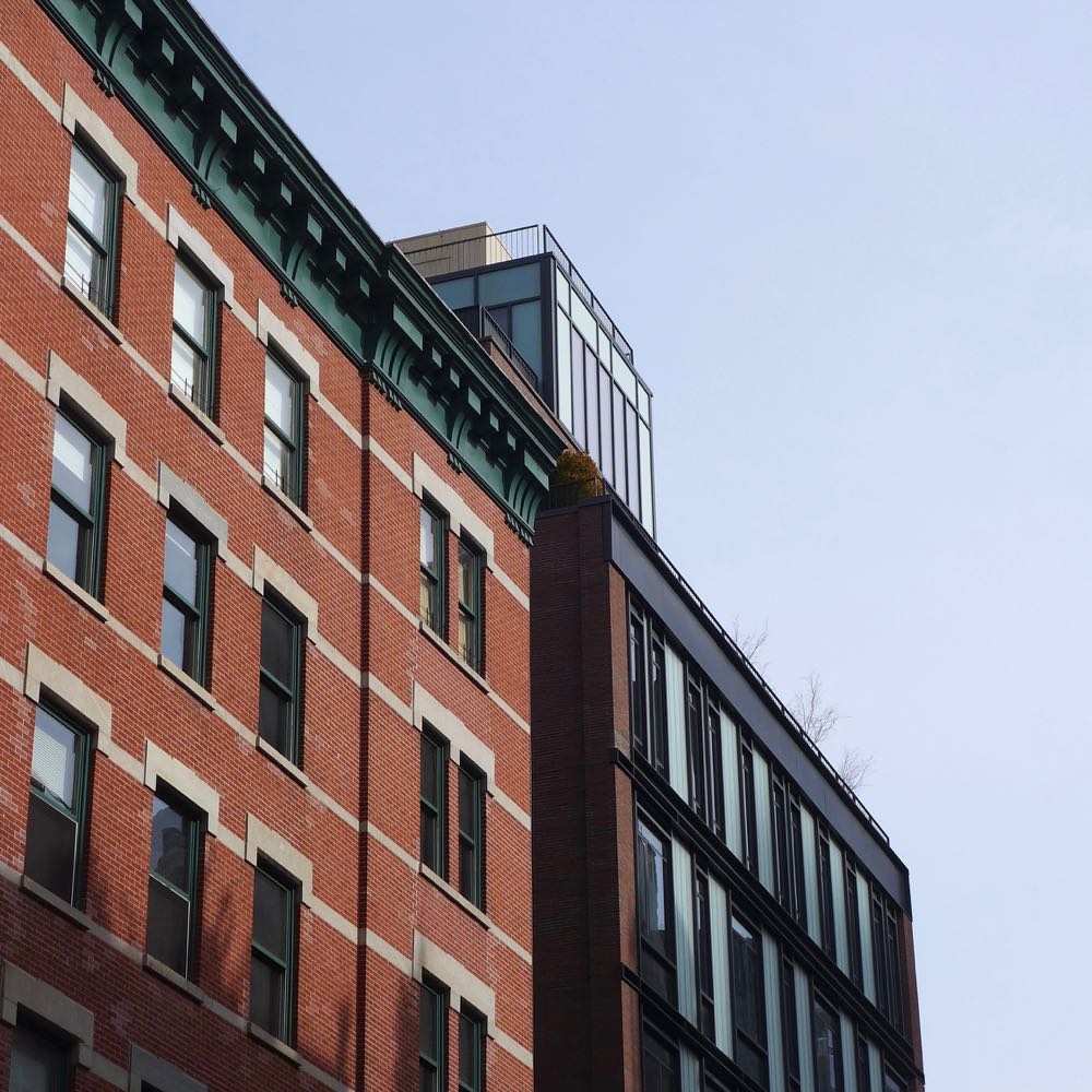
Who knows? (Well, Kylie Jenner does.) Like with 15 Renwick, the building is too tall for the narrow street, so whatever is happening on top remains mostly hidden. From across Leonard, an off-center nub pokes up, with an inspired bulkhead at the very top. They should have at least painted it gray or black.
Is the building an improvement?
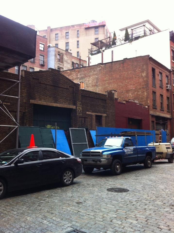
Comparing a nine-story condo to a pair of old single-story garages is like comparing apples and oranges. The scale of the smaller buildings is dearly missed, and where there was once light and air is now a dark mass.

Rendering vs. reality
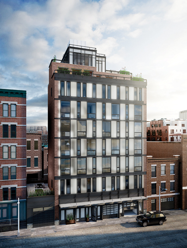
In the rendering, the opaque glass panels seem to be a little translucent, and they didn’t have the vertical lines within each panel. The rendering also makes the bulkhead at the very top appear invisible, which would have been nice. Last but not least, a plant or two on the sidewalk, as rendered, would be welcome. But other than that, it hews pretty close to the final product. (Like all renderings, it’s brighter than reality.)
Pass or fail?
It’s rare for a mid-block building to have three visible sides, and yet 15 Leonard entirely ignored that opportunity. I wish the façade were lighter, but even more, I wish that it made more sense—in the context of its neighbors (why this design in this location?) and within the context of the building itself (why this facade with those sides?).
For all the missed chances, however, I don’t have a visceral reaction against 15 Leonard—the way I bet the neighbors in the old buildings nearby do. That it feels substantial goes a long way toward making it acceptable. So many new buildings around here look and feel like cheap copies of old Tribeca, but 15 Leonard doesn’t. You may not be able to make ’em like they used to, but you get credit for trying. Pass.
Previously:
••• The Sterling Mason (71 Laight)
••• 15 Renwick
••• 456 Washington
••• 11 N. Moore
••• 290 West
••• The Reade Chambers (71 Reade/87 Chambers)
Comment:
Medium rectangle #1 (top)

Right column rectangle ads


Mega rectangle

Restaurant guide icon


Shopping Guide icon

