
Left rectangle ads redesigned


Robert Ripps book
History of Tribeca Buildings
New Building Report Card: 30 Park Place
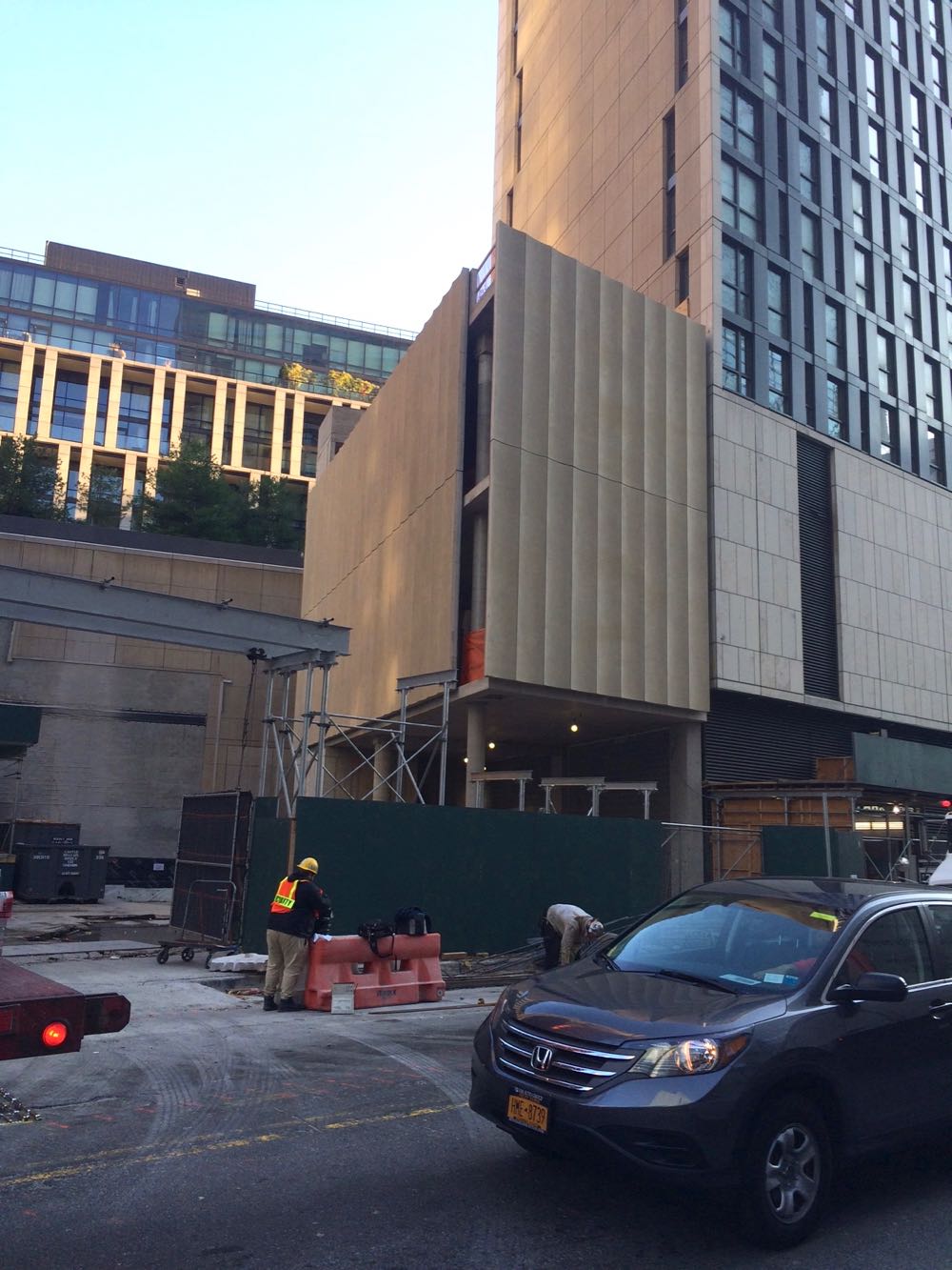
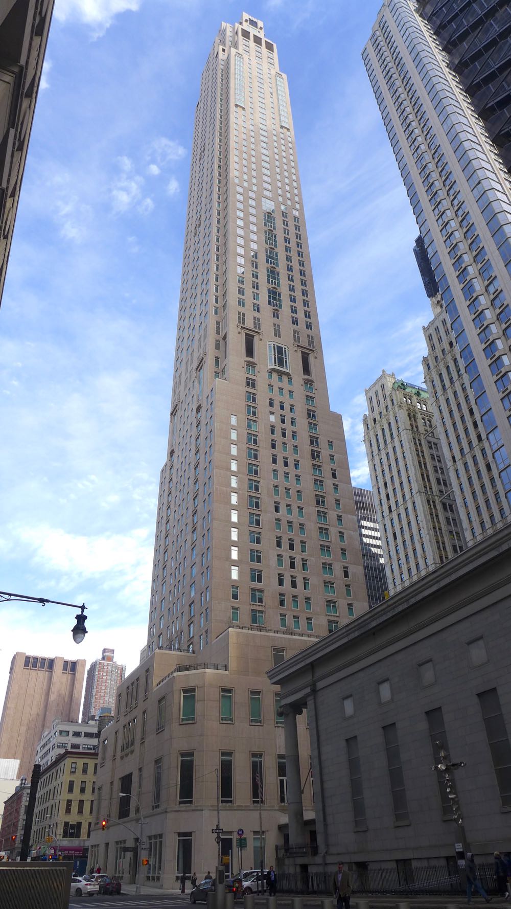 Only residents may care how new buildings turn out on the inside, but we all have to live with the outside. So let’s review the new tower at 3o Park Place. The building was developed by Silverstein Properties; the architect is Robert A. M. Stern Architects. Please don’t let the fact that you’re not an architecture expert (either) stop you from weighing in.
The design in general
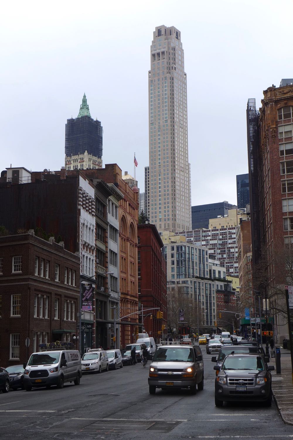
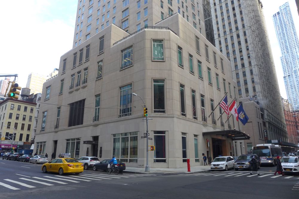
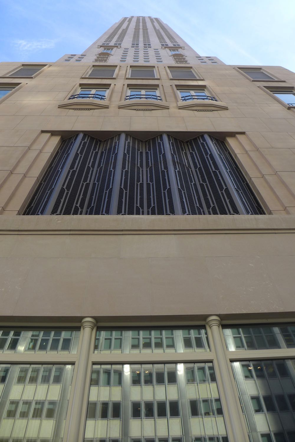
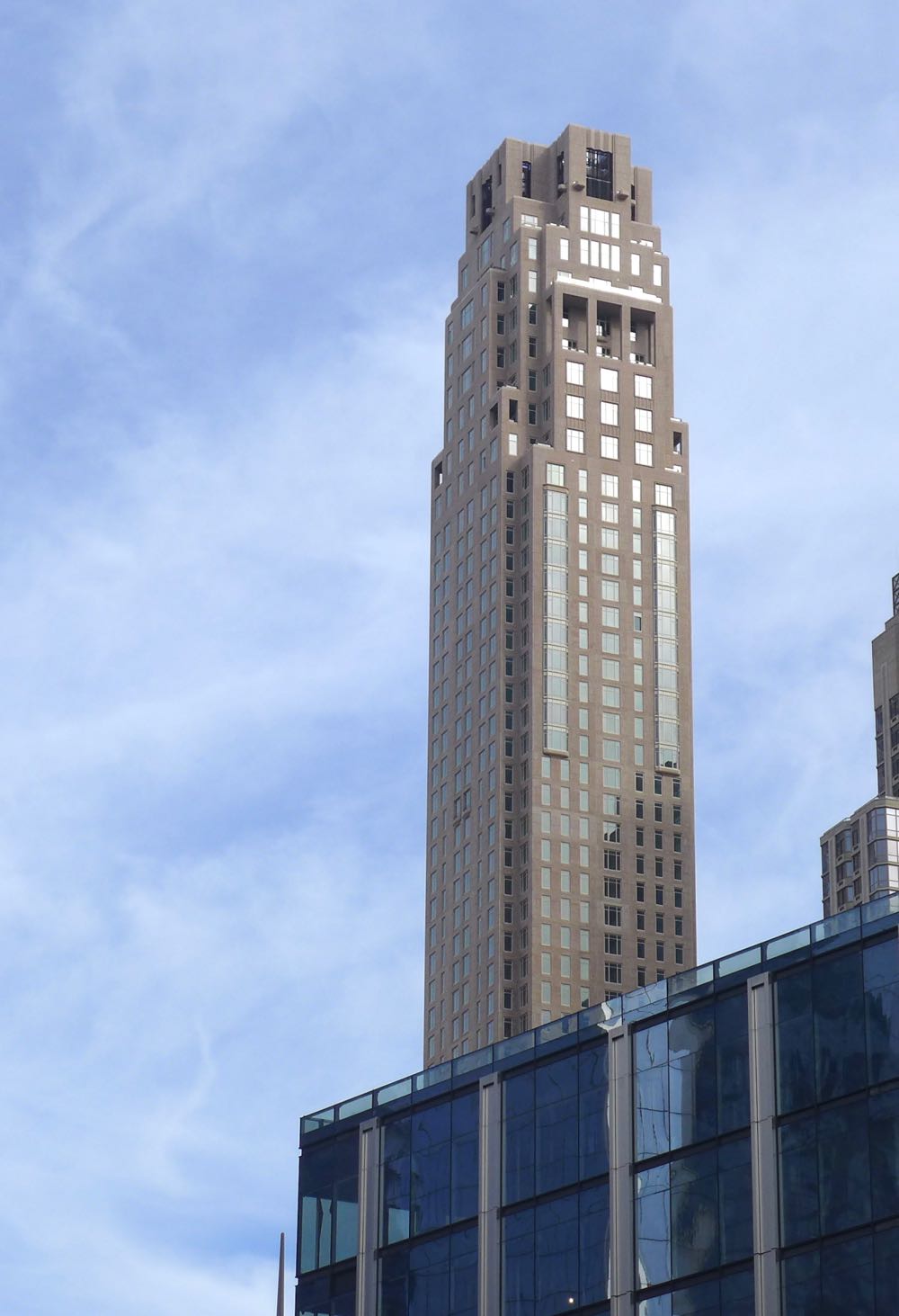
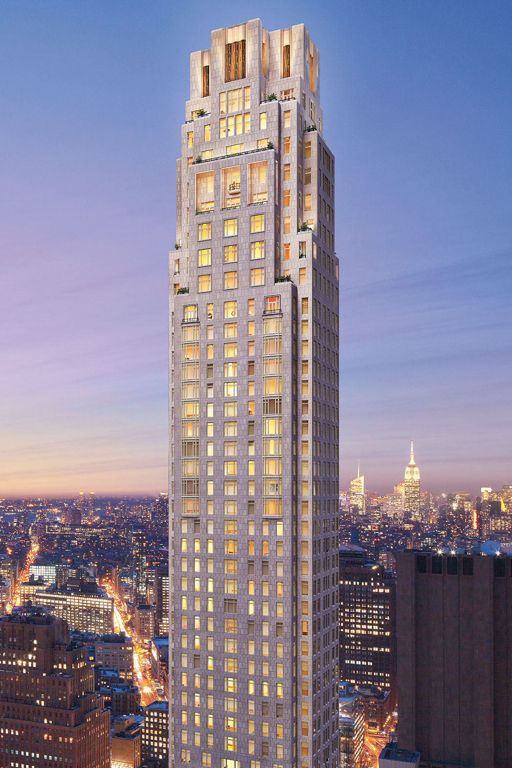
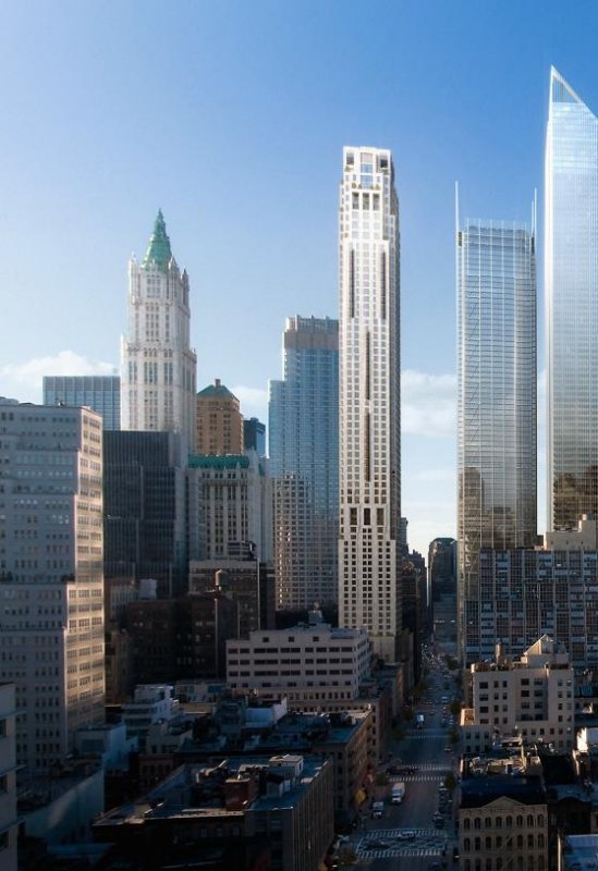
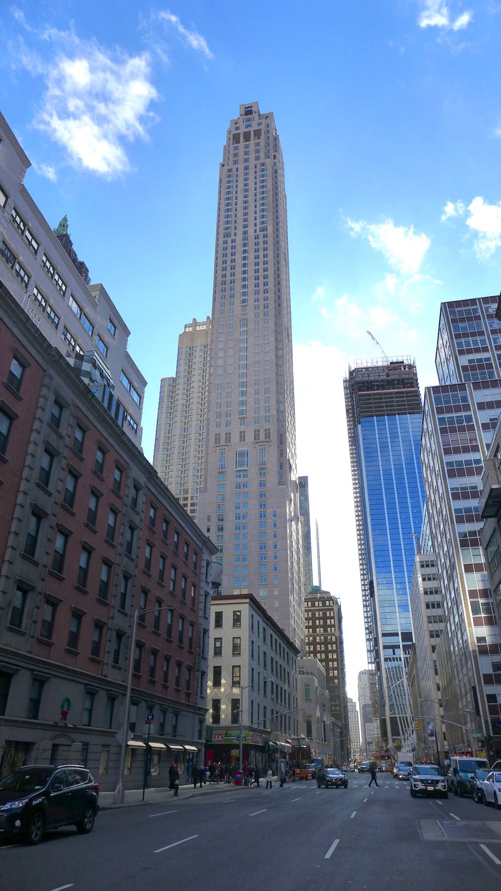
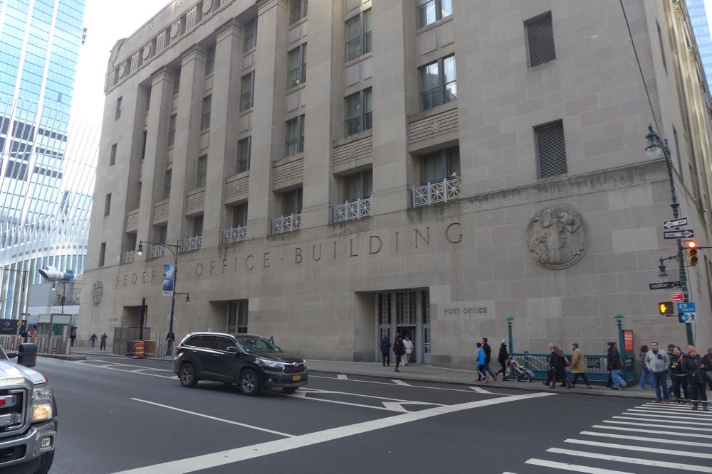
The 82-story building is primarily a thin, square column atop a wider four-story base; chamfered corners at the base and notched corners and setbacks on the tower lend an Art Moderne feel. The first 24 floors are the Four Seasons Downtown New York hotel, with an entrance on Barclay; the rest are condominiums, with an entrance on Park Place. To the east, across a narrow public plaza, is a three-story outbuilding (for parking and mechanicals) in the same style. Designing a new tower on the same block as the Woolworth Building poses obvious challenges; mimicking the Woolworth’s ornateness may be impossible in this day and age, so Stern utilized myriad devices to make the new tower feel as if it could’ve been built decades ago. (If anything, 30 Park Place feels more akin to the Federal Office Building across Church.) Besides all that notching and chamfering, there are bay windows, Juliet balconies, iron railings, Neoclassical frills on the level above the hotel, Art Deco grilles…. I don’t have the architectural vocabulary to describe them all; spend a few minutes looking at the building and you’ll see how decorated it is, especially compared to the glass shafts going up everywhere else.
The only serious issue with the overall design is that the proportions are off: The building is too thin for its height. But that’s the new normal, and as more pencil buildings pop up, it’ll likely feel less weird.
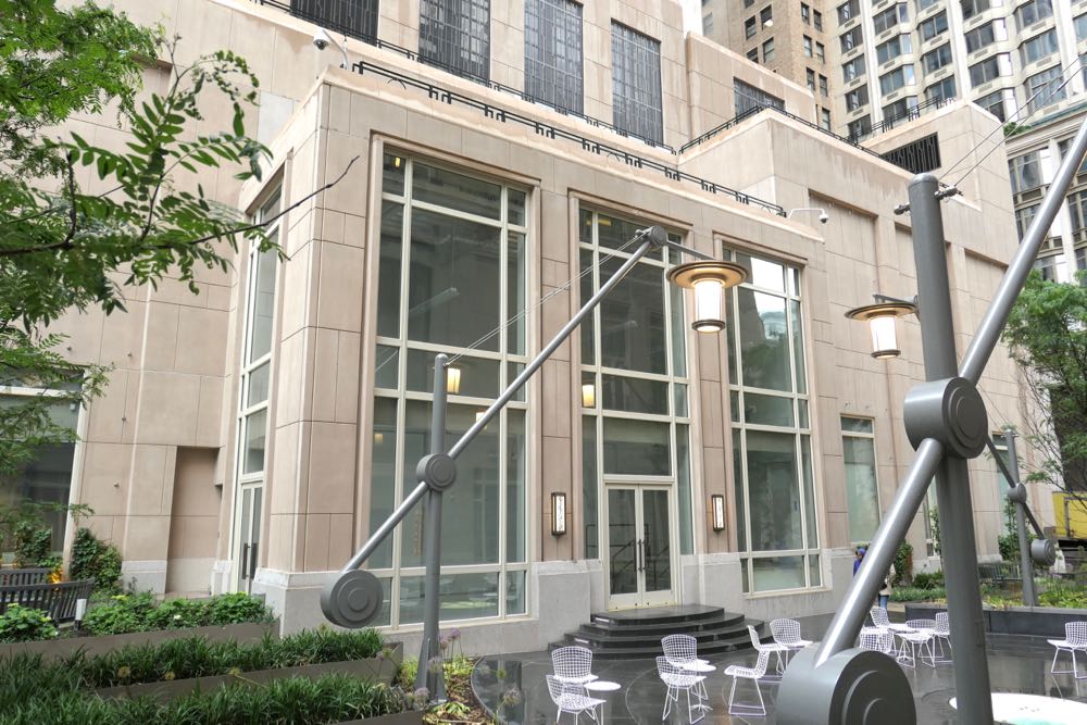
 At street level
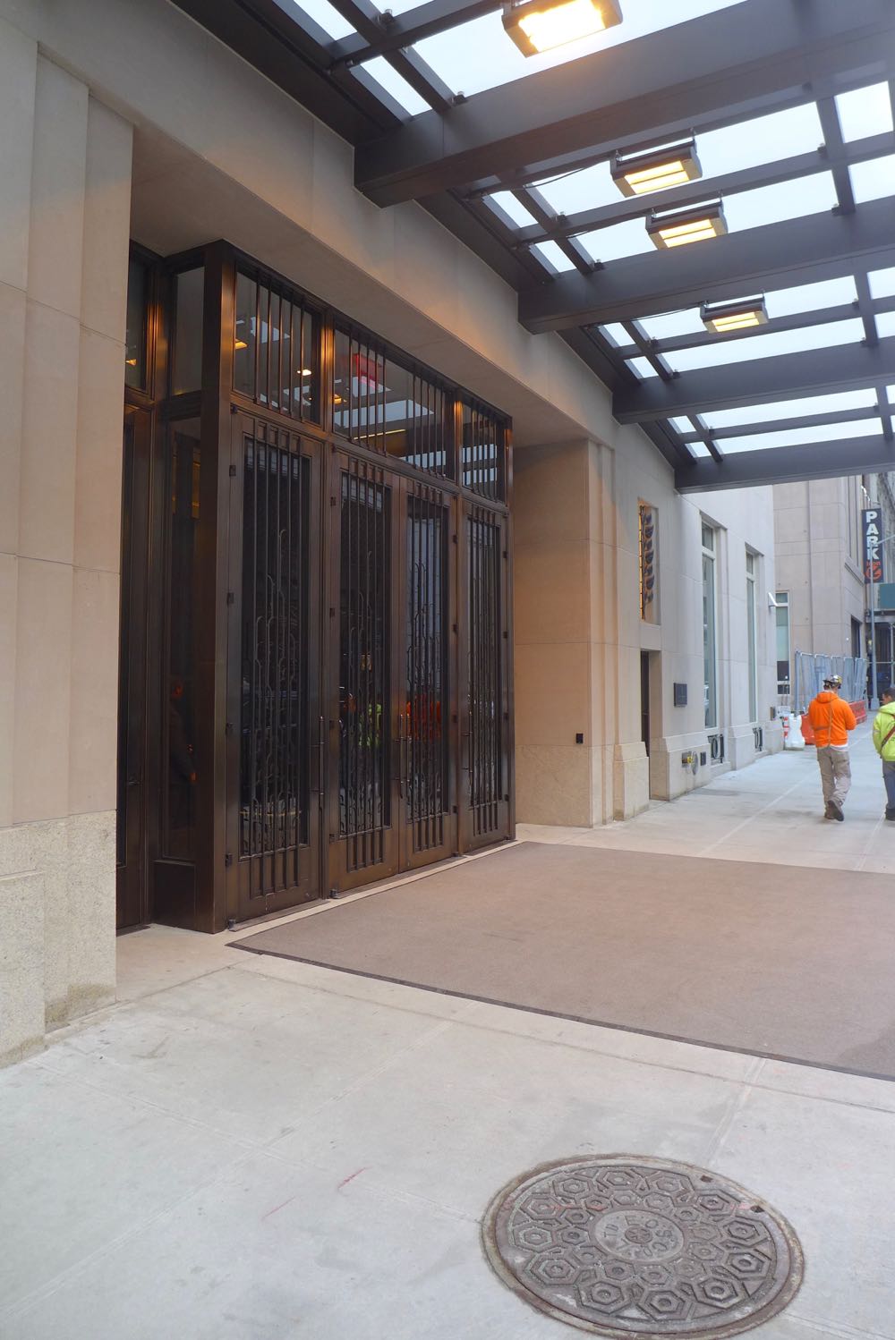
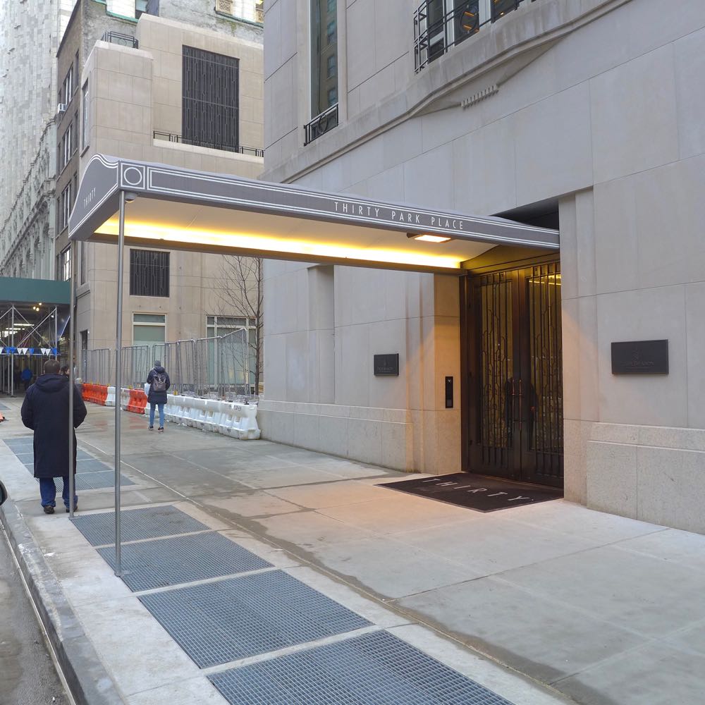
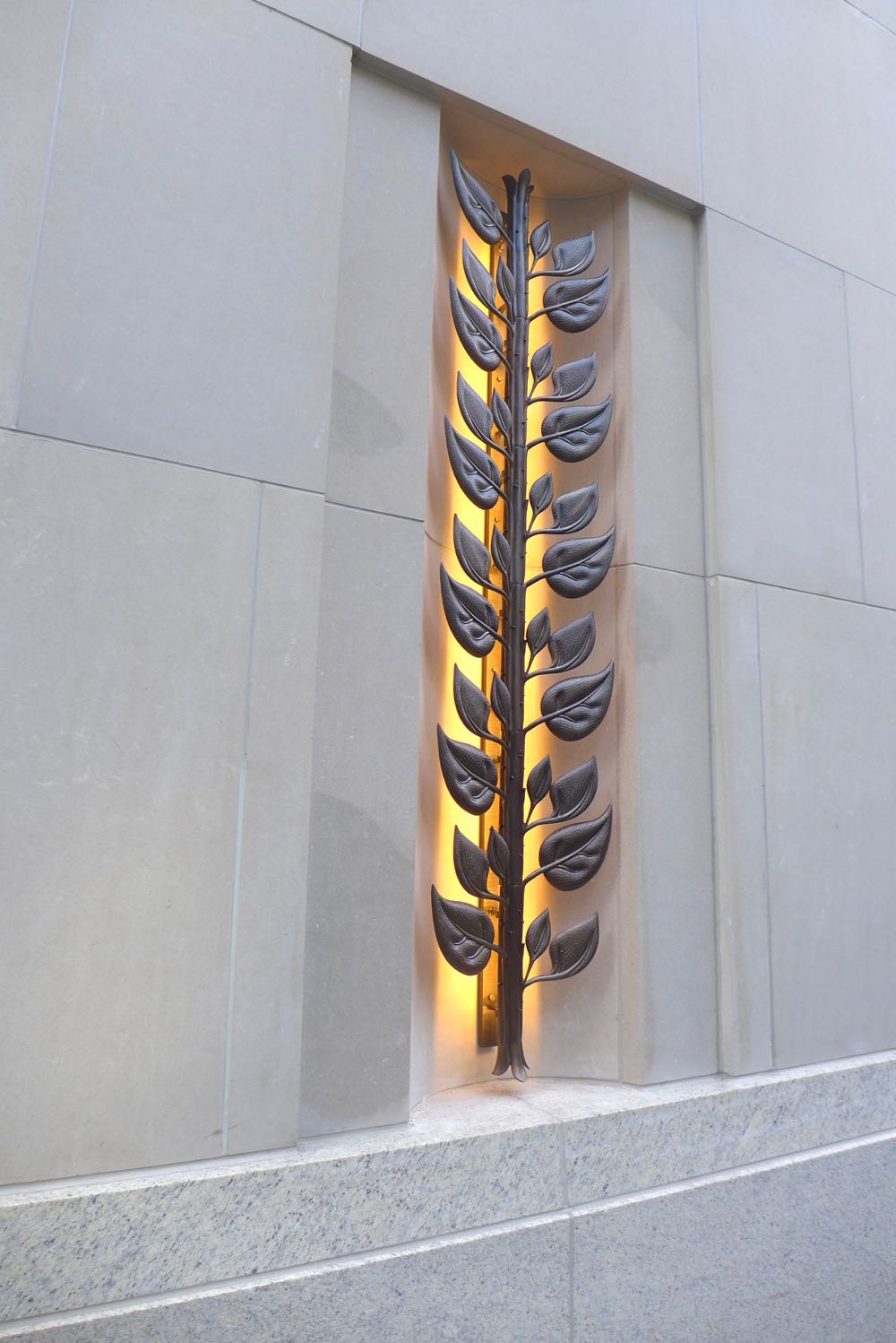
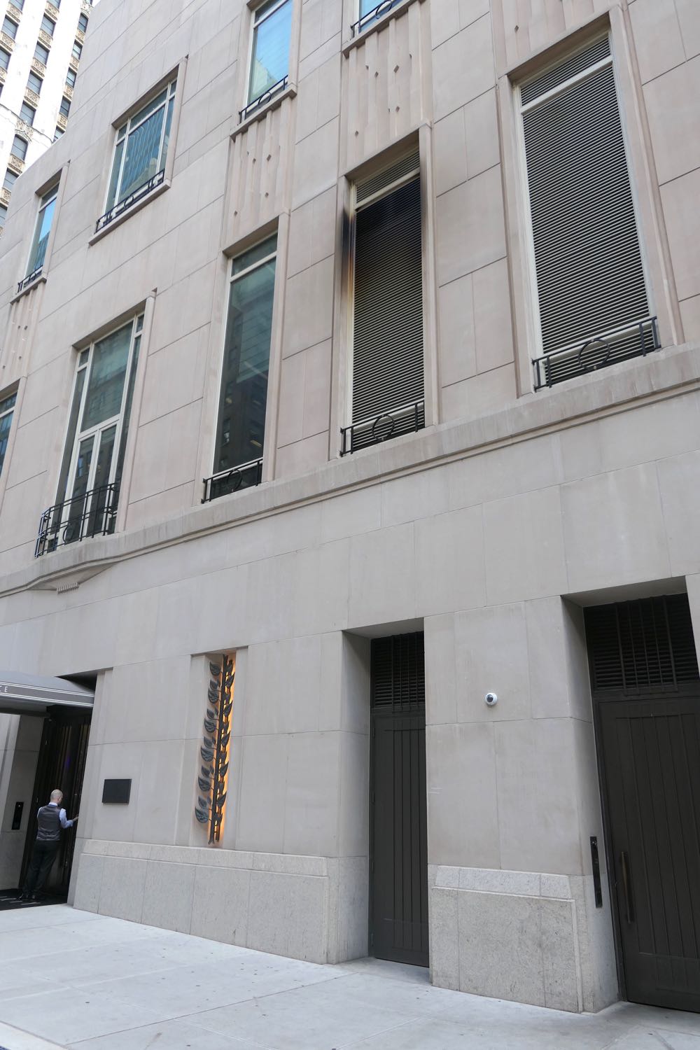
The façade is generally elegant at street level: Stern used granite and limestone to clad the first floor, and cheaper pre-cast colored concrete panels—to mimic limestone—higher up. The Four Seasons entrance looks like a bank vault, which might be intentional, and the Cut restaurant’s exterior could use some drama, but the condo side has a terrific Art Deco awning (soon to get wrought-iron poles), and there are sconces made to resembles vines all around the building. I’ve already gone on record as admiring the plaza, which is far better than the afterthought over at 111 Murray; the tenants that rent the three retail spaces will have a tremendous effect on the overall appeal of the plaza.
 Upon closer viewing…
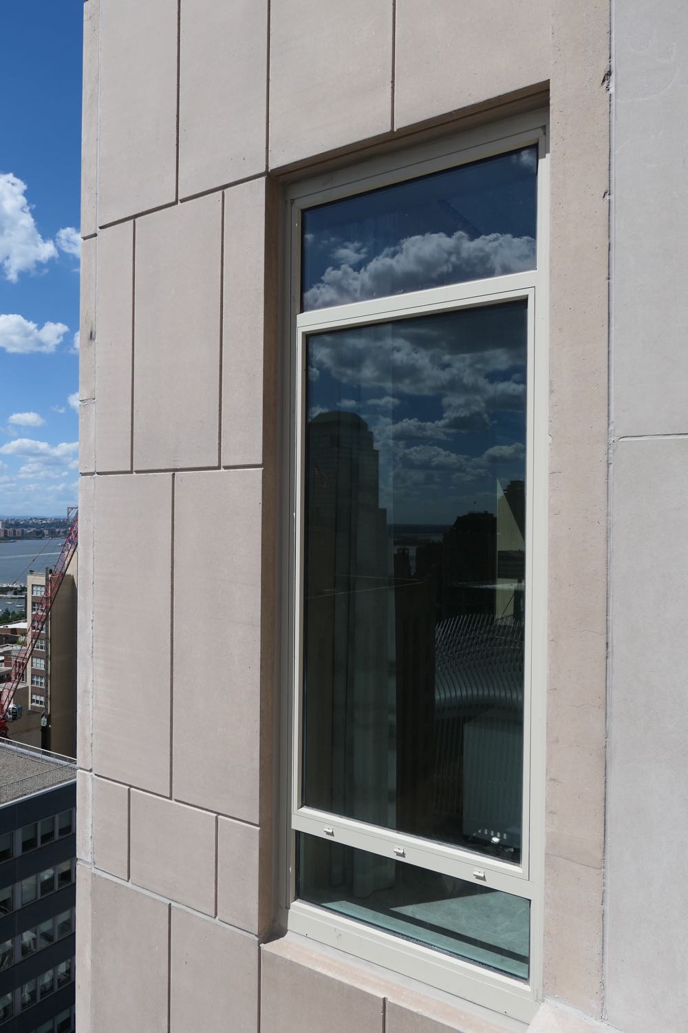
From a distance, 30 Park Place has a welcome dignity, even if its pencil-like proportions can be jarring. Stare at it up close for a while, and all those flourishes can start to look like the gilding of a lily. I have found myself wishing that Stern had streamlined the design a bit, trusting the inherent grace of the shape more. And we’ll have to see how the concrete holds up; the second photo below is from a balcony on the amenity floor, and you can see the concrete is stained and chipped. (Speaking of stains, the ugly black soot around the second-floor restaurant vent, right off the residential entrance, is pretty embarrassing.)
 And the top?
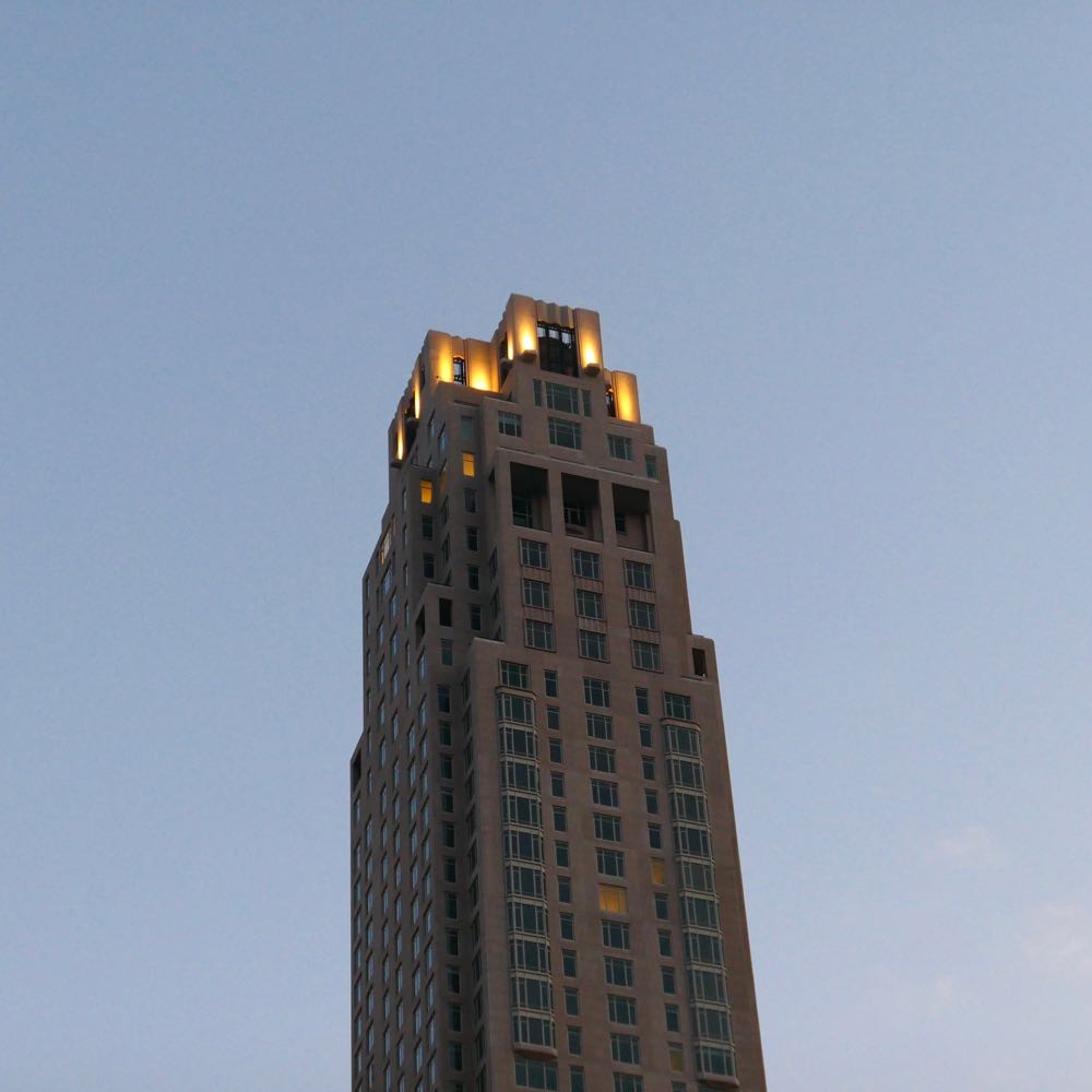
The top possibly has too much going on, compared to the vast middle section, but that’s a quibble. Because to the building’s immense credit, the mechanicals are hidden from view—something that happens far too rarely around here. And it’s lit nicely at night.
 Is the building an improvement?
I didn’t really go below Murray Street much before starting this website, at which point the previous building had already been demolished (and then sat stalled till the economy improved). There aren’t that many photos of the previous building online. As you can see below, or better yet, on Google Maps, it was the type of solid, gray-flannel-suit building they don’t make anymore. But the new 30 Park Place holds its own well enough.
 Rendering vs. reality
The renderings are slicker than reality, but there are no glaring discrepancies.
 Pass or fail?
Pass, definitely.
 Previously:
••• 15 Leonard
••• The Sterling Mason (71 Laight)
••• 15 Renwick
••• 456 Washington
••• 11 N. Moore
••• 290 West
••• The Reade Chambers (71 Reade/87 Chambers)
12 Comments
Medium rectangle #1 (top)

Right column rectangle ads


Mega rectangle

Restaurant guide icon


Shopping Guide icon

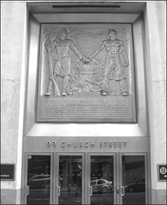
The original building at 99 Church Street was the Dun & Bradstreet building (also housing Moody’s Investors Services). The two men holding hands in the relief represented “man’s confidence in man”, that is the role credit plays in all business transactions. I worked for the company for 11 years.
The big issue I have with this building is it’ location. It hulks over the Woolworth building. Who on earth approved that? To me it look like a big middle finger flipping the bird to all of lower Manhattan.
That bronze relief is now in the WYETH showroom on Canal. It is very very beautiful.
The best thing Stern did was pull his building as far away as he could from the Woolworth – giving it some room to breathe – and then toning everything down on his building so as not to even try to compete with the Woolworth’s ornate facade even as the new structure echoes the Woolworth tower’s form. I agree with your assessment – certainly, it could have been a lot worse. Bob Stern considers himself (he’s said this in interviews) as much an architectural historian as an innovator (and he’s the dean of Yale Architecture School so he knows his stuff.) He was the right person for the job.
I live across the street and my view overlooks the hotel entrance and plaza. It makes for a very nice presence and the plaza is particularly lovely at night as well as a significant advantage as a mid-block thoroughfare.
I wonder about the the retail, though, especially in an era when retail is struggling all over, and hope they’ll find quality tenants for the three relatively small spaces (which appear to have no venting for food). We could definitely use some additional retail/food on this block, but with no natural pedestrian traffic and the small size of the spaces what will succeed here? I agree that whoever winds up there will have a strong impact on the feeling of the plaza.
My one issue with the plaza is that many of the chairs are bolted to the ground in odd configurations which challenge natural interaction. I understand why they’d bolt the chairs just not why these odd layouts were selected.
I agree with you design of the building and the relationship to the Woolworth build. Actually will walk over and work in the plaza today. Issue- why is Silverstein allowing the food cart east of 30 Park entrance? I am on Murray and Greenwich and fed up with the unsightly food arts which are parked over night lately.
Curious??? Any way to remove the carts? I would for home and the food smells are entering my apt as I text.
Live a solution to fight the food cart take over in South Tribeca.
Thank you
See this comment by James about food carts (and how landlords have no say over where they go): https://tribecacitizen.wpengine.com/2017/04/29/seen-heard-four-seasons-food-cart/#comment-107157
The 1% can now look down their noses at the Woolworth Building.
My only regret it that it towers over and pulls glory from the Woolworth Building, the most beautiful skyscraper in New York City and Cass Gilbert’s crowning achievement.
By the same token, it distracts from Barclay Tower….
Please write about the filthy food carts that are plaguing Tribeca including the one parked outside of 30 park
My writing about the carts wouldn’t change a thing. (And I agree there are too many.) You have to contact CB1 and our city councilmember, Margaret Chin.