Suggestion Box: Bogardus Plaza
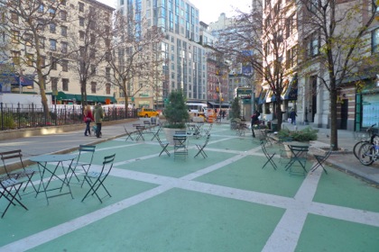 Last week, reps from the Friends of Bogardus Garden presented their plan to turn the temporary plaza—the block of Hudson between Chambers and Reade—permanently traffic-free. From my unofficial CB1 meeting minutes: “They made their case, pointing out that all but one neighboring businesses support the idea, as do many surrounding buildings; that the community events have involved local businesses […]; that if the plaza becomes permanent they’ll be eligible for money from places such as the Department of Transportation, which would allow for more (and nicer?) furniture, improved street surface (no green?), free wi-fi, and so on.”
That was the second time I had disparaged the green paint, and one of the reps from the group asked me why I didn’t like it: “Since the plaza was temporary, we could only afford the green paint to tie back into the ‘green’ garden. Since we’ve received a resolution in support of us becoming permanent, I would love to know your thoughts.” Well, the green has always struck me as playground-y, and I’d like the see the plaza go more in the European style of Bryant Park. As I learned the hard way when I put up crazy wallpaper in my apartment, keeping the background somewhat simple means the furniture can be more interesting, or even be changed with the seasons or the years. I’d also love to see the park and plaza integrated.
I’m no expert in park design, of course. Presumably neither are you, and I hope that won’t stop you from weighing in. What do you think should be done with the plaza, aesthetically speaking? I have tremendous respect for the women who have transformed Bogardus Garden & Plaza (there may be men involved, but I haven’t met them), and I’m confident they’ll take this in the right spirit. Maybe our suggestions will be end up being useful; maybe they won’t. But we can have fun daydreaming….
By the way, the plaza still has to get final approval. You can support it by signing this petition.







I like the idea of real cobblestones.
@Troy: I was thinking the same thing. Cobblestones make more sense (to me) for a pedestrian area than for streets, although I’m sure they’re rather expensive. I guess my aversion to color comes from the blue and green tiles in the Tribeca section of Hudson River Park—to my mind the only unsuccessful design choice in that area.
One of my favorite places… cobblestones?.. Great idea!
I don’t think cobblestones are a great idea, myself, because it limits the use of the space; they are hard to roll on (wheelchairs, bikes, strollers, etc.) and furniture doesn’t sit evenly on that kind of surface. I’d say a natural stone paving would be better, in large slabs. I think plantings should remain in containers, so they can be moved around. I like the existing furniture; I think it is important that the plaza remain a space that one occupies (a word I use without any specific political association) rather than a space one moves through. So “pedestrian” seems like slightly the wrong word to me.
I agree with hst on the cobblestones. Probably too expensive anyway. What about that tan gravelly stuff that would be ok for wheelchairs but not skateboards? I haven’t really used it but like passing by it. It should tie the garden and the sidewalk together somehow without getting too over-designed. Very simple and looking like it’s been there forever.
I’m voting no for cobblestones – they are not user friendly and they ensure that the tables and chairs will be wobbly.
I agree with hst – it’s not a walk through zone, it’s a sit and be zone…
Point taken on the cobblestone, but I often walk through it (happy to have room to move).
It should revert back to the street, but keep the green asphalt because it’s eco-friendly. If the board gives in to the Dark Side and creates a plaza, it should be modeled after Trump Plaza – classy. It should also be a stroller-free zone with entrances just wide enough to allow a person thru but not a stroller. And have large penis-shaped chairs designed by James Franco. What?! It’s art, people!
The green paint must be really bad up close because it actually produces a garden feeling when taking the long view. Cobblestones are horrible! For one, they’re a huge liability factor since people can barely walk on them. What is the problem with strollers? No screaming babies? How is a plaza that people use a real plaza if it doesn’t have screaming babies? Besides, closing it up would completely ruin the feeling. Part of the feeling of a plaza is that of view and display. You’re on display watching the view. If it were closed up, you really would have to change the green paint and the design. I say leave the green paint and swap out the furniture for something contemporary and functional but more stable looking–more solid.
Cobblestones are attractive, historic, and functional. Cobblestones provide excellent drainage and will not crack when expansion and retraction occurs due to seasonal changes.
The good thing about the chairs is that they are easy to move around. The bad thing is that they are quite uncomfortable and unsteady. My biggest beef though is the traffic light. It is a long light on a lightly travelled street besides. It is unnecessary!
I was walking through the new Washington Square Park the other day and thought how nice the pavers look. Maybe because they’re all new and pristine looking still… But I think some nice stone pavers that are reminiscent of the cobbles is the way to go. Adding some planters and trees would be nice too.