Three Possible Designs for a Unified Bogardus Park
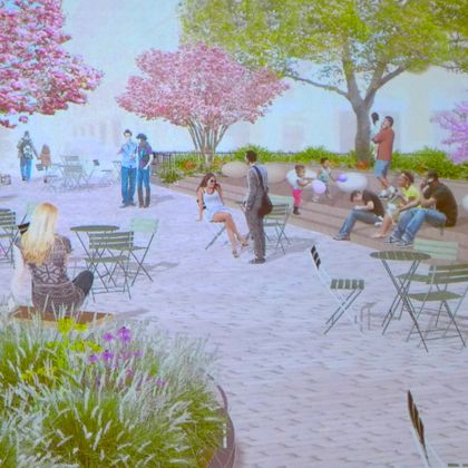 The other day Adam and I were having lunch in Bogardus Plaza when Victoria Weil, president of Friends of Bogardus Garden, walked by. “Glad to see you enjoying it!” she said, no doubt recalling that I may have voiced a doubt or two when the plan to close that block of Hudson was first floated. I’ll happily eat that crow: Even though I live in southeast Tribeca, where we have to make sure we make cabs turn north on Church when heading north, lest we end up on West Street, I love the plaza. And even more, I love what it’s going to be. Last night, Signe Nielsen of Mathews Nielsen Landscape Architects presented three possible designs to unify the garden and plaza, based on community feedback at a previous meeting. (Nielsen, you may recall, designed Duane Park and the Tribeca section of Hudson River Park, among many other projects.) You’ll see all three concepts below. But just pause for a second first and reflect on how awesome this is. We’re about to get a new park because dedicated Tribecans made it happen—and if you think it was done easily or lightly, you have obviously never dealt with the city in any fashion.
 First, a few points:
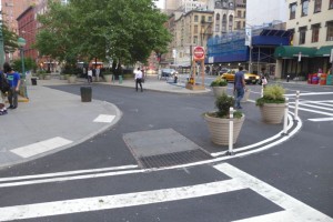
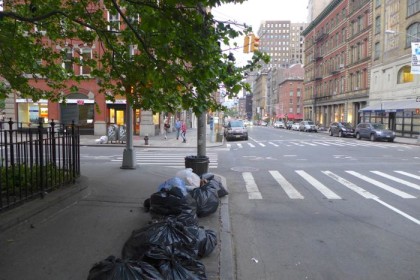
••• The park will be around 12,000 square feet when complete, and it will go as far south as where the new painted white line is—we gain quite a bit of territory, as you can see in the photo at right.
••• What is now street will be raised to sidewalk height.
••• What is now the garden is raised about a foot off the ground, and it needs to stay that way (unless we also want to get rid of four big London plane trees, which we don’t).
••• We need to respect the entrances to the buildings on the west side of the park.
••• The MTA insists that no plants be put over the subway station, at the south end of the park. Moreover, a water main runs under what was Hudson, and an area eight feet on either side of it must remain clear (also important for emergency access).
••• Not on the table: a water feature (too costly to maintain) or permanent art.
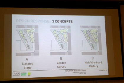
For all three concepts, the amount of greenery is the same, and they have more or less the same number of trees (Concepts A and B add four, while Concept C adds five). The pear trees in the garden have to go, but that’s OK because they’re too high to be useful and they block light from getting to the undergrowth; they’ll be replaced by something seasonally pretty, such as redbuds or magnolias.
All of the images below get bigger if you click on them.
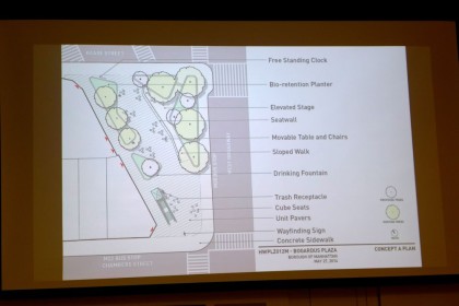
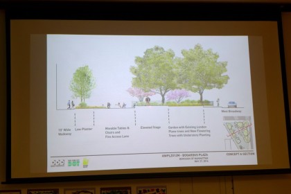
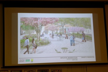
Concept A
Concept A is also known as “Elevated Stage” for its raised element, with a boardwalk-style path over the current garden (to an entrance/exit to the northeast); the stage functions as both seating and a platform for events.
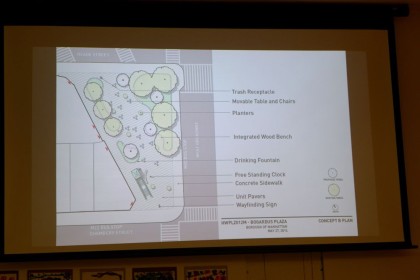
Concept B
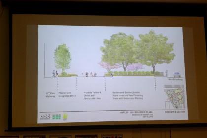
Concept B, known as “Garden Curves,” includes nooks for seating and wooden benches integrated into the garden wall. It’s relatively flat compared to the others, with the existing garden the sole raised element. Note: This one erroneously puts the clock at the south end, where it can’t go. More on that in a bit.
Concept C
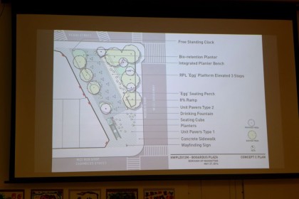
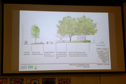
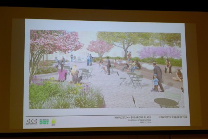
Concept C, or “Neighborhood History,” includes an elevated perch with immovable egg-shaped seats as a reminder that this was once the butter-and-egg district; there’s also an inset with a different type of paving. The “seating cubes,” also in Concept A, are what Nielsen calls “butt parking”—not so comfortable that you want to linger, but useful if you need a place to sit for a few minutes.
Some elements could be taken from one concept and used in an another. And some of the details and materials are budget-dependent, but we did see a few possible examples:
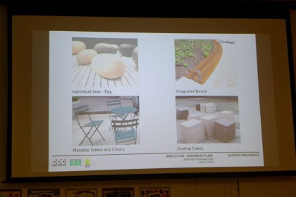
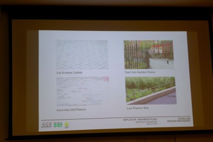 The attendees at the meeting brought up various issues, which often led to more information: Residents of 1 Hudson feel left out (but only one or two showed up?); the clock would make more sense at the south end (but it needs a “robust” base so it can’t go over the subway station—this remains an open matter); skateboarders will be a concern (Nielsen has a bag of tricks for discouraging them); the lighting, currently three cobra heads, will be converted to LED and spread throughout the park on poles around 14 feet high (you don’t want to add wattage or you have to pay for it, and using non-city-standard lighting means you have to pay for maintenance and change the bulbs yourself); the Department of Transportation is insisting on a six-foot bulb at the sidewalk at the northeast corner because it perceives crossing there as dangerous.
 As for next steps, Nielsen will come up with a final design, which goes soon to Community Board 1, then on to the Landmarks Preservation Commission. The group is forecasting work to start in the summer of 2016 and to take a year.
If you have thoughts or suggestions, I’m sure the group would still like to hear them. Post them in the comments or there’s a contact form here.
Update: Comments have been turned off due to spam. To have them turned back on, email tribecacitizen@gmail.com.





These are great. B is missing an important view, making hard to compare. A looks best to me.
People want places to sit, not to perch. Comfortable seats, please!
I understand your desire for comfort, but please realize that the many residents who encircle the park asked that any permanent seating not be comfortable to discourage patrons from the many nearby bars from congregating and throwing impromptu 4am parties under our bedroom windows. The moveable seating, which hopefully will be tied up at night as they are today, would provide comfort for those that want to linger in daytime hours.
is there any evidence that bar patrons are actually doing this? if so, can you please post links? we need to stop this right away.
I very much like the designs which have long seating, like low walls and integrated benches. There are often not enough movable chairs, and people don’t have any place to sit at lunchtime, even though there’s plenty of room in the park for more people
I am so glad that N finally pointed the finger at the real problem – comfortable seating. We can no longer blame the approval of bar after bar after bar, 4am closings and the lack of any police patrolling the neighborhood’s parks and streets for these drunk and slightly drunk young men and women just trying to enjoy family-friendly Tribeca.
Aaaand I am sure once they hang the “THIS PARK CLOSES AT DUSK” sign, all of these problems will be resolved.
Thank you for reporting on this. We all knew that Bogardus Plaza has been a success and that unification with the garden was coming, but you’ve nicely summarized the design options and have helped us all look forward to more green-space in Tribeca.
I think in any of these designs that you’ll need to push the tables and chairs more to the side to leave a gap so that the double-wide strollers and Range Rover Sports can drive thru. Has there been any discussion about changing the name to TrIraQ Plalooza? In honor of all those young warriors that lost their life waging war against the evil brick facades, street poles, mailboxes, and construction signs of Tribeca and “Harlem.” R.I.P., you brave-spray-paint-in-your-backpack-take-pictures-of-your-scribbles-with-your-DSLR-warriors.
Aaaand I am sure once they hang the “THIS PARK CLOSES AT DUSK” sign, all of these problems will be resolved.
I like A best, with the elevated stage that also serves as a seat-wall, like a long low bench but also can have a band or a speaker or a puppet show or something for events. BUT, I also love those eggs (but if it was the butter and egg district, should the cube seats not also be pats of butter?)