The “Ed Hardy House” Is Back
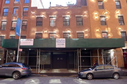
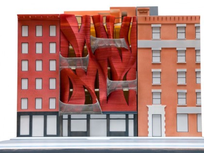
 The building that Curbed called “the Ed Hardy T-shirt of Tribeca houses” is getting ready to roar to life. The single-family residence at 187 Franklin—just east of Greenwich—will undergo an extraordinary metamorphosis: The façade will be removed, two stories will be added (and then also a set-back, brick penthouse), and a fiery new façade will be applied.
Architect Jeremy Edmiston, designing for Douglas and Michelle Monticciolo (or at least that’s who the Landmarks Preservation Commission letter posted outside is addressed to), explained the assignment on the System Architects website:
The clients, a family of four, have a home that’s way too small for their needs, especially as the kids grow. The building they are in was put up in the ’90s and is not historically significant, but it’s in landmarked district. This means that any new building or addition to a building has to go before the Landmarks Preservation Commission and prove that it’s not bringing down the neighborhood. […] Because our clients’ home faces a public building, we added a new facade in which the windows are angled so that they protect the family’s privacy, while bringing in a whole lot of light. We also added balconies and two more stories.
But really, the rendering is far more helpful at visualizing what to expect. Click it to better see the texture of the building brickwork—rather like flames on the side of its face—and the net-like balconies.
 The LPC unanimously approved the design in 2011, with DNAinfo noting that members said:
••• “It more than works—it actually enhances the richness of the district.”
••• “We should celebrate this project. Everything is familiar and yet nothing is familiar.… This is smart architecture as well as delirious architecture.”
••• “Tribeca is a place of drama, challenge and invention. It has its moments [and] I think this is going to be one of them.”
••• And DNAinfo said that “several commissioners liked Edmiston’s reference to the Synagogue for the Arts building nearby on White Street, which is also unusual but has become one of Tribeca’s most beloved buildings.“
Because so much time has passed since the LPC approval, I first thought maybe a new design was in the works, but the LPC letter posted outside clearly describes what’s pictured above.
The current building, meanwhile, was constructed in 1992 and the LPC called it “very simply designed”—which surely must have impacted its decision. And which bodes unwell for a couple of buildings that I’ll post about very soon….


Not wild about this design. I am a big fan of modern architecture but this seems like it is trying too hard to fit in while still being different.
I suspect (and experience suggests) that the final look will be quite a bit more “organic-looking” than this very rough rendering. I think that it will be a fascinating piece of work and I’m looking forward to seeing it executed. Synagogue for the Arts is an apt comparison. Were that presented as such a rendering today it would undoubtedly rankle some who find the actual building interesting and worthy.