We Need to Talk About 56 Leonard
“Am I missing something, or does 56 Leonard lack most of the ‘Jenga’ structure that originally featured in the building’s designs and public presentation?” asked HST on the post about the recently released time-lapse video of the building. “The building itself is turning out to be a straight-up high rise with balconies applied to the facade in a gently alternating pattern—nothing like the strongly offset layers that the original design promised. The original design was fantastic; this is banal and a huge disappointment.”
I bring this up again because I keep watching the top floors, hoping for something interesting to happen. “The most ‘Jenga-y’ part is by far at the top,” replied John. “The rendering is pretty bland at the bottom, if you look closely. I think once the upper floors are poured and the middle floors get glassed, it will be more distinct.”
“The building was originally depicted as going through to Worth Street and getting thinner at the top,” added Josh. “This allowed it to be more asymmetrical. Also the terrace layout is not following the original rendering. The developer has removed those graphics from their site but they’re still out there if you Google.”
Before we get to comparing and contrasting the renderings and the reality, there is a dissenter: “It’s an amazing building,” said the commenter who goes by Architect.
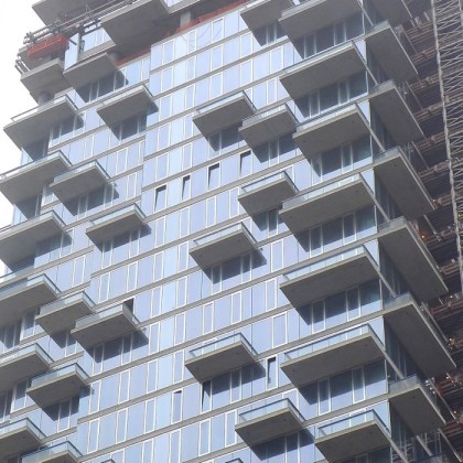
As John points out, the dramatic offsets of the Herzog & de Meuron–designed structure happen at the base and the top 11 floors. But was there no indication in the renderings that we’d end up with a building where the middle 85 percent is pretty unremarkable and far more appropriate for downtown Miami? Could we have focused so intensely on the top and bottom that we missed the middle entirely?
First, let’s look at the building as it stands now, seen from the north, east, and south, respectively.
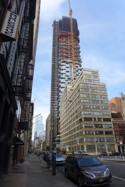
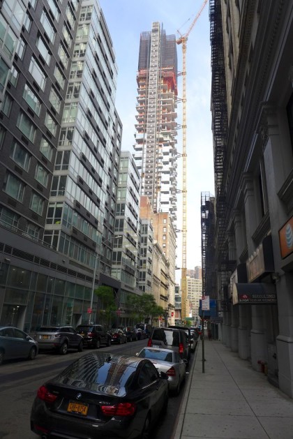
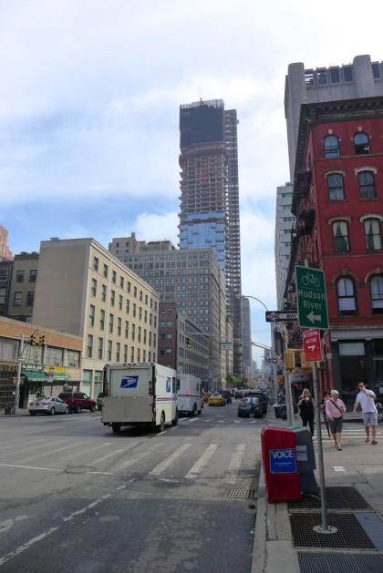 And some close-ups of the lower floors and the midsection.

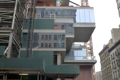
 Now let’s look at the renderings.
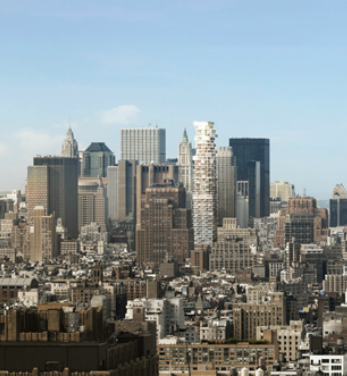
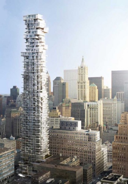
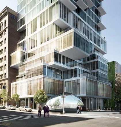
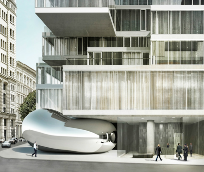
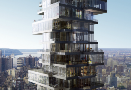
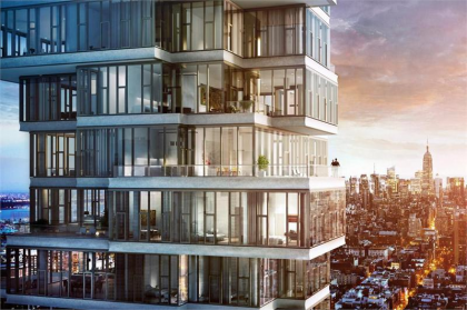
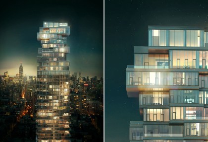
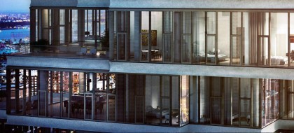
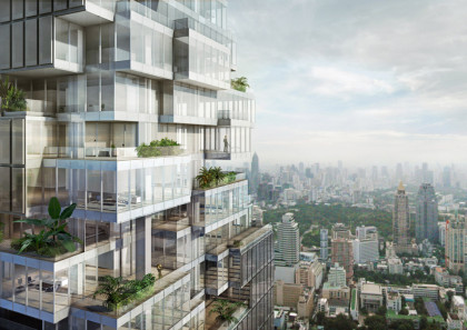
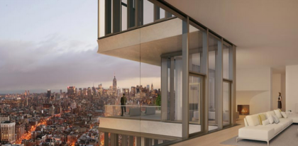
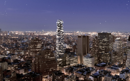
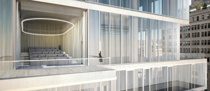 For me, the way the glass was rendered (as transparent when it’s actually reflective) is a significant culprit; in the renderings, the middle isn’t Jenga-y, but it has a certain style. Also, the gleaming white of the renderings is, in reality, the grim gray of concrete. That part of the building could still change, I suppose, but I doubt it. The renderings certainly emphasized the upper-floor terraces created by the offsets vs. the uninspired balconies throughout the rest of the building.
There’s a lesson here for us (don’t trust renderings) but also for developers: Don’t let your renderings make promises your building can’t deliver on.




There’s no more sunlight on Leonard street.
We now call this building “the 85% disappointing building” at home as it really does seem like a bait and switch. I quite prefer the plein air depiction of this building on view from the street at the New York Academy of Art to what we’re ultimately getting. #disappointed
I think you’re right that the type of glass has a lot to do with it. I bet at night it will look much cooler (that is if anyone actually uses it as a domicile and turns their lights on…)
I’m looking again….it is vaguely reminiscent of the Gehry building which narrows twice…….and then they stacked a Jenga tower on top of that.
There is absolutely NOTHING interesting about this building, except for the fact that it takes up air space way above other structures in the immediate vicinity and is another link in the chain of crap development choking NYC.
This building should never have been built. It is a middle finger to the neighborhood and the hoped for effectiveness of zoning laws. It only exists because the neighborhood was powerless to stop it.
Could not agree more. Makes me sick every time I look at it. One positive thing, I am now paying attention to what is going on in the neighborhood and will do my part to make sure this does not happen again.
All,
If you check the renderings carefully most of the “Jenga Fun” seems to happen above floor 50 – i.e. the top 12 or so floors where it really starts stacking around.
This is what creates the rather disproportionate illusion that the whole building is stacked
There is also more “Jenga Fun” in the bottom 5 floors but this is not really visible to most unless you are right outside the building.
The vast majority of floors in the center (which is what most of us are seeing now) are pretty non descript. I get the “balcony” analogy but in all fairness I feel Miami is a bit unkind – would like to give it a chance to finish before we tar and feather it’s hide out of town :)
Developers will do what they can to make the best use of existing zoning – so the failure of zoning to control what is obviously a disproportionately high building is more a failure of the city than the developer.
Wondering if we will ever see a picture of this building with even 25% of the lights on… Based on the pricing $trategy I gather most buyers will be foreign corps / investors and only “home” 1-2 times a year
For the record, I like a lot of the buildings in downtown Miami — but I like them *in* downtown Miami
This isn’t the only high rise in this part of town – there’s 33 Thomas (the AT&T long lines building) and 105 Duane street. That’s probably how they were able to build that high since there are 2 other high-rises a few blocks away.
HH, the main reason they were able to build so high was the air rights were transferred from the law school property on the block. This was a neat trick that’s was chronicled in detail (possibly here). instead of building up, the law school built down. i believe their new building has at least five basements where law students toil away in subterranean dungeons. They then transferred the unused air rights over to 56 Leonard.
For the record, I like the neo-brutal long lines building. It was built at a time when nobody gave a rat’s a** about downtown. I prefer its in your face dystopian design to the current era’s starchitecture.
I kept trying to figure out what the drastic difference was and you nailed it. The glass in the actual tower is so reflective compared to the renderings, it gives off that miami vibe.
With that said, the tower still has a way to go. If I recall correctly, the highest glassed portion of the tower in the pictures are around floor 29 or 30. That’s only half the height of the final building. Then it’s about 10 floors of exposed concrete.. and then the beginning of that black netting looking part, which starts at around floor 40.
Also wanted to add… that unfinished concrete is a huge disappointment for such an expensive building.
it will never work…the start of every great success story. stay tuned. let them finish the building before you attack it. It actually looks very much like the rendering (as much as any other building looks like it’s rendering). In my view Herzog & de Meuron are creating a masterpiece at 56L.
I’ll also wait for it to be completed before I judge it a masterpiece, but I’m leaning in that direction (and I live across from it, for the record).
But what struck me about your comment was the “It will never…” part. I enjoy reading those pronouncements and have collected them over the years. Some of my favorites are from people who suggested, when the iPad came out, that it would be a complete flop and the concept of the tablet would never, EVER catch on. I look at those now and then for a laugh. The air of authority some people assume for no ostensible reason can be quite comical.
It does look as though the main jenga-offsets happen in the top 20% or so, and it looks from recent progress as though it’s about 60% built, so I’ll hold my breath and hope for the best as they move up. Are they moving? It doesn’t seem like it at the moment.
I loved the original design and don’t have any problems with the height, myself. If it turns out as well as the design, then I personally think it will be terrific addition to the neighborhood — so much better than most of the residential banality that one sees.
I can’t wait to move into this terrible new building and sit on my terrible balcony and soak up the terrible views of this terrible city filled with terrible people. Rumor has it that Arne Svenson has acquired all of the air rights from his place to the Jenga building to avoid any potential obstruction of the view from his super deluxe zoom lens. Sorry, Arne, my blinds have already been ordered and, just in case, my daughter will be dressed in an age-appropriate burka at all times.
I find 30 Park Place even more disturbing than 56 Leonard. How on earth did it get the air rights to loom over the Woolworth building?
i think the north side has the most stuff going on renderings and reality
Jim Smithers is my hero! Count me in with the less vocal majority who are excited by this building. That said, I’m so over this thread. I’m going to go navigate around this site some more so I can read all the comments complaining about nail salons, Starbucks, Haus, and sidewalk cafe seating (except for Little Park, omg Little Park’s ourdoor seating is amazing).
I see this building from my window and while I agree it is nothing like what was promised, it does offset the ugly, windowless ATT building and old school rental just next to it. It brings some interesting new texture. Having said that, this building and the one on Park Place are out of character for Tribeca.
The height of this building is so inappropriate for the neighborhood. It could have been very avant-garde without having to be so grossly tall. There is appreciation for talented architects to bring about great projects but they loose their relevance when there is a lack of consideration for the neighborhood.Hopefully they are making an education donation or providing some consideration to the neighborhood as did 200 chambers who houses Manhattan Youth and has 3 floors of the elementary school in their building…
It’s height is as-of-right, so no.
As your Democratic District Leader, I see three sources of failure when I look at this building: the failure when creating the Tribeca Historic District to include our Avenues which was supposed to be left open for business use; our loss of New York Law School as a polling site (since I hire poll workers, it was one of my absolute favorite sites: well run and positioned.) NY Law shut the site down as the building went up. I will fight very hard to get it back once Jenga is opened.. And I totally agree the finished building disappoints; it looked much better when it was just concrete.
Quite a while back, we (at Tribeca Trust) were among the few complaining about this building. Even here, people were telling us that we’d love it, or that we ought to love it, and that it was bad form to complain loudly about it, because it was designed by those lackeys of real estate capital, De Meuron and Herzog, as if starchitect status meant quality and because we are supposed to “embrace change” and that we are supposed to “love skyscrapers”, all nonsensical arguments that trivialize the very idea of context.. The thing should never have been built. It is and always will be an insult the very concept of a historic district. It is also an ecological disaster with all that curtain wall and air conditioning (as are most buildings of that type, LEED status or no).
Blame for this building can go to very specific names that let this through.
And I hope very much it wakes up New Yorkers to the need to reform zoning, including the transfer of air rights. We at Tribeca Trust are working on specific proposals for Tribeca on this, but they should be applicable citywide to any low and medium rise neighborhood with historic character.
sign our petition here: http://tribecatrust.org/interact/me-too-protect-tribeca-a-neighborhoods-petition-to-city-government/
Exactly, thank you Lynn.
not to beat a dead horse, but I am in love with the building now that that the construction netting has come off. Do you still hate it?