New Building Report Card: The Reade Chambers
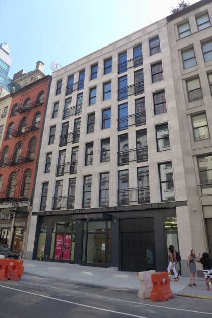 All the prominent new buildings on the verge of being finished got me to thinking we should review them—only the residents may care how the interiors turn out, but we all have to live with what’s visible from the street. First up: The Reade Chambers, as 71 Reade/87 Chambers is known (it goes through the block). The architect is Goldstein, Hill & West.
P.S. Don’t let the fact that you’re not an architecture expert stop you from weighing in, either.
The design in general
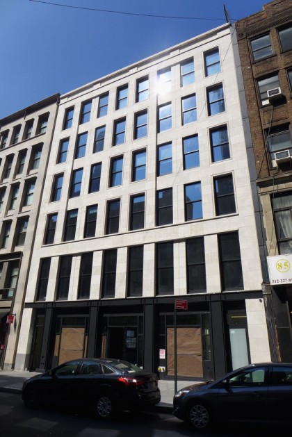
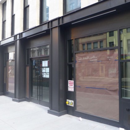
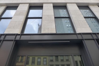
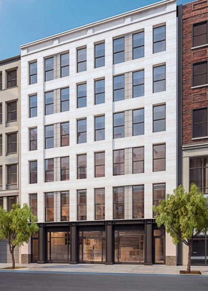
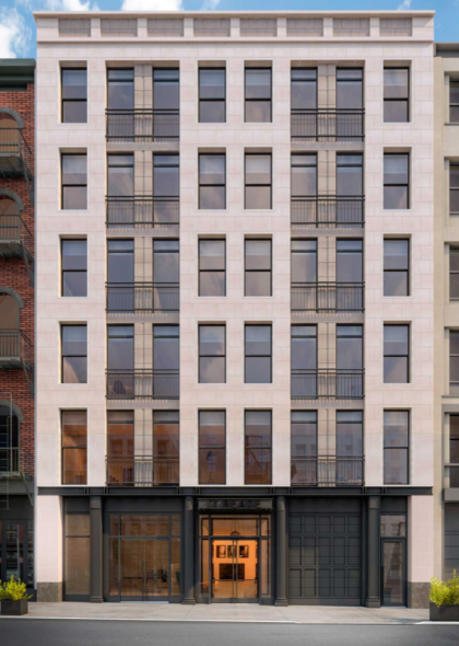
The Reade side (above, where the entrance is) is distinguished by a staggered fenestration and window guards that look like flattened fire ecsapes. The Chambers side (below), while more utilitarian, holds its own on a block that has some excellent buildings, even if they are in need of attention.
The ground floor
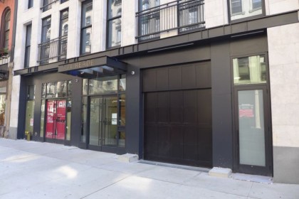
Even if there’s currently a glut of vacant storefronts, it’s a relief that the building has two—both Chambers and Reade are commercial streets that want more retail density. And the dark, industrial-ish metal storefronts pay historical homage (while referencing the storefronts across both Chambers and Reade). I don’t know what the pale stone-like material is, but it’s definitely not styrofoam. Greenery would really zhoosh up both sides—maybe once the tenants move in (an urgent-care facility is coming to the Chambers side).
Upon closer viewing…
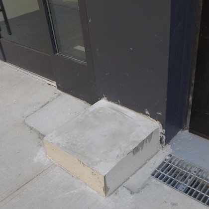
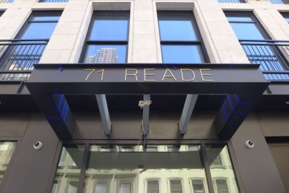
It’s hard to tell how complete the construction is, but generally the details appear to have been attended to —with the a notable exception of where the metal meets the stone on the Chambers side, the concrete pedestals (?) on Reade, and the Reade canopy.
Does it crap out at the top?
A huge relief here: Whatever penthouse/bulkhead/mechanical situation is happening on the roof, we don’t have to see it from the street.
Is the building an improvement?
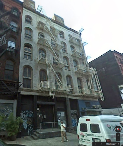
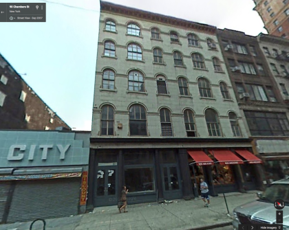
On one hand, sure. It’s a spiffy building that’s right at home in the Tribeca of 2015. On the other hand, its predecessor, which fell down in 2009, was arguably a better contextual fit and, well, prettier. The rounded windows more than make up fort the fire escapes. Then again, it’s not like the developer tore down the previous building. (Below: Google Maps images of the Reade and Chambers sides, respectively, in 2007.)
Rendering vs. reality
The only discrepancy I can see—besides the trees and planters—is the slightly darker vertical striping that’s in the renderings but not on the finished building. It’s too bad—it would have added some complexity.
Anything else?
Kudos for not actually calling it the Reade Chambers, which always sounded to me like a soap opera patriarch.
Pass or fail?
Pass.




I think it’s a great looking building
It is a classic Selldorf-designed building, with a rich-looking limestone facade that references but does not reproduce the historical buildings around. I think it it looks beautiful, elegant, and expensive. Selldorf happens to be the architect of all of my company’s offices, so I know that the finished inside will be high-end and restrained, just like the exterior. Bravo! A tasteful and sophisticated-looking new development in the neighborhood.
Goldstein Hill & West Architects Designed the building not Selldorf