New Building Report Card: 290 West
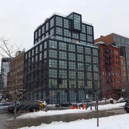 When it comes to new buildings, only the residents may care how the interiors turn out, but we all have to live with what’s visible from the street. So let’s take a look at 290 West, at the southeast corner of Canal Street. The developer is VE Equities; the architect is AA Studio. Please don’t let the fact that you’re not an architecture expert (either) stop you from weighing in.
The design in general
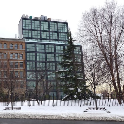
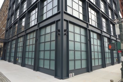
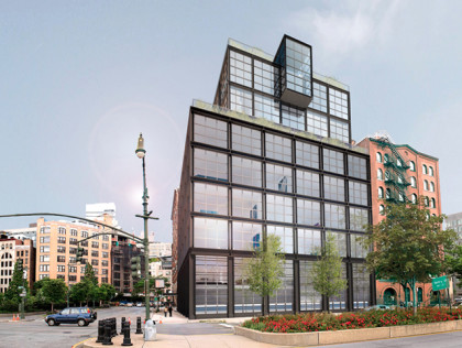
The massing is not unappealing, and the protruding penthouse on the west side is a welcome touch of personality in an otherwise incredibly stolid design; overall, the building bears more than a passing resemblance to AA Studio’s 250 Bowery. All those wide windows along two broad façades, referencing a warehouse aesthetic more common in other neighborhoods, no doubt give the owners great views. People on the street, however, don’t get nearly as much in return.
The ground floor
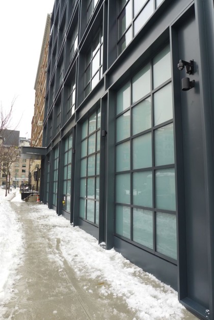
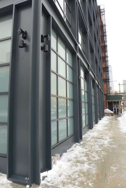
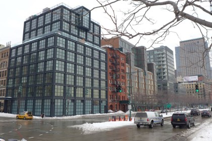
The generic industrialness that’s inoffensive enough as a whole fails the building at street level, where the opaque windows and total lack of ornamentation—unless security cameras count—call to mind infrastructure like the AT&T Long Lines Building or the Con Edison substation on W. Broadway. One can certainly understand that there might not (yet) be a huge demand for retail at the corner of Canal and West, but any building taking up a corner and sitting opposite a park—two parks!—should be less of a fortress than this. Perhaps plants will be put out come spring; then again, the landscaping budget might be reserved for the private courtyard.
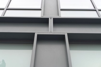
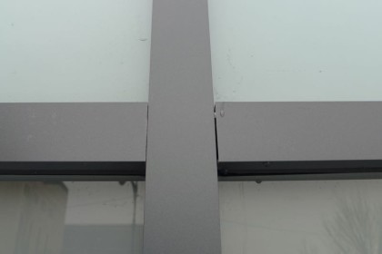
With nowhere else to go, the eye lands on the less than stellar detail work. And just as minimalism demands high-quality materials, industrial-inspired architecture must feel substantial. But when you tap the sides of 290 West, you’ll learn that those are faux beams, hollow as can be, sounding like aluminum affixed to something heftier.
That depends on where you’re standing. There’s a reason the renderings all showed the building from the west: The north side has a motley group of mechanicals right up against the edge of the roof, as if they’re waiting to jump.
 Is the building an improvement?
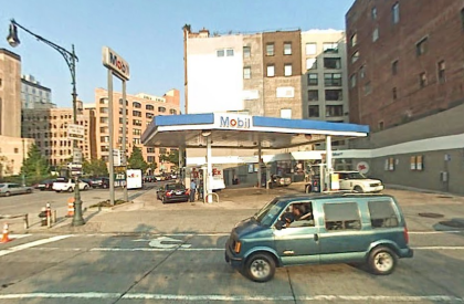
Over what it was? Sure. That corner was most recently the site of a gas station (below) that, handy as it was, had no architectural merit. But 290 West may be the best example of how any building that can be seen widely from a distance bears a burden: It should want to be noticed. 290 West benefits tremendously from its location, gaining immeasurable gravitas from the prominent spot, but it does little on its own to earn that gravitas.
Remarkably, there’s not much discrepancy.
One of the main complaints about Truffles Tribeca has always been how dark and foreboding it is—how out of character for northwest Tribeca. 290 West is much darker than Truffles; so is 471 Washington a block to the east. As the neighborhood has changed, 288 West, the 1860s brick building to the south, has become the outlier.
Going into this critique, I thought it would pass, but as you might have noticed, the more I think about the building, the more disappointing I find it. What might have squeaked by in a mid-block location comes off as a missed opportunity.
Previously:
••• The Reade Chambers (71 Reade/87 Chambers)




It’s OK.
But I am reminded of a terrific quote:
“Doctors can bury their mistakes. Architects can only plant ivy.”
Frank Lloyd Wright
I agree with you. It is a total letdown for such a prime location. Then again, the apartments seem to have sold. Sadly, until buyers demand better, who is there to hold a developer accountable for such a disappointing design and cheap exterior detailing?
Meanwhile, across the street, we have two of the (surprisingly) best additions to the neighborhood: the salt shed and sanitation garage.
It sucks.
Are these rentals? I just can’t imagine that these will sell to fast with all the traffic at that location. The traffic is terrible there. Getting a cab outside the entrance seems impossible and the walk to the subway is many blocks away. That being said I don’t mind the appearance for that location. Maybe there is a view of the new salt storage building?
Sales, all at $5M or above. Uber or lyft solve the taxi situation and i dont think these buyers will be taking the subway too often
Its a 5 minute walk to the 1 train…
Condos…and sold out, I believe.
Notice that they bulked up the mullions, which is a value engineering trick (thinner mullions = more expensive). It also looks like they may have added another floor in the base mass (rendering shows 5 vs 6 in reality). This added floor further cramps the mullions. The visible mechanicals are really bad too.
Developer crap.
That being said, 11 N Moore (same developer) is slightly more promising although, the different color / material on the facade is unnecessary and detracts from the clean design.
@Getch
I might not like how it looks, but this property is condo and is nearly sold out at astronomical prices.
I’ve noticed blatantly misleading renderings in several of the VE Equities projects. The glaring one you pointed out, where the rending has only 5 stories that reach up to the top of the red building next door but the actual building has 6 stories. This leads to each floor in the actual building looking much more cramped with lower ceilings than what they sold in the renderings.
They also had 11 n moore which originally was shown in renderings with huge single panel windows, when in reality the windows were more like the ones here in this building. Once they started putting the windows in at 11 n moore, they switched out the original single pane windowed renderings with new ones.
Very shady stuff to pull on people paying 5-10 million.
I call this architectural period Container Store.
Form follows disfunction.
Maybe this building will be featured in the new season of Million Dollar Listing NY?
One of the original listing agents was one of the brokers on MDL-NY. I think he was replaced at some poknt, though.
They still have the same broker that’s on MDL, Frederick
He actually bought at 290 West.
Oh yeah! I remember now. Fredrick did buy his unit at 290 West in the last season of MDL NY. Bldg was under construction so he and his hubby had to wear hard hats. Maybe we’ll see the interiors of the bldg once he moves in in the upcoming season.
On its own, it is not terribly different from the original rendering, so based on that metric alone, it gets a C. However, as you note and show with a photo, in the context of the neighborhood and the block specifically, the original brick building looks like an outlier. And that seems very wrong. Whenever I drive up the WSHWY, I’m always struck by the horribleness of Trumpland. At least these buildings are not as tall and generic as those, but this stretch certainly doesn’t represent the general character of the neighborhood, just as the wall of Trump buildings obscures the pretty prewar buildings on th UWS. Bummer.
The original building sandwiched in between the new development is actually really handsome. Unfortunately, they had lot line windows on both sides, which have been completely blocked. Those lofts, which used to be really nice, have been crushed in value.
That’s the risk you take when you buy a unit with lotline windows. They can be covered at any point, in spite of the assurances offered by the developer and real estate broker.
I looked at one of the lofts in that building in 2007/8. Price was surprisingly “reasonable” considering water views, sunsets etc. and so on… Then the penny dropped about the lotline windows. Lucky escape.
I still cannot fathom that anyone would WANT to live at that traffic-choked corner! Uber? Taxi?
Good luck GETTING there with the traffic mess!
doubtful that many people will actually “live” there. it’s all part of the grand international ponzi scheme.
Just want you to know, that “Bruce” is not me. I’m staying out of this one.
Location, location, location…Granted if you are living there you might not be schlepping to the 1 or ACE every morning at 7:30a but that walk along Canal is really AWFUL. Pile on all of the traffic and horn blowing when Canal is backed up onto West and you have crummy building. The metal facade that doesn’t line up is really telling too about the interiors. Although I’m not annoyed at the exterior I’d rather have a park/fountain/community garden.
Ehhh but still nicer than Truffles…
Truffles is one ugly building.
I agree that they need to do some planting a outside… Just finished the sidewalk a few months ago so perhaps in the spring.
The change in massing / floors and height is certainly a detractor as well.