In the News: 11 Hubert goes back to the drawing board
11 HUBERT REJECTED BY LANDMARKS
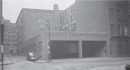
A classic lede from The Post: “This Tribeca building cost $20 million, but its owner apparently couldn’t buy good taste.” The story goes on to say that the Landmarks Commission blasted the new plans for 11 Hubert as being “fortress like” and “almost Darth Vader-ish” and “very mask like.” The building will go back to the drawing board. (The proposal did have this evocative photo from 1946.)
…………………………..
ONE SEAPORT NEARLY COMPLETE
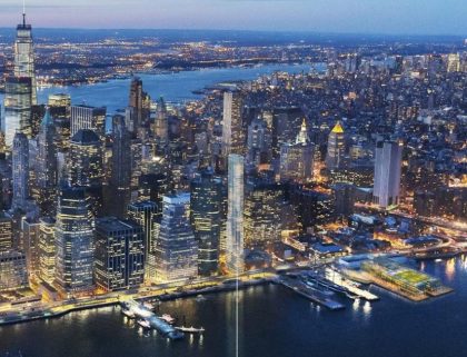
New York YIMBY has photos of One Seaport, or 161 Maiden Lane, which earlier this year was reportedly listing three inches. Construction has resumed and the glass curtain is nearly complete.
OBIT FOR DEAN & DELUCA
In what has to be an unusual feature for a fine art magazine, ARTnews has an obit for a grocery store – in this case, Dean & DeLuca. It starts with “It doesn’t seem real,” and has quotes from artist Betty Tompkins, dealer Jeffrey Deitch and the children of Donald Judd and Paula Cooper, who as little kids, would shop with little pieces of paper that served as credit. “What was beautiful about Dean & DeLuca was its invention,” Rainer Judd told ARTnews. “Artists at that time were creating the world anew, demanding of each other a certain originality of living and life and floorplan and art and dance and performance and music. Dean & DeLuca was in line with all of that.”
DAVID YURMAN’S FAVORITE THINGS
Barron’s has a list of jeweler David Yurman’s favorite things in his Tribeca loft, including his wife Sybil’s paintings, an Eames lounger and the rhododendrons on his terrace.



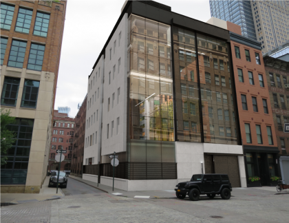
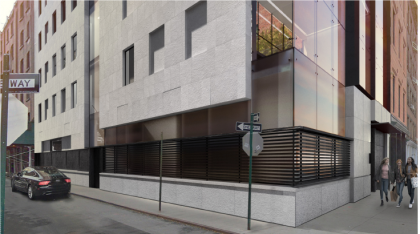


Is there a reason why the super wealthy people never want to create a single family that looks like it blends in with the rest of the neighborhood, rather than some random glass/concrete thing? That’s actually an honest question. Is it so that you’re more noticed? Or are buildings like this easier to build? Cheaper? Better layouts?
Has more to do with modern design and resale value. Blend in to what? Old buildings with prison size windows and low ceilings? No thank you.
LOL. I agree. I like the rendering. It offers a nice contrast.
I actually kind of like it. And the old garage is no great architectural loss. It would surely look out of place among the typical TriBeCa / SoHo Second Empire style neoclassical loft buildings, but among its neighbors, I actually like the effect.
The style is a rather extreme example of the design trend for a while now: minimalism, sometimes tending towards brutalism.
This area is a landmarked district. The fact that the proposed design “would surely look out of place” is thus a big problem by definition, no matter what the merits, in one’s opinion, of the specific proposal may be. At least LPC took a stand somewhere against an inappropriate new building proposal that doesn’t even reasonably claim to be inspired by the district in which it is to be located.
I think the rendering is quite attractive, too! As a resident of the street, I can attest that the current structure at Hubert and Collister is empty, in disrepair, without lights, and, as such, regularly draws groups of people drinking, spraying graffiti, and loudly carousing after dark. This new residence would GREATLY improve the appearance and safety of the street and the block!
Landmark has lost all respect for itself years ago! The cultural elite – ha! Some of the crap they have okayed is horrible. 11 Hubert is a great investment and is small enough to blend in no matter what they do.
Here we go again
https://newyorkyimby.com/2020/04/e-cobb-architects-updates-proposals-for-tribeca-mega-mansion-at-11-hubert-street.html