In the News: The sore thumb of Tribeca
THE SORE THUMB OF TRIBECA
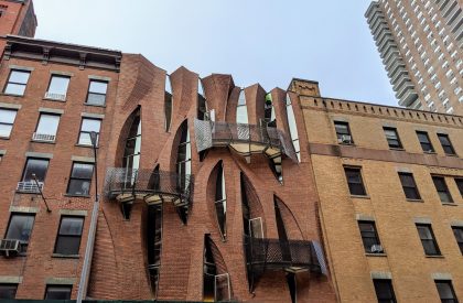
New York magazine‘s Intelligencer made a list of buildings that stick out like sore thumbs and the un-townhouse at 187 Franklin makes the list. “Curbed referred to this building, which was designed for a family of four by SystemArchitects, as ‘the Ed Hardy T-shirt of Tribeca townhouses.'” I’ve always wanted a tour…
AN EXPERT’S DINNER PARTY
This is a bit old, but putting it down for the record: Vogue covered a dinner party hosted by entertaining expert Athena Calderone who owns the furnishings company EyeSwoon (among other accomplishments) and who recently bought at 110 Hudson. There were a lot of beautiful people there. Calderone wrote two best-selling books in the food and design category: in 2017 she released the James Beard award-winning cookbook “Cook Beautiful” and quickly followed that with “Live Beautiful.” The latter has gone on to sell over 300k copies. She also has a podcast, “More Than One Thing.”
JAZZ AT THE LOFT, CIRCA 1967
The Times has an obit on Jay Clayton, a singer “whose six-decade career encompassed freewheeling improvisation, lyrical songs and poetry, and the prescient use of electronics.” in 1967, she and drummer Frank Clayton started a concert series, “Jazz at the Loft,” in their home on Lispenard, “in the neighborhood later called TriBeCa, presenting performances by the saxophonist Sam Rivers, the pianist Joanne Brackeen and others. They married in 1968.”
Anyone have any photos from those events??





I think that 187 Franklin Street is great. it’s an appropriate height and made of brick. what did you want? a faux historic townhouse? it’s much better than these giant coops with full floor windows that are popping up around tribeca. the biggest sore thumb in tribeca is the jenga tower.
Jenga tower is not in a historic district.
IMO a facade made to resemble flames does not complement a historic district in construction or fenestration, despite the contextual scale and materials.
speaking of flames, if the flame shaped white street synagogue were proposed today, it would be rejected as not fitting into the historic district in which it was built. today, it widely praised for it’s innovative design. there needs to be a balance between preservation and innovation, even within historic districts.
I’m with you in that I like 187; it’s unique while still contextual given the material used. I don’t want to live in a static city with faux historical façades just for the sake of it. I’m not saying it’s particularly attractive, but it’s got personality, that’s for sure.
Unlike you, however, I think 56 Leonard is pretty rad. I may be biased because Herzog & de Meuron may be my favorite firm working today, but again, it’s a unique building and how they play with concrete and floorplates is really interesting. It’s just unfortunate that Alexico VE’d it a bit because the operable window seams mar the curtain wall.
There’s a similar brownstone in East Harlem with that curbed design.
Oh man I was hoping to read a bit more about this house. I love this building (and I loved it way back when New York Mag published this article, which has a lot of great buildings in it.) Its contextual but also something nobody has seen before. Doesn’t look anything like flames, though—much more Gaudi than Hardy.
I live across the street and it’s a pleasure to view this Gaudi-like facade everyday…. Agree that I prefer to see this architectural element vs a floor-to-ceiling glass type building which are more of an eyesore in ANY district – they give nothing back and at times could appear soulless if not properly executed.
Oh let’s face it, 187 Franklin is hideous. And the alternative to it is not another ‘faux historical’ facade but an architecture you might actually like living in (those pointy windows? Please.) Architects now consider themselves sculptors rather than designers. The baleful influence of Mr. Gehry and Ms. Hadid and digital technology. Another neighborhood horror, by the way, is 325 West Broadway, across the street from the SoHo Grand hotel. Yuk! There should be an award for the Ugliest Architecture of the Year.
The issue here, according to “New Urbanist”and current urban thinking, is that a modest use, such as a single family residence should not be so notably inconsistent with it’s surrounding environment. Society has always enjoyed the introduction of non-conforming edifices, but these should also reflect non-conforming uses. For example important religious, governmental and other monumental uses are always appropriate venues for interesting and non conforming appearance- The synagogue on White Street (designed by one of my architecture professors at Pratt) was in my view appropriately formed as an homage to the Torah- there is a place for this kind of thinking and presentation- 187 is however an exercise in self indulgence, and is thus a deficiency for our urban environment