Landmarks puts off decision on new 109 West Broadway sign
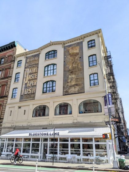
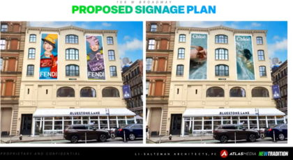
The Landmarks Preservation Commission has put off a vote on the new painted signs for the building at the corner of West Broadway and Reade — a proposal that would paint over the existing ads that have been there since the 1940s. No date had been scheduled for the application to come back in front of the commission as of my note to them Friday.
In the meantime, you can send comments to testimony@lpc.nyc.gov. (I doubt there will be another live hearing.) And you can watch the presentation from Landmarks staff here on YouTube. Here’s what I learned, which was more than the applicant presented at the CB1 meeting earlier in May:
- The sign is 11 feet wide by 24 feet tall and covers 27 percent of the facade.
- The current mural was installed in the Cold War Era, the 1940s or 1950s, when lettering like that with a drop shadow became popular.
- The ad was sponsored by the American Coatings Association, which still exists and still functions as a paint lobby. (www.paint.org!)
- At the time, the association was running a civil defense campaign that claimed that painting your home would protect it from nuclear annihilation — not kidding.
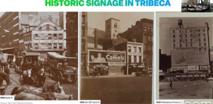
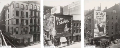
- Reade and West Broadway was a popular location for signs
- There was also a pattern of painted signs on corner buildings on the West Broadway façades – multi-story monumental signs with graphics and text
I think the commissioners could have an interesting debate when it comes time to vote. After all, while we all love the sign that is there now, it is after all just an ad — it just looks quaint and charming to us because it’s three generations old. And while the last thing I want to see on the side of that cute building is an ad for Fendi — or anyone really — I did wonder: will Fendi’s models look quaint and charming in 80 years? AND, there is a historic tradition of painted signs — the neighborhood was truly covered with them. (See below.) So while we can justify the existing ad using historic references, there is no way we want to go back to that era and have painted signs on every building as was the case when this ad first appeared.
The commissioners did indicate their initial thoughts, none of which were fully supportive of the application though some realized this was a nuanced issue. The opinion that folks around here will appreciate the most came from Frederick Bland, a managing partner of Beyer Blinder Belle Architects, who said the proposal was “a disgrace and completely annihilates the whole idea of what this building is about or even the district.”
“I look at the building and say, is the sign destroying my ability to enjoy the architecture of the building, which I believe is supreme?” he said, “and if it does, I oppose it. I look at this and I think, where’s the building? Some times [painted signs] are appropriate and I have often voted for them, but this is the most extreme and I couldn’t support it.”
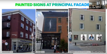
The commission has supported painted ads in the past — see the image below. But this one is non-accessory, meaning it does not advertise a business in the building, which is an important distinction for Landmarks. Many other approved signs are not on the principal facades, but the secondary facades.
But there are also rules that allow the ad to remain in place. The existing sign was determined by the Department of Buildings to be for an entity that still exists, so it meets the definition of a legal, non-conforming advertising sign. Once that determination is made, under zoning rules there is a right to “change copy.” But then there’s another angle: when the signs were put up, the zoning allowed for exactly what is there now. The current zoning does not.
And then there’s the idea that the landlord can paint over it at any time — the sign itself is not protected. “Ghost signs are not significant historic features and the owner is not obligated to keep then,” the Landmarks chair noted.
Nearly everyone, even if they liked the idea of the painted signs, seemed to think these were ugly. And it seemed to come down to vibrancy. “I don’t think this is appropriate — it’s too dramatic and attention grabbing,” said commissioner Diana Chapin.
And the one person who called in to testify noted that what we all find so jarring is the photo-realism. Any new mural, said Christina Britton Conroy from the Victorian Society, “should follow the rules of the time,” meaning the 1940s. Then they were largely text and had illustrations that were drawings — they did not mimic photographs. “We do not support photo-realistic signs on this building.”
More TK.





My letter to them:
Dear Landmarks Preservation Committee,
I am writing in regards to the 109 West Broadway Sign. I own a building in the area and have worked with LPC to preserve its many historic qualities. So I would hope that other buildings preserve them as diligently as we have.
More importantly, I am one of many of the original artist pioneers of Tribeca. We saw, and still see, the aesthetic value of the neighborhood before others were able to do so.
Emblematic of this aesthetic is this particular sign (more so than any others!) with a hand holding a paintbrush! While its initial purpose was not so – it became a visual anthem of what the area meant to all of us emigrating to this part of NYC to become artists. We loved it.
We still love it and believe in its preservation.
I hope you will vote to keep this sign and ban ones that can go anywhere else, in any other neighborhood.
I fully agree with Heidi and Betty!
Ads are made by writers and artists and so can, very rarely, grow beyond sales tool. This one has become the welcoming gateway to a neighborhood. We shouldn’t just protect it, we should be grateful for it and cherish it.
I love the paint sign and yes it should remain.
That said, can there be a compromise with sometimes temporary (paid) ads that cover them in vinyl and do not damage the originals?
trying to be realistic
would be a shame to loss them permanently
Agree with Betty. Please preserve the character and history or our neighborhood. I have loved that building and that sign for 25 years. It is very particular and truly great. Not just a sign at all.
This sign greatly adds to the charm of the neighborhood, and to Bogardus Square in particular. This is arguably the southern entry to Tribeca. Hope we can bombard testimony@lpc.nyc.gov with reason.