
Left rectangle ads redesigned

Robert Ripps book
History of Tribeca Buildings
How the Warren Street Hotel got to be teal
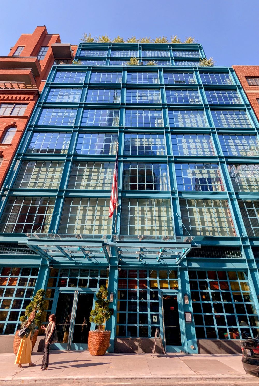
C. caught a case study on the 3D rendering of the Warren Street Hotel — done by the architecture visualization firm AIMIR — and it’s an interesting look (to me, at least) at how the plan for the building evolved to be the crazy colors it is now. (The only color story I want to know more is how the FDR Drive got to be lavender.) Turns out this scheme is mild!
From 2019 to 2021, the 3D team worked with architects Stonehill Taylor to come up with the color palette, and while I have to say the yellow still knocks me out (not in a good way) as I walk west on Warren, I think we dodged a bullet with the other color proposals.
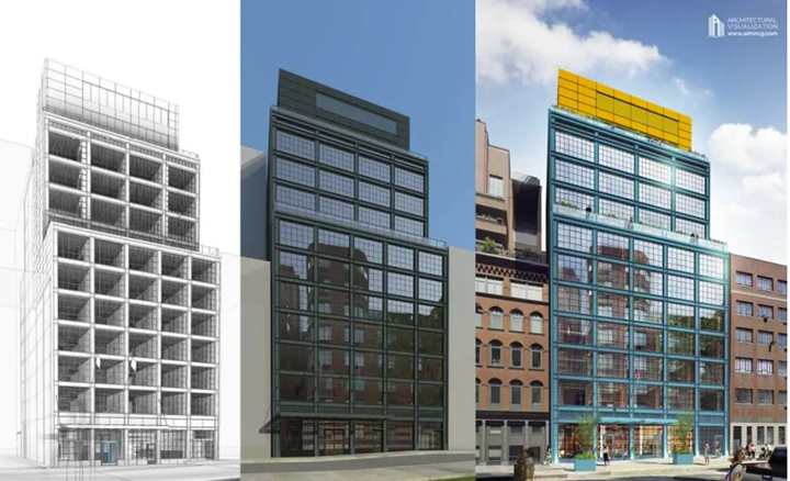
AIMIR
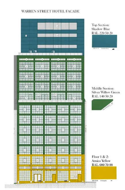
The building was originally rendered in Blackforest Green, an almost-black, very handsome color — a winner as far as I am concerned. But then in 2021, the plan for the steel structure changed from Blackforest Green to Shadow Blue and Silver Willow Green with Arnica Yellow on floors one and two. Yipes! Then there was a render for the whole facade to be yellow with the Shadow Blue for the mechanicals on the roof. (Yipes again.)
But they settled on the Shadow Blue for the facade, and the Arnica Yellow for the mechanicals on the roof. Phew.
AIMIR
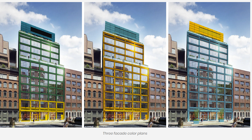
AIMIR
13 Comments
Comment:
Medium rectangle #1 (top)

Right column rectangle ads


Mega rectangle

Restaurant guide icon


Bullet dodged indeed! Now I will be thankful that yellow is only visible from far down on Warren and not the entire facade.
I like the current color, but I think the black would be preferred.
I don’t love the color palette, but I’m not too bothered; it’s one of those things that could be relatively easily changed with a fresh coat of paint.
I actually kinda like the blue/green/yellow facade mock-up option. I’m happy with how it turned out, it’s light and fun!
I’m with you the original palette is great and would have looked terrific. This is not Miami and just looks odd, like it’s trying to hard and out of place.
I guess I am in the minority — I love the facade colors. I think it’s bold and fun, and very on-brand for Farmdale group properties.
For a while, I thought it was a preschool. But it’s growing on me. Inside is terrific.
I like the blue and yellow. It brightens up the block.
As I live directly across the street, I can confirm the teal has grown on me (although the green/black would have been better!). The yellow is still awful. I want to know when they decide to do something focused on the neighborhood. Private Tribeca dinner or rooftop?
Agree it’s on brand. It stands out, makes you wonder what’s going on in there. Inside, the decor is just as playful and interesting. Go Bold or Go Home!
Americans live in fear of color, especially in their architecture. Europeans, thank goodness, aren’t quite so terrified. I’m pleased this building brings a bit of brightness and playfulness to the neighborhood – I wish it weren’t the only one to take the plunge! Don’t be afraid – it won’t hurt you! I might just brighten your day.
I would never live with the chosen colors in my own home, but I am a fan of them on this particular building nevertheless.
The blackforest green looks so sleek and modern. The teal isn’t terrible but the yellow is just hideous, especially against the skyline.