Red Terra Cotta Facade Proposed for Canal Street
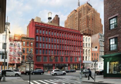
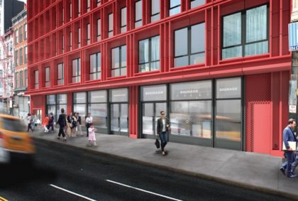
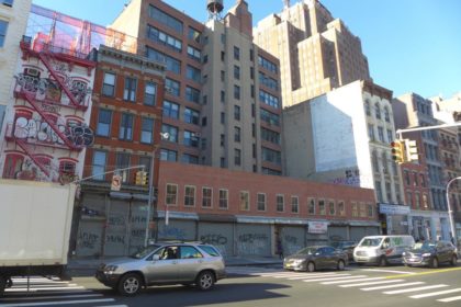 In June, the Landmarks Preservation Commission sent developer Trans World Equities and architect Paul A. Castrucci back to the drawing board for another go at 312-322 Canal, where they’d like to replace the existing two-story commercial building with a nine-story residential one. YIMBY got its hands on the new renderings, below: “Castrucci has proposed a brick-red terra cotta facade which will frame inset floor-to-ceiling windows on each floor. The architecture firm describes the project as entering into ‘a critical dialogue with its surrounding context. The façade’s repetition recalls some of the underlying structural rhythms of the historical district’s notable palazzo-style, cast-iron facades, but avoids replicating or reproducing their forms, details or material choices.'”
If the terra cotta comes off anything like it does at 10 Bond by Selldorf Architects, I’m on board. The red does give one pause—although I suppose you could argue that it references Pearl Paint…. The LPC will discuss it tomorrow morning.
UPDATE 1/23: The new design for 312-322 Canal was approved by the Landmarks Preservation Commission, says Curbed, but apparently it’s seven stories, not nine, as reported. And the LPC “still had a few pointers. The Commissioners agreed that the architect should either do away with the current glazing on the building’s facade or try to pick a more muted version of the color they’re presently going with [rendering below]. They also asked the architect to reduce the ceiling height on the building’s penthouse to make it less visible from street level. The architect will now work with the Commission’s staff to rectify those concerns as this project moves forward.”





I welcome some color – no reason buildings have to all be dull grey or brown or just white.
Agreed. Why not?
This building is an insult to Canal Street. One continuous facade running 100 feet that replaces what had been 5 discrete buildings is totally out of context and contrary to one of only two blocks of Canal Street that has landmarks protection on both sides
Agreed. Just look at it in relation to the surrounding buildings! This is one of the VERY FEW designated special “Tribeca historic district” blocks and this ugly, oversized structure is going to singlehandedly ruin the aesthetic in a tiny area created to protect it from this kind of development. It’s a shame Landmarks is letting this go up, especially considering the all the trouble this same developer has brought to the neighborhood.