A Closer Look at 30 Warren
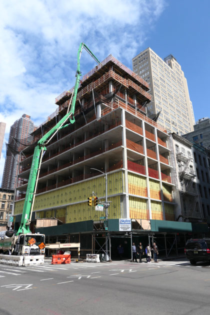 I don’t tend to visit condominium sales offices because they leave me feeling dissatisfied with my current living situation. The new one for 30 Warren was no exception: The floor plans are appealing, the model rooms cushy. I could live in the bathroom alone. I said yes to the visit because 30 Warren, designed by Post-Office Architectes for Cape Advisors, interests me more than most new buildings. It’s trying to stand out rather than simply fit in.
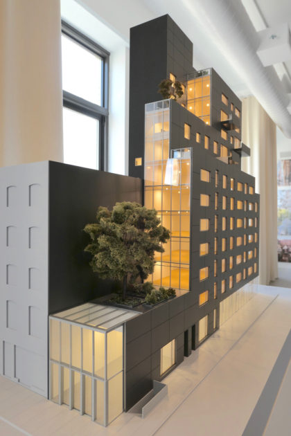
The building extends along the full block of Church between Chambers and Warren, with the apartments stacked away from Chambers. There’s an interplay between the solidness of the concrete facade and three main expanses of glass—the skylight storefront on Chambers, the curtain wall extending above it, and the second retail space at Church and Warren. Windows are various shapes and sizes, irregular as you look from left to right, but identical from top to bottom.
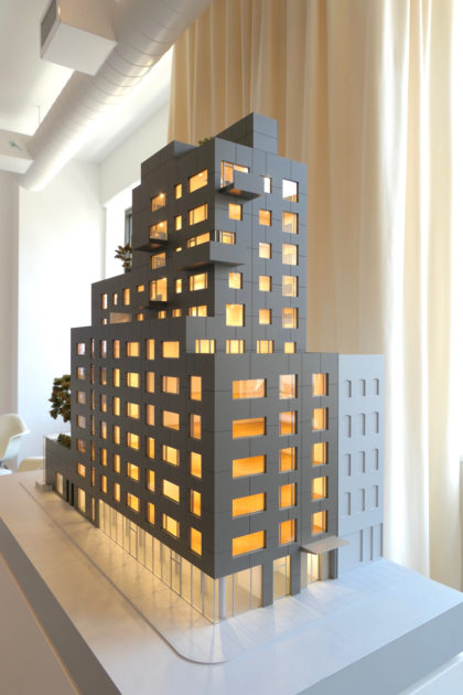
 When the design was announced, I didn’t think much about the concrete, because so much depends on the execution. It came come off cheap (see 56 Leonard), and it can turn lustrous (see the Spring Street Salt Shed). The 30 Warren sales office has installed a wall of the facade for inspection. The concrete panels, with spacing between, will have diagonal ridges—or ribbing, if you’re so inclined. I like the idea of running a hand across it as I walk down the street. Look closely and you can see constellations of air bubbles.
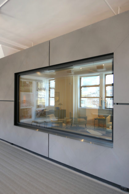
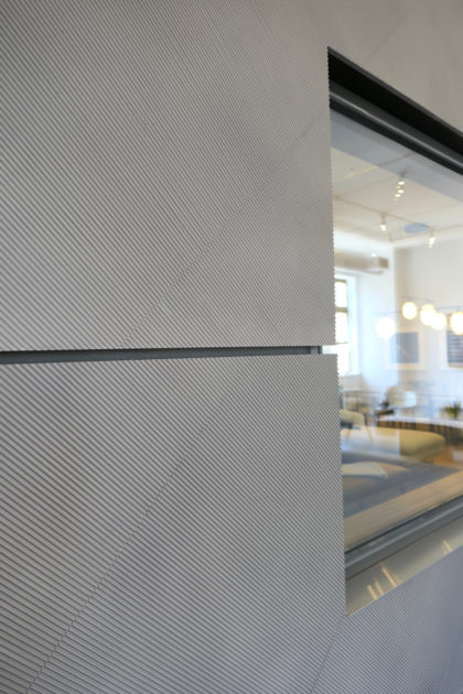
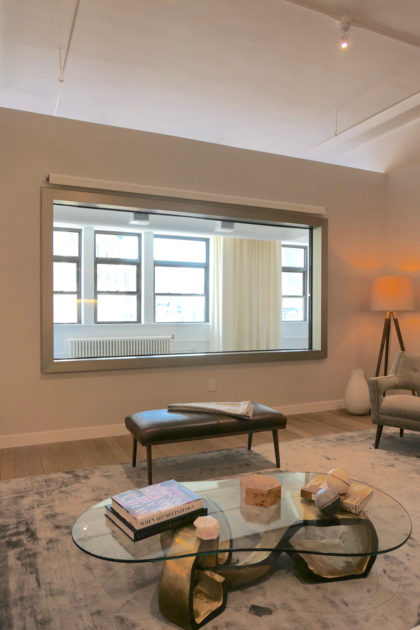
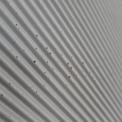 The window pictured above (and below) is one inch shy of 12 feet wide. I don’t think any other building around here has gone for such an expansive effect.
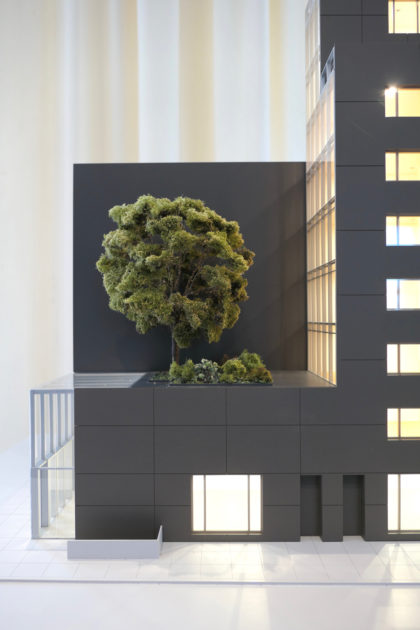
 For all of that, the best part of the building might be the trees—and, in particular, the 35-foot-tall Kentucky coffeetree that will be planted on the Chambers side. (The others will be a 15-foot-tall Katsura and a 12-foot-tall river birch.) Think how great it would be to sit on a swing hanging from its branches….





Did they explain to you how the 2nd and 3rd floor will have the windows shown in the mock-up if they have been completely walled off with metal studs and yellow insulation panels?
It’s a mystery that I suspect will solve itself in time.
Almost 100% sure they’re temporary walls. Probably haven’t got the facade yet but want to start working on interior
This concrete monolith will look horrible. Brick, limestone, or all glass would have been far superior.