Goodbye Glass, Hello Bricks
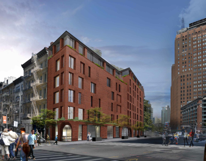
 Goodbye glass, hello bricks. The Tribeca Trib tweeted—from the Landmarks Preservation Commission hearing, I think—that that developer DDG presented a new version of 100 Franklin and the LPC kvelled over it. But the neighbors still oppose it. (I’ll link to the Trib’s article when it goes up.) Update: Looks like Curbed got there first.
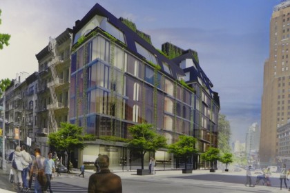
As a counterpoint, here’s the previous design.
Update: Comments have been turned off due to spam. To have them turned back on, email tribecacitizen@gmail.com.


Glass looks better. The brick is reminiscent of the mistake built at 66 Franklin.
Much more appropriate for the neighborhood. The attention to detail will be impeccable, looking forward to seeing finished product
Now it looks like a narrow Prison — still disgusted by the “greed” that has taken over Tribeca —
Why are these two buildings connected? The thin connector looks very strange. I doubt it is an aesthetic issue? Is DDG trying to pull a fast one with a variance to the building code? Hmmm…..
Sad. I am all for protecting architecturally significant buildings, but it is always depressing when good design is trumped by provincial thinking and an irrational exuberance to build buildings that are supposed to reference the past. The first design was so much better and completely in context with how the neighborhood is evolving. So much for progress!
While brick is a step forward, the window pattern should be symmetrical and follow a clear story-by-story pattern. The massing is still a bit too big and dependent on the granting of a variance and the claiming property rights to the sidewalk and rear yards. Improvement could also be found by connecting the two sites to make one building instead of two and scaling back the penthouses and mechanicals. And silly that they want to use Danish “artisanal” brick (no brick to be found on the Eastern seaboard?). This is an effort to be “abstractly contextual” and does not succeed all that well. Most of the “abstractly contextual” infill buildings in Tribeca are pretty bad. This just adds to the list.
I am sorry that Mr. Burns thinks that educated, highly informed views on infill sites within historic districts are “provincial.” So many issues to untangle in such a charge. The most important is: what is good design anyway? How does one identify it as good? And what should we do when 90% of new construction is awful? Ada Louise Huxtable once described “most of the city’s current construction” as “cheap, thin, tinny, thoughtless, dull, facile, shoddy, and routine.” (NY Times, Dec. 22, 1963). I agree with her years later. Maybe 9% is just okay, but more problematic, only 1% of new construction might rise to the level of art. Even great architects don’t design masterpieces every day. So what to do in a historic district when you have no or few guidelines about new construction? Odds are, you are not going to get anything very good. The routinely awful will just bring down the larger public good that is the historic district. What then?
To Tribecans interested in the problem, there is a very good book out, “The Future of the Past” by Steven Semes. The book gets the debate out of the level of personal opinion about design onto a more principle-based discussion.
Yaaaaaawn. Another very good book out is, “Those Darn Squirrels” by Adam Rubin.