A Deeper Look at the Harley-Davidson Flagship
A big thanks to Sean Karns of JPDA, the architect of the Harley-Davidson showroom coming to 378 Broadway (southeast corner of White, where the David Z. shoe store was), who sent over renderings that give a much better sense of how the place will look. “The Landmarks preservation Commission has required us to eliminate the metal cladding that is shown in these renderings and keep the brick as is in its place,” he said. “We are also having to bring back a small pier at the corner.” In my opinion, this may be a prime example of how misguided the LPC can be; that building is no one’s idea of distinguished…. Anyway, could the Harley showroom be the start of a retail gentrification on Broadway below Canal? (BroBeCa!)



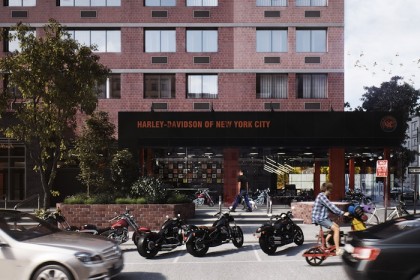
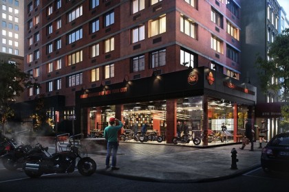
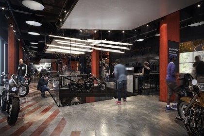
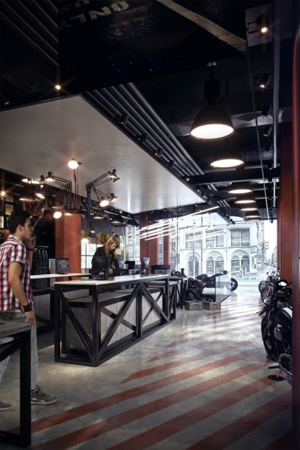
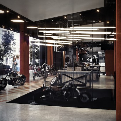
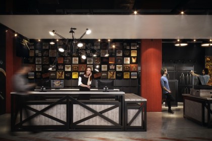
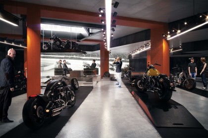
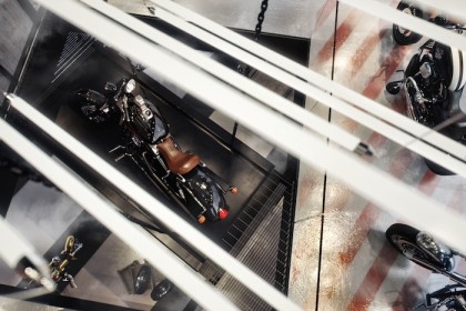


This is certainly ” the start of a retail gentrification on Broadway below Canal”
The accelerating pace of residential construction in the area, both the works in progress and the ones on the drawing boards will demand retail that matches the new demographics of the area. In addition, this area is well-served by transportation and it is just below Soho, where for all but the toniest retailers, rents are beyond reach.
This is a real mess. Everyone failed Tribeca here. There was an opportunity to have a showroom that blended in better with the existing streetscape (rather than egregiously insult it with bad architecture) and to fix that miserably neglected POPS (public-private plaza) so that residents of the area would have an actual “amenity”. Now, this offensive showroom will effectively steal the plaza from the public and insult the historic district all around it. Everyone lacked imagination here: LPC, the architect, and the building owner. I note that the Chinese Baptist Church is around the corner from this site. Tribeca Trust tried to get the parties together: the owner, the Harley foundation, and even asked Chin’s office to help. Ah well. Can’t wait now for the opening parties.
We were really disappointed when our client couldn’t be persuaded to create a more historically appropriate tannery and rendering plant.
The building’s “plaza”, which is not under the retail space owner’s jurisdiction and was mandated by the city in return for additional development air rights in the 1980’s, would have made a perfect place to store carcasses in advance of processing.
Unfortunately, due to the recent invention of the “auto-car”, it seems that New York no longer has a herd of 200,000 horses, each depositing 24+ lbs of manure and collectively leaving behind an estimated 40 rotting carcasses per day on the neighborhood streets.
It’s such a shame that our client will be forced to deprive the already underprivileged local residents of the ability to bask in the historic, aesthetic, and cultural heritage of such a proud part of their neighborhood’s past.
Instead, by performing an interior renovation of an existing retail space, the project will be programmatically limited to integrating contextually with the lower Broadway retail corridor, which has come into existence in its current form only recently – since the early 1850’s.
The previous occupants ran a delightful discount shoe store and warehousing operation in the ground floor spaces of the building. The deli-style storefront mullions, blacked-out glazing, sticky-taped signage, supermarket-style lighting and complete lack of interior decor “kept it real” and provided nothing if not a “classy” neighborhood amenity.
While it may seem obvious to even the most unimaginative amongst us that the renovation of an existing interior space can completely remediate the exterior defects of one of the most hideous edifices in New York City, the Landmarks Commission short-sightedly did not require the renovation design to address the building’s siting, zoning, massing, structural system, exterior finishes, fenestration, exterior lighting, landscaping, residential awning, parking regulations or visibility to out of state tourists. What an insult!
Offensive is too kind a term to describe the so-called “Community Board” and their unanimous, enthusiastic approval of the renovation design, in which some non-structural brick infill is removed to allow visibility into the retail space from the street (horrors!). Can the Community Board people really be expected to know what’s best for their own neighborhood? Are they simply pawns of the so-called “progressive” forces in society who would drag us all unwittingly into the 20th (oops, 21st) century?
The Chinese Baptist Church, a street-level storefront located three blocks away on Walker Street, will hopefully put out the call to assemble their congregation into a holy bucket brigade, to cleanse and re-sanctify this sacred ground, and to exorcise the sinful ungodly riders and their demon-spawn machines.
A more salient question might be “does this neighborhood really need a motorcycle dealership here?”
This building was built in 1990. Why is it Landmarked to begin with? I think the glass facade looks great.
Zoinks! That was a snarksplosion!!
An even more salient question might be – Are you with Lynn Ellsworth or against her? I, for one, am with her and her narrowly-focused horse manure-laden vision of a proper Ellsworthian-Tribeca. Cobblestone it all!!!
Thank you, Tanenbaum! Finally, someone brave enough to speak up for a more Ellsworthian-Tanebaumian Dictated Neighborhood Store Development/Investment Decision Board. If people or businesses want to invest in and profit from this “neighborhood” they must first get a “2-thumbs-up” from the non-elected, but oh-so admired and trusted, Ellsworth & Tanebaum brain trust. We are lucky to have them. I wish they could be landmarked.
Eric,
The Smithers troll here is why you cannot expect on your website to have any kind of rational discussion or genuine exchange of views within the comment part of your blog. It is also why for the past year I have rarely ever posted a remark. Smithers creepily haunts your site with the most extraordinary personal attacks an anyone who annoys him or with whom he disagrees. His rhetoric is virulent, ad-hominen and not funny. Jordan Parnass is at least funny, but Smithers is creepy.
Creepy in a good way?
@ Jordan Parnass AIA
That post belongs in The Louvre.
The Harley Shop design looks fantastic. I live right across the street and can’t wait for it. Significant improvement over the slave labor shoe stores or Halloween costume pop-ups or whatever other turd factories are consistent with that sad stretch. I couldn’t feel less sorry that the LPC and TT are upset that their heavy-handed approach failed and this business succeeded. Those brunch set bosses have run too many good ideas out of this hood.
Welcome to the neighborhood.
Harleys revving engines. ‘nuf said.
Ah, the charm of the angry AIA rallying the bitter and discontented. The humor in the post for me comes from making fun of the way architects talk, not from any actual content. But If I am to glean any meaning from your post I conclude that you think:
– the POPS plaza there is so hopeless that it is only fit for horse carcasses, so no point in considering it in a design; in your view, the POPS element of the situation is just irrelevant.
– the site is such a disaster that no act of imagination or creativity could find a better way to integrate the street level facade into the historic district of which it is part by accident or design or sheer proximity, nor should one even try, just a waste of time, besides it is not your job and wasn’t in your scope of work that the client gave you.
– residents of Tribeca who are not underprivileged should not have any rights to enjoy cultural or historical or open-space assets, nor should they ever make any attempt to do so, nor should they dare express their opinion on design issues (except to blandly applaud whatever is happening. Yes, just, be good peasants and let the architect do the job and be silent, grateful, and happy at what the architect has done. Yes, we who are not of the design priesthood should just shut up.
-it wasn’t your job to deal with the nightmare of a site, it was only to make Harley a display case, as overlit as possible so that it could be seen for miles around and as in keeping with your particular black/white idea of the Harley aesthetic.
-not sure what you are saying about the community boards. That the CB committee let it through? So? We should all shut up?
-being against your design somehow means to be against Harley (totally absurd and a misreading of the evidence)
-asking the Landmarks Commission- charged by NY law to be the regulatory body for historic districts – to step up to a fairly rare and new situation for them and manage a site-specific urban design issue when it arises on their watch is somehow too much to ask a committee of architects and is a silly expectation
-the church is too far away to be relevant (three blocks? huh? the church is at 84 Walker) and because they are a church you assume they must be against Harley rather than a design that makes transformation of the POPS even more unlikely and ever remoter a possibility.
I also conclude from the behavior of Smithers and his like that there is a crowd of angry thugs out there in cyberspace, lurking especially here on Tribeca Citizen, ready to do the dirty work of modernist ideologues and the real estate industry and be the avant-guarde by verbally spewing virulence on anyone they disagree with in the hope of quashing discussion and opinion, making all kinds of ridiculous assumptions in the doing (brunch? not liking motorcycles? )
Oh, Lynn, don’t be so bitter and discontent, your posts are very humorous too with all of your ridiculously charming conclusions & assumptions and virulence spewing. Welcome to the crowd of lurking & stalking angry thugs & trolls out here in cyberspace! What took you so long? Were you at brunch?
@Ellsworth – why did you go so gentle into that good night? I would have thought you would have at least defended your defenseless hypocrisy and doube-standardly posts? The greater-Tribeca readership awaits your guidance and edicts.
I am sure (or not sure) Eric or EriK misses your 2-cents (or nonsense) in all things Tribeca…or should I say, Ellsworthian-Tribeca?
Yeah, Lynn, why did you give up so easily on cobblestoning the Duane Street Park area? I agree that it is really the most pressing issue and concern for Lower Manhattan. Why are we wasting money on floodlights for the WTC anniversary when we could be cobblestoning Duane Park and Staple Street?
I still don’t understand why there is any conflict here. The building was built in 1990 – so it is not historic and does not need saving. Over the past 10 years the store has been vacant with a one year stint of a failing pop-up shoe store. And nobody uses that plaza.
In fact, there are several vacant stores in this area, and bringing a nice updated store that is not just a pop-up Halloween or pop-up shoe store is great for the area. Who knows, in a few years, this stretch of Broadway will have really nice shops.
Lastly, I think what the architect did is great. It looks like a really nice store.