Numerophilia!
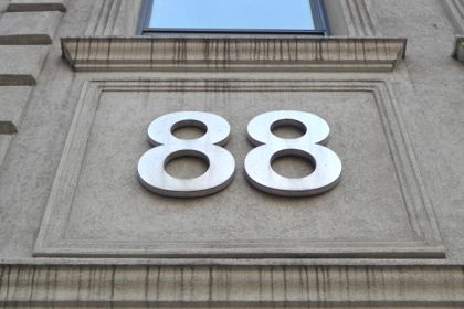
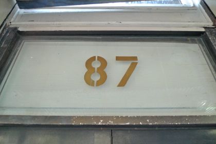
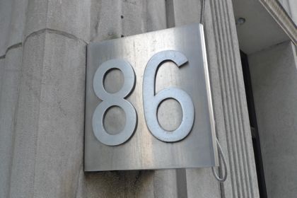
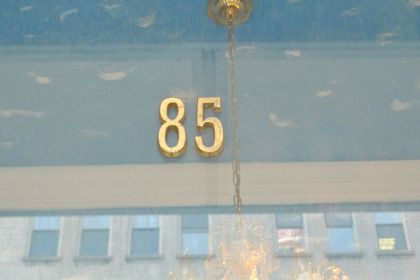
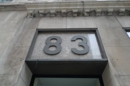
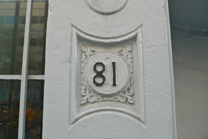
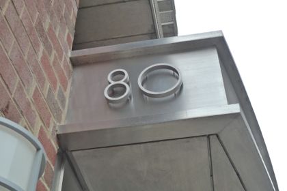
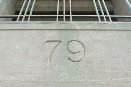
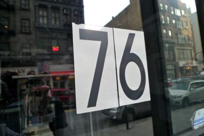
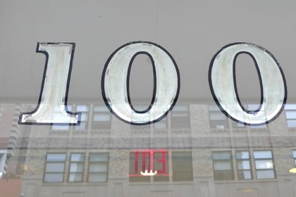 As I may have mentioned (ad nauseum?), I spend a lot of time walking around Tribeca, often with my dog, looking at the neighborhood. My goal is to see if anything changes—is that a flyer in the window across the street?—but one day, I got the idea to take photos of all of the interesting street numbers. I ignored the impulse, because I knew it would be a mammoth undertaking, until I couldn’t any longer. So many numbers—from the ones painted in gold to the the slapdash ones to stylish new ones—were so cool! During the months-long project, I received a lot of funny looks—and I was even chased down Murray Street by an angry resident who thought I was taking photos through his window—but I think it was worth it.
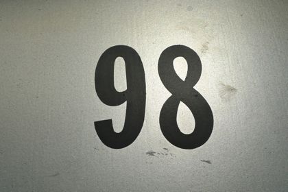
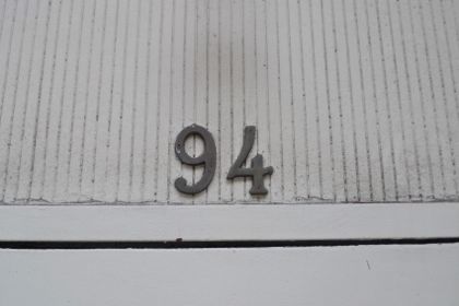
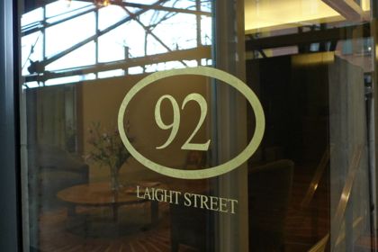
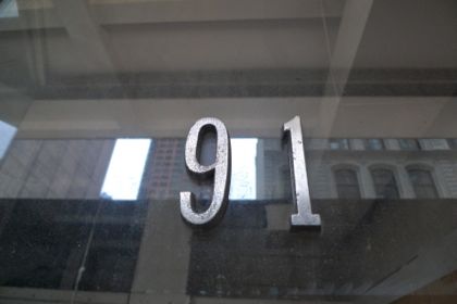
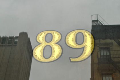
I took hundreds and hundreds of photos. Once I was finished, I wasn’t sure what to do; only a numerobsessive would want to see all of them. So I created a countdown of my 100 favorites. Certain numbers (17 and 19 come to mind) were standouts on several streets, which led to tough decisions. And sometimes unremarkable numbers had to be featured. There were three numbers—97, 63, and 30—that I couldn’t find anywhere in Tribeca. If your building is one of those numbers, let me know!
P.S. You could think of this as one big Where in Tribeca…?, except I labeled each photo with its address. Drift your cursor over a photo to see where it was shot.









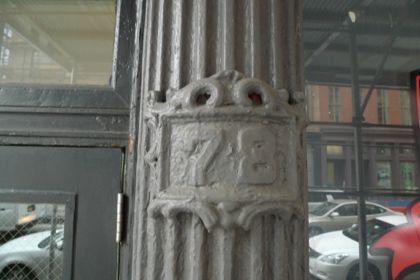



Brilliant! Thanks for continuing to be one step ahead of me by thinking of all the cool photo projects just as I’m about to begin them.
this is way cool
like your 92!
I don’t want to sound like a crank — no offense intended, Smithers — and a photo essay on the creative or most interesting top ten numbers would be fine — but looking at rather mundane numbers from 1 to 100 is actually boring. The surrounding support for the numbers might make it better, but that isn’t your purpose. Well, I’m glad others liked it, but I suspect it is just a good holiday weekend filler when you are away and have these stored and ready to go.
@betty: It actually occurred to me about a third of the way through that context would indeed interesting, but (a) I wasn’t about to start over, and (b) the choice has to be close-ups or context—both is impossible. It’s true that they’re handy posts for when I’m away, but I spent enough time on them that I wouldn’t call them completely tossed off, the way the word “filler” implies.
hey betty how much do you pay for this site?
This is fascinating, but I’m a graphic designer so I love this kind of thing. It used to get done for typeface catalog covers but no one does those anymore.
So are we going to have a contest to i.d. typefaces, or a survey to pick favorites? I’ll start! Number 76 is Avant Garde Demi (that was easy; a lot of them look like they may have used different faces for each number and some of them are so old they will be hard to find). I love the old ones–79 and the curly ones that seem to be related–37/38 and 58/59.
hey – constructive criticism doesn’t have to be followed, but it should be accepted as a compliment. I don’t waste my time on boring blogs.
I think this is fun, I have been trying to identify where the numbers are before I check….
this is great…doesn’t in any way feel like filler.