Seen & Heard: The Battery Bike Path Is Also Open
••• “White Street b/w Broadway and Cortland Alley (side across from Harley Davidson) has been converted to NYPD and Health Department parking this week,” says TribecaMom. “No more 6pm parking.”
••• Commenting on the post about the bike path along Brookfield Place, Eric says that “They also opened the bike path in the Battery yesterday.”
••• L. asked a question that I answered a few years ago, but I figured you might have wondered, too. “My partner and I were walking along W. Broadway between Murray and Warren and saw (not for the first time) the second floor of the building on the east side of the street (the Gibbes building) all lit up and looking kind of awesome. What’s in that space? Is it just an amazingly cool apartment? Is it some kind of event space? I’d love to know what that is!” It’s the home of wine distributor T. Edward Wines, which holds tastings there.
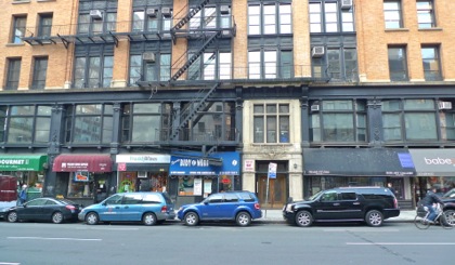 ••• Business owners: New York City comptroller Scott Stringer and various other parties are holding a Red Tape Commission hearing. It appears to be BYOB.
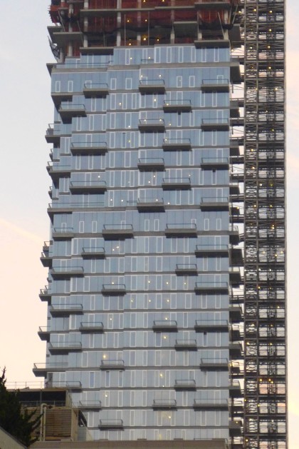
 ••• John had this to say about 56 Leonard: “Not to beat a dead horse, but I am in love with the building now that that the construction netting has come off. Do you still hate it?” I don’t hate it (as long as we leave aside the question of scale). The top is undeniably striking, and in certain light and/or from certain angles, the building really captures the eye. But I do think the midsection is a disappointment, despite the random balconies, and (at risk of repeating myself) I don’t understand how all those lighter vertical rectangles were allowed to happen. They distract from what the design wants you to focus on; moreover, the varying heights and widths of those rectangles—not to mention the varying widths of the horizontal concrete lines—add an extra, unnecessary layer of randomness. In renderings, the randomness came from the shape, not from the materials or details. In the finished building, the randomness is everywhere, with nothing orderly to react against.


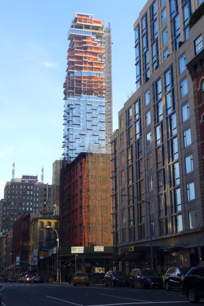


You can’t leave the question of scale aside. That is part of the design. That is why so many people resent this horrifically out of scale building.
I was crossing Church St on a bright, sunny afternoon last week and the reflection off 56 Leonard was absolutely blinding.
I suppose it’s partly a matter of personal experience, but I can’t see the fuss being made over the scale of 56 Leonard. I’ve lived diagonally across from the site most of my life – moved in as the equally tall AT&T Long Lines building was just completed. I then saw the high-rise on Thomas St. go up. I go to the corner and look north to see the massive and majestic Ralph Walker building, and before 56 Leonard could see his Western Union building with a glance left – south the once and future WTC. On B’way there’s the Federal Building and a number of other moderate to rather tall buildings. I see nothing particularly outstanding about 56 Leonard in that light. Moreover I can’t imagine that anyone can realistically imagine a future in which lower Manhattan will move toward smaller buildings and lower density. That’s not the way of the world unless one is projecting that this city (and let’s recall that the city is a technological invention designed to advance the progress of civilization) is doomed to failure.
56L is historic and groundbreaking and stunning. We are so lucky we will get to enjoy it soon. The structure is amazing and it’s not even finished. Wait until it’s finished and lit up at night. Those who don’t see that should see the addition to the Louvre.
Wow, what a review…did you design it?
just a fan of great architecture
just a fan
I like 56 Leonard though it does not measure up to the initial renderings. The love the top, but the lower floors are disappointing, hence an overall judgment of “like”. Maybe I will feel differently when it is completed. We shall see.