
Left rectangle ads redesigned

History of Tribeca Buildings
New Building Report Card: 11 N. Moore
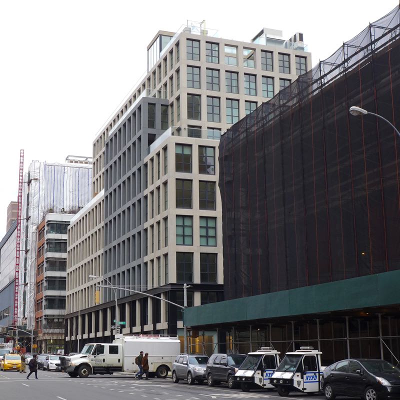
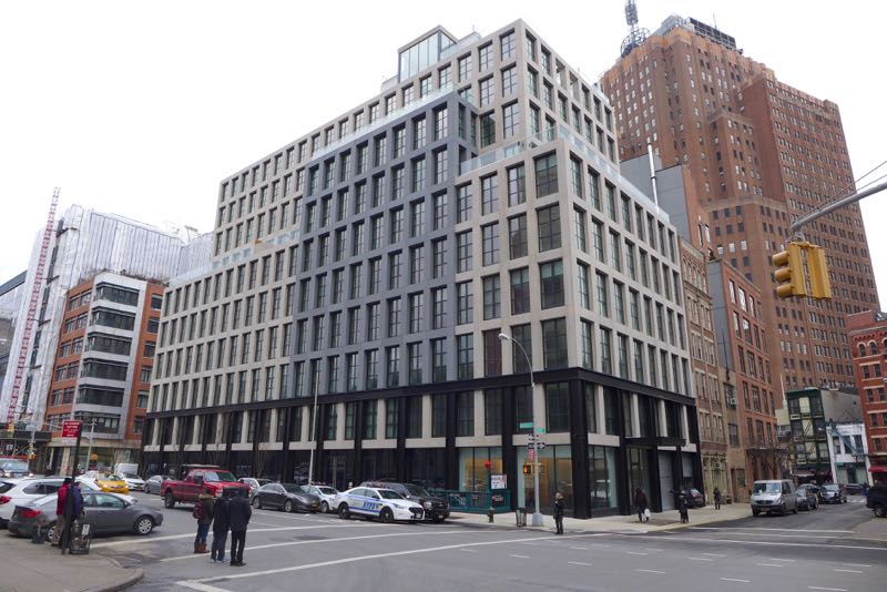 When it comes to new buildings, only the residents may care how the interiors turn out, but we all have to live with what’s visible from the street. So let’s take a look at 11 N. Moore, which extends all the way along Varick to Beach Street. As with the last building in this series, 290 West, the developer is VE Equities and the architect is AA Studio. Please don’t let the fact that you’re not an architecture expert (either) stop you from weighing in.
The design in general
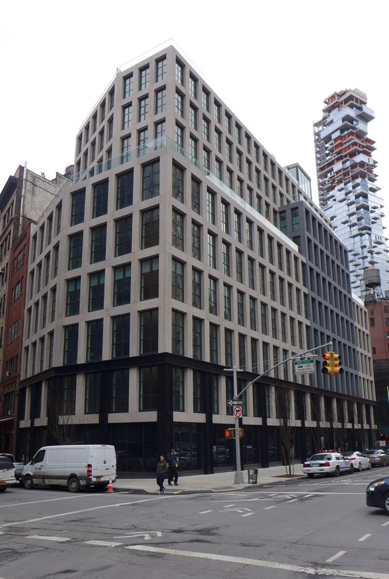
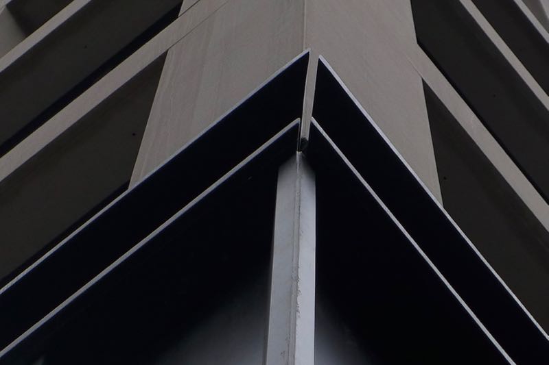
There’s not much to latch onto, design-wise—a shame for a block-long building on what is essentially an avenue. It’s another faux-industrial box, embellished with a lattice of dark and light Ts at the base, a gray inset on the western façade, and a glass box poking up at penthouse level. The beveled north side, paralleling Beach as it forks, is elegant.
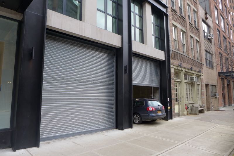
The ground floor
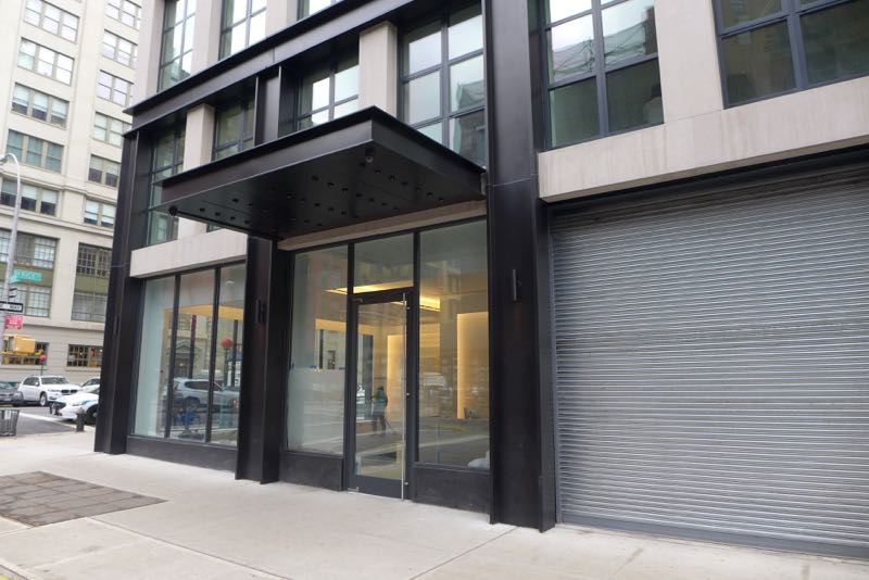
Like 290 West, the street level of 11 N. Moore is grim, enlivened, such as it is, by a pretty lobby on the south side and some security cameras. The absence of retail on an entire block is a real loss to city life. (Those are “indoor recreation rooms” for the residents.) Trees planted on Varick help a little, and perhaps they’ll stop the NYPD from parking on the sidewalk. But can the flimsy, unpainted garage doors—right next to the building entrance!—really be the final version?

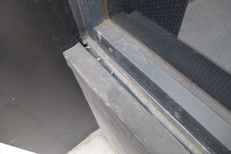
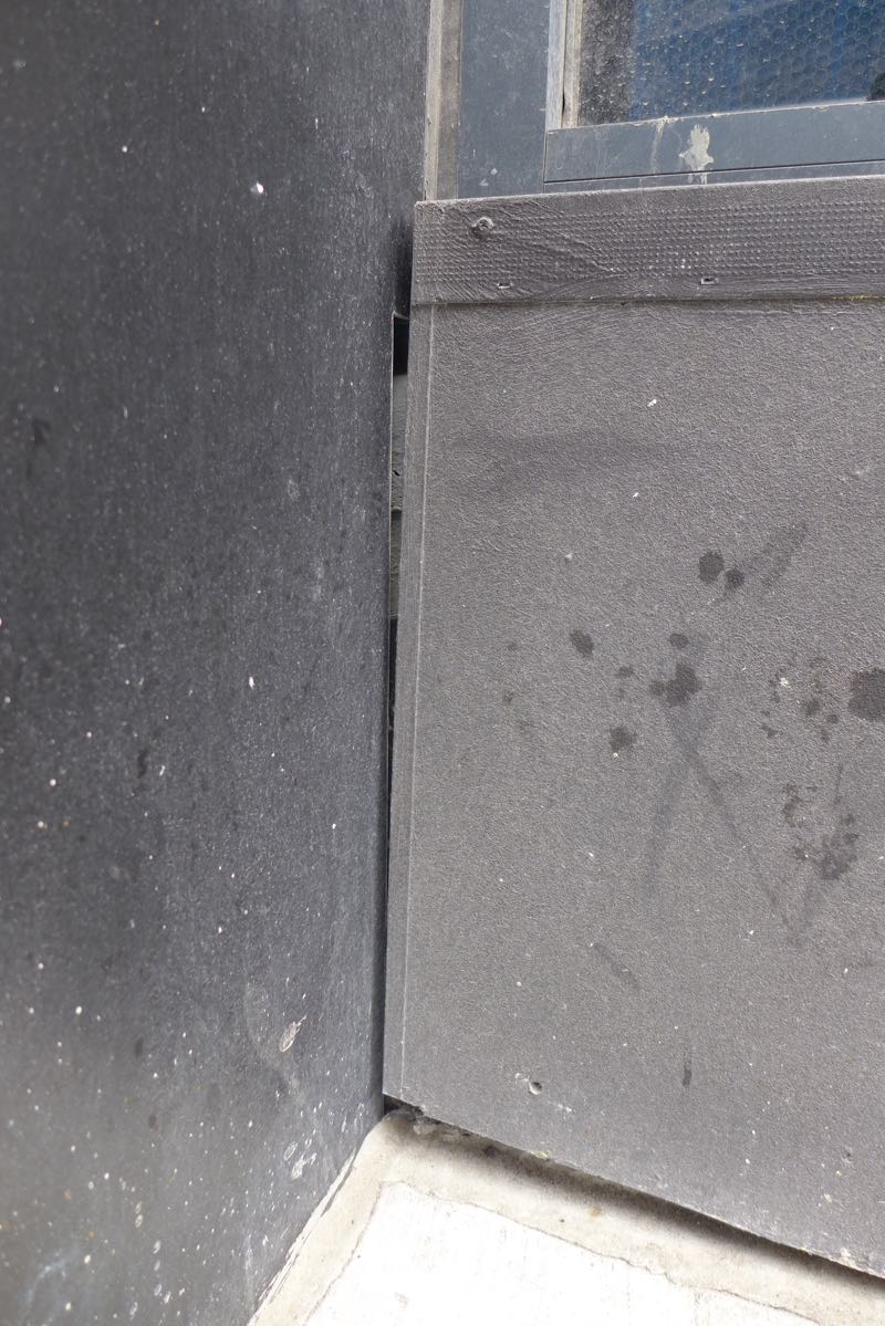
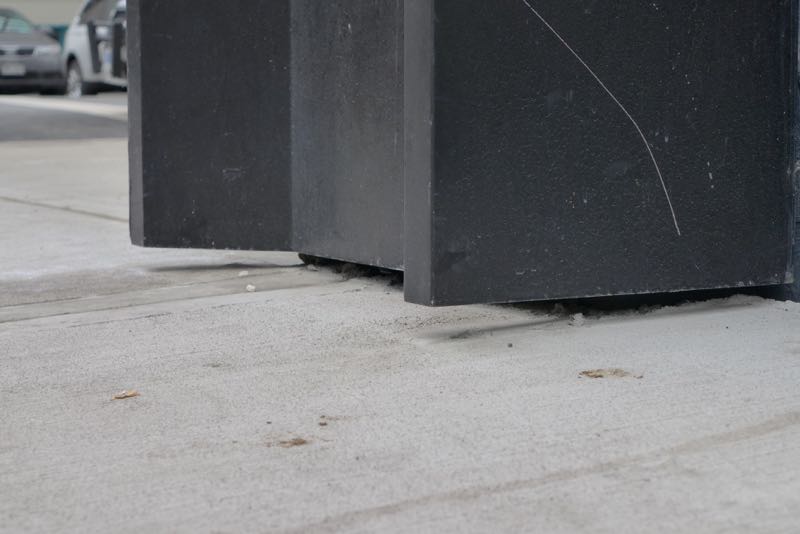
Upon closer viewing…
As at 290 West, the façade’s metal framing is hollow. The windows, meanwhile, have a honeycomb material embedded in the glass (the first two photos below), presumably so passersby can’t see inside; it doesn’t exactly warm the place up. And let’s hope that the punch list is still open.


And the top?
You’d think the architects would want the eye, as it rises, to land on that penthouse—instead, it bounces between the penthouse and the mechanicals grouped at the southeast corner.
Is the building an improvement?
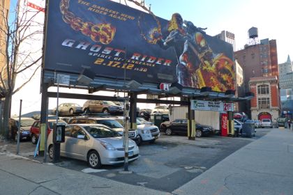
Sure. There used to be a parking lot with an ugly billboard at that location.
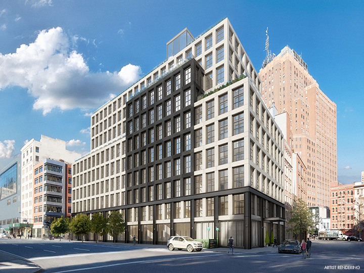
Rendering vs. reality
Unlike 290 West, the renderings for 11 N. Moore have the same number of floors as the finished building, so that’s something. There are other discrepancies, however. The windows were initially to be single panes of glass—a feature the brokers trumpeted—but that changed at some point. (I’m not sure they would’ve been better that way.) And in a later rendering (the second one below), the inset is black, not gray, matching the trim on the first two floors. The increase in contrast would’ve crisped the entire design up.
Pass or fail?
It squeaks by, but only because it could’ve been much worse. And someone really needs to address the shoddiness. This is Tribeca.
Previously:
••• 290 West
••• The Reade Chambers (71 Reade/87 Chambers)
6 Comments
Comment:
Medium rectangle #1 (top)

Right column rectangle ads


Restaurant guide icon


Another poorly crafted and disappointing design from the same developer of 290 west. Your photos expose some truly shoddy, embarrassing work. Obviously, no one takes any pride in the finished product here.
As to the design, it is another oppressive structure that tries to spice itself up with a few interesting “gestures” which only worsen the design’s incoherence. I recall reading the original marketing hype around this building…wasn’t the developer pitching it as “Tribeca’s version of 15 CPW?” What a shame.
You raise a great question about accountability. So long as people line up to buy from the developer, sight unseen, how can there be any?
From 2012: “It’s going to be the pre-eminent building in Tribeca,” VE Equities’ Justin Erlich told Real Estate Weekly about 11 N. Moore. “This is going to be the 15 Central Park West of Tribeca.” http://rew-online.com/2012/07/18/ve-equities-to-build-%E2%80%98next-15-cpw%E2%80%99/
Would be interesting to see a similar analysis on 15 Leonard round the corner …
Waiting for the building to be finished—the ground floor is taking its sweet time.
The parking lot added much more to the neighborhood in terms of usefulness, classic design, and craftsmanship.
I miss that tree in the lot….