Categories
Left column house ads
New Building Report Card: 456 Washington
April 18, 2016 Real Estate
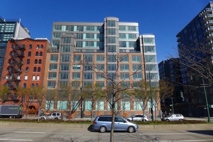
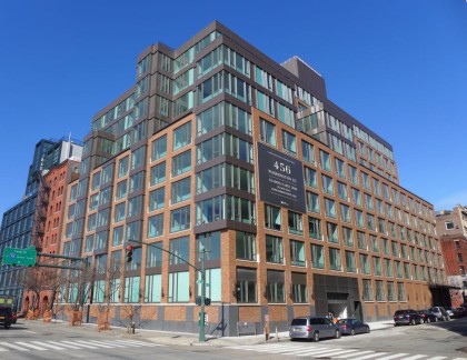 When it comes to new buildings, only the residents may care how the interiors turn out, but we all have to live with what’s visible from the street. So let’s take a look at the new rental building at 456 Washington, which runs along
 Desbrosses Watts and up West Street. The building is a partnership between Related Companies and the Ponte family; the architect is BKSK Architects. Please don’t let the fact that you’re not an architecture expert (either) stop you from weighing in.
The design in general
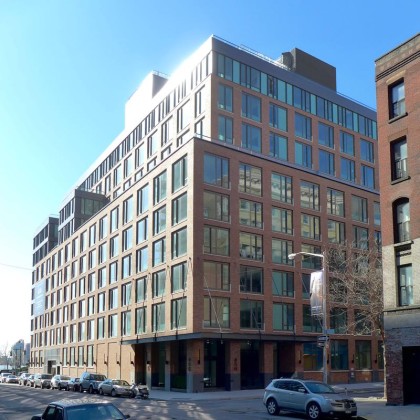
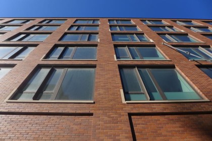
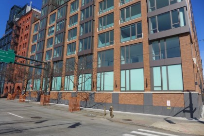
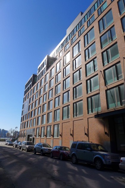
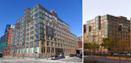
The 10-story, 84-unit building has one main setback atop the sixth floor, and four extensions of various heights above it, at seemingly random points. My guess is the asymmetry—and the use of two materials in the curtain wall—is intended to make the building seem like less of a hulking mass. Likewise, the windows have trim along the bottom that also goes a bit up the right or left side; there’s no obvious pattern.
The ground floor
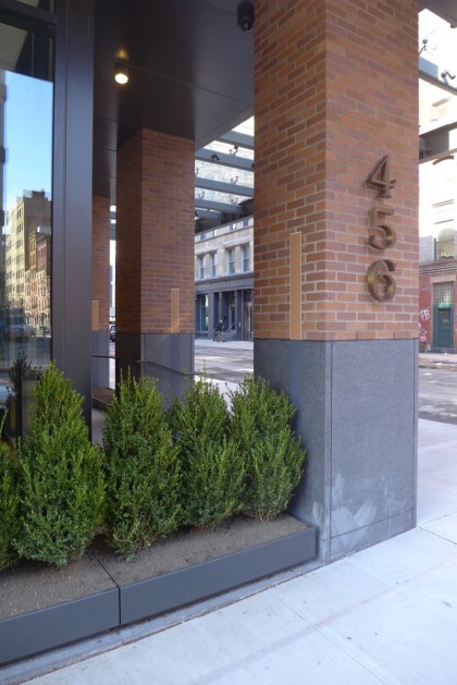
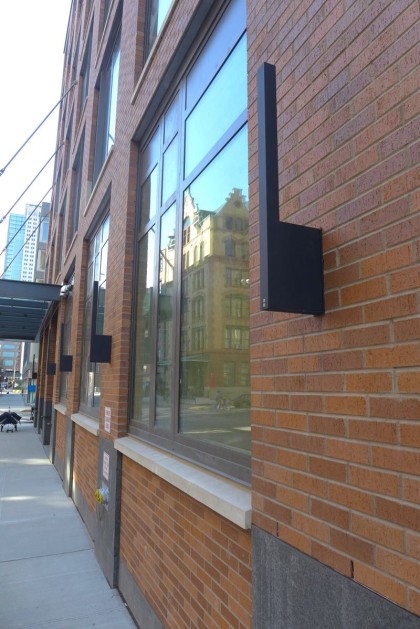
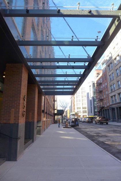
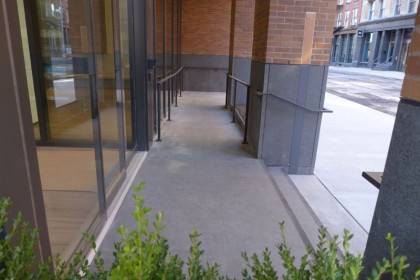
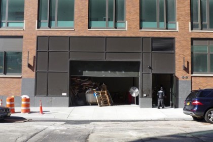
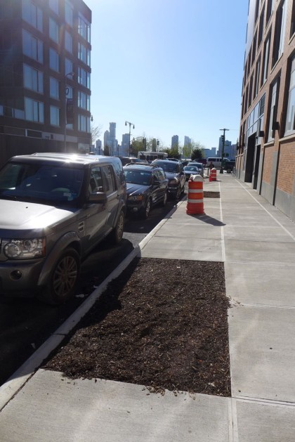
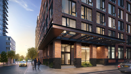
With its recessed planters, glass canopy, elegantly designed ramp, and spiffy address numbers, the entrance at the corner of Washington and Watts is an unqualified success. Even the freight entrance on Watts is nicely done. The five trees that’ll be planted along Washington and Watts will be very welcome, and while the sconces along the façade might not be anything you’d want in your home, they add character at street level. The complete lack of retail is a disappointment, and I’d love to know the reasoning for the line of opaque white windows on the first floor along West Street.
Upon closer viewing…
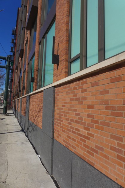
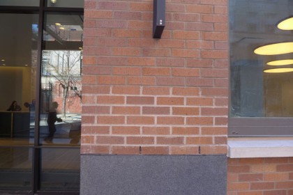
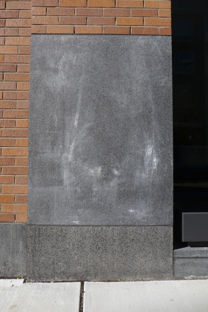
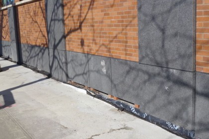
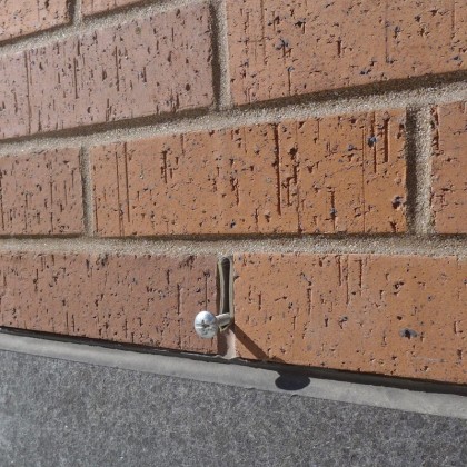
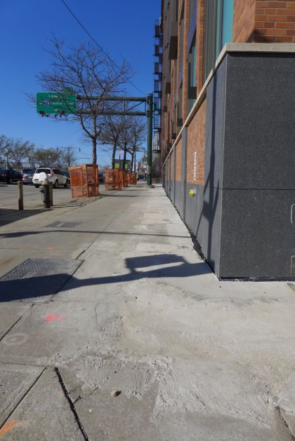
The brick and stone are an appealing mix of textures, and the fact that the wall isn’t one smooth plane makes the building visually richer. Demerits, however, must be handed out for the mismatched materials right off the entrance (see the second and third photos below). Also, there’s still punch-list work: the trim and/or caulking along West Street, the occasional screws stuck into the brick. Last but not least, the sidewalk at Watts and West needs to be redone.
And the top?
The mechanicals are hidden from street level, and the bulkheads are relatively unobtrusive.
Is the building an improvement?
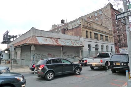
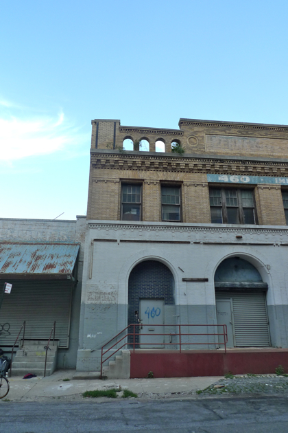
It’s hard to grieve the loss of the parking lot (at least on aesthetic grounds) or the small building that was at the corner (except for the relief of its small size). As for 460 Washington…. It had been misused by the end, and a larger replacement was inevitable, but it had infinitely more charm than any new building of recent years.
Rendering vs. reality
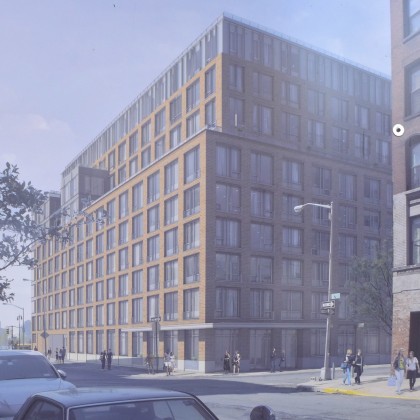
Related has been chintzy with the renderings, which may have been smart: Keep expectations so low you can step right over them. At first, there don’t appear to be many differences between the renderings and the completed building. But in the third image below (click on it to see it larger), you’ll see that the original plan was for much more brick at street level and on the top third. (There are also a laughable number of pedestrians on West Street….) Value engineering, one presumes.
Pass or fail?
This building inspired tremendous fear in northwest Tribecans, who dreaded a Truffles twin. Compared to what might have been—there was no landmarks protection for this site—it’s a success. Even on its own terms, I find the building an above-average example of contemporary residential architecture. It won’t win prizes or be especially memorable, but it works.
Previously:
••• 11 N. Moore
••• 290 West
••• The Reade Chambers (71 Reade/87 Chambers)
6 Comments
Comment:
Subscribe
Subscribe to the TC Newsletter






I love these report cards. It’s so nice to see a critical but open-minded eye on the neighborhood. Also great to compare to the before pictures.
Yes! Please keep publishing these.
While some of the ground floor details are appreciated, overall it looks like a poorly done rental to me. Using glass that appears to be green tinted was a particularly bad choice.
Maybe it looks better in person.
building is on Watts and Washington, not Desbrosses
Of course it is. Stupid mistake. Thanks
I find myself saying it looks ok and is not as bad as Truffles which is a very low bar. I like the other new building on the same block much better.
Love these report cards as well. Well balanced and rounded review. I’m really surprised with the exterior. This building is brand new but to me, appears that it could have been built 15 years ago. Brick is a great feature on the exterior of a new building but needs to be done correctly from a design perspective. Agreed on the green glass. Outdates a brand new building. I’m sure inside will be beautiful with great views from some units. It will bring needed retail to the area!