New Building Report Card: 15 Renwick
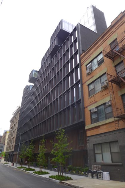 Only residents may care how new buildings turn out on the inside, but we all have to live with what’s visible from the street. So let’s review 15 Renwick, on the west side of the street between Canal and Spring. The building was developed by IGI USA (Izaki Group Investments); the architect is ODA New York. Please don’t let the fact that you’re not an architecture expert (either) stop you from weighing in.
The design in general
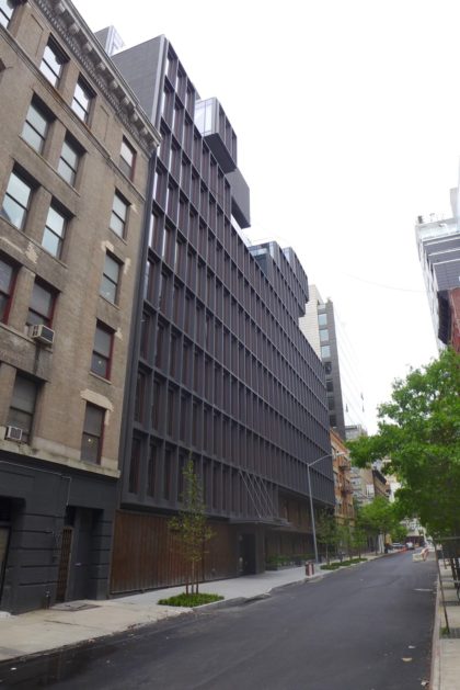
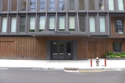
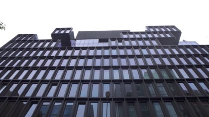
15 Renwick has three distinct levels: The copper-cladded base; the boxy grid of windows in the middle, and the Tetris-ish top third, where the grid disintegrates. “The exterior honors the authentic architecture of the street and neighborhood,” says the website, which is mystifying, unless the reference is to the other dark, boxy new condos along Spring. If anything, those big windows and random stacks pay homage to other ODA work—to wit, Franklin Place over on Broadway.
The ground floor
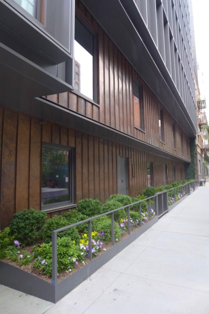
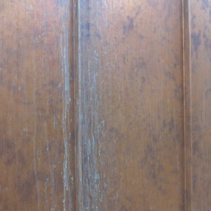
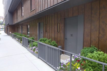
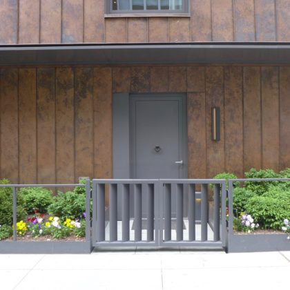
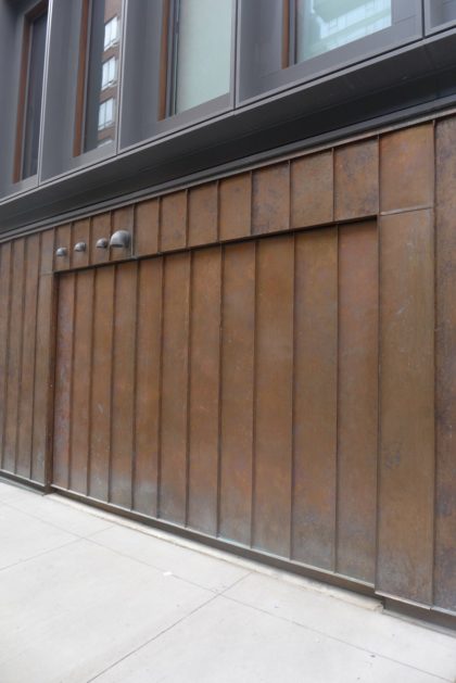
If a building is going to skip all retail—which I’m not a fan of, but that’s life these days—it should offer something to passersby, and the penny copper is eye-catching and novel. As the metal ages, the patina will do more to add “authenticity” than anything else in the exterior; too bad the metal sounds so hollow when you tap it. The entrance is a bit overly discreet, given all the zippy copper that flanks it, but maybe there are planters coming (or better yet, a sculpture by the front door). As for the maisonettes at the north end, the landscaping is a delight. I only wish that the architects had found a way to avoid the motel vibe created by a row of exterior doors. The doors might have been angled, for instance, or offset on different planes. Add in the gray front gates and the result is a combination of industrialness and homespun Americana; whether it works is in the eye of the buyer.
Upon closer viewing…
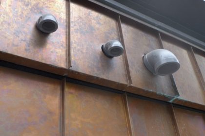
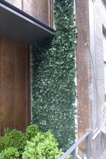
Nice work making the garage door blend in, but the contractor might want to try again with that poorly cut pipe hole above it. And the less said about the fake ivy, the better.
And the top?
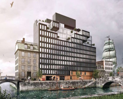
The top—or at least what one can see of it—is lively, but why those shapes and not other ones? And why go to such an effort on a part of the building that’s basically impossible to see from the street? Then again, perhaps we’re better off not having to see the huge bulkhead/mechanical box at the very top. (Skip below to the rendering to see what I mean.)
Is the building an improvement?
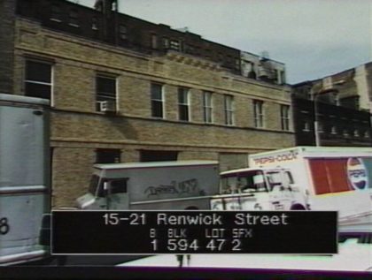
I don’t know. I have no recollection of what was there, and the oldest images on Google Maps (from 2007) show a vacant lot. Renwick had a lot of charm, so the developers are probably fortunate that no evidence exists of what was destroyed. UPDATE: James points out that the New York City Municipal Archives has a photo from the 1980s (below). The photo isn’t great, but an argument could probably be made that the new building is indeed an improvement.
Rendering vs. reality
Leaving aside the more fanciful aspects of the rendering—the marketing campaign for 15 Renwick is oddly steampunk—it does seem to represent the finished product. We’ll have to assume so, anyway, since the top third of the building is such a mystery.
Pass or fail?
Pass, but given that no effort was made to blend it in with the older parts of the area, I wish the reasoning behind the more outré design choices was clearer; as it is, they seem arbitrary.
Previously:
••• 456 Washington
••• 11 N. Moore
••• 290 West
••• The Reade Chambers (71 Reade/87 Chambers)




“evidence exists of what was destroyed”
1980s:
http://nycma.lunaimaging.com/luna/servlet/s/ez9nr1
1917:
http://digitalcollections.nypl.org/items/510d47dd-51d5-a3d9-e040-e00a18064a99
I just want to go on record as LOVING your reviews of the new TriBeCa architecture. You really have a knack for this. I never miss a review, and never fail to appreciate new aspects of the buildings. I often walk over to see them up close and personal after reading your take on things.
i live right next door. although i am pleased to have my block “whole” again, i think this building is far too bulky for the narrow, one block long street. . i’m calling it the ” Hulk of Renwick”. ( ps -look inside the lobby to see an “english-upper-class- looking portrait)
I walked by the lobby today thinking I would see a portrait of James Renwick. But NO! GAH.
I am somewhat confused by the townhouses with gardens in front. The floor plans on the building site show those were designed to be private terraces with doors.
http://15renwick.com/wp-content/uploads/2014/11/TH1.pdf