
Left rectangle ads redesigned

History of Tribeca Buildings
Seen & Heard: How to Pronounce “Tribeca”
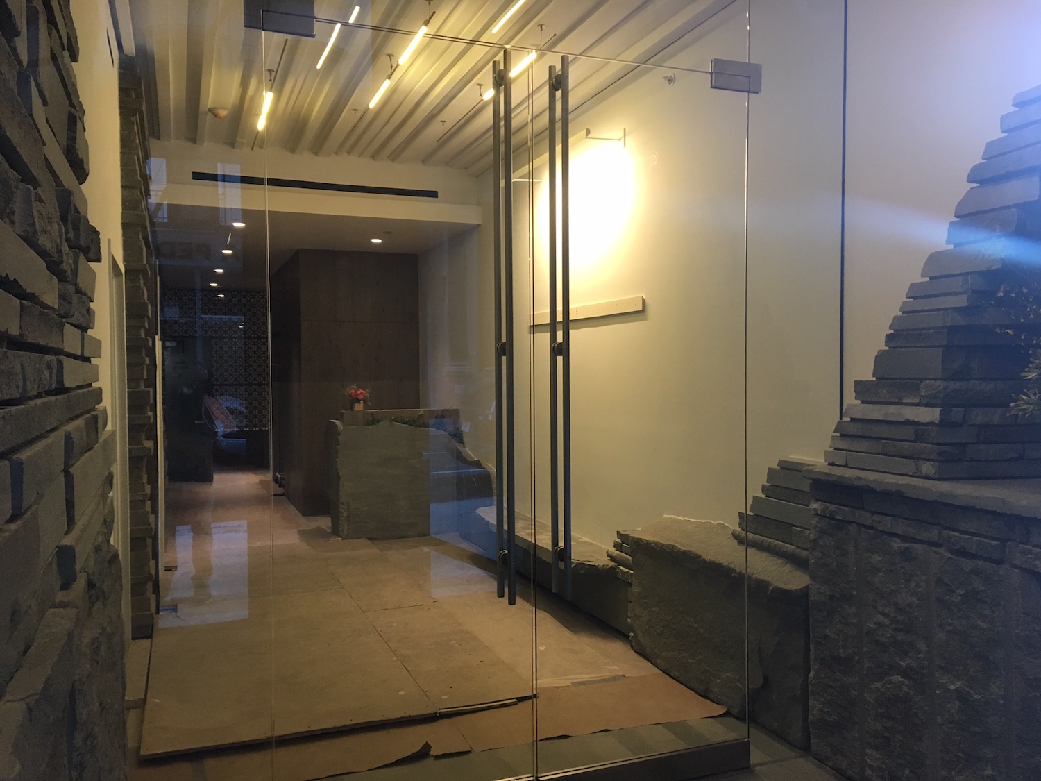
••• You can see the lobby of 12 Warren now. They really went for the stone theme.
 ••• Press release: “The Museum of Jewish Heritage […] launches The Center for the Study of Anti-Semitism with a series of programs exploring contemporary issues of hate, hosted by The Center’s director, Abraham H. Foxman, internationally renowned as a leader in the fight against anti-Semitism and bigotry. Through scholarship, exhibitions, and programs, The Center will lead a national conversation to examine where the specific hatred of Jews comes from, why it continues to persist, and the dangers it poses to a free society.”
••• There’s definitely something happening inside 63 Reade.
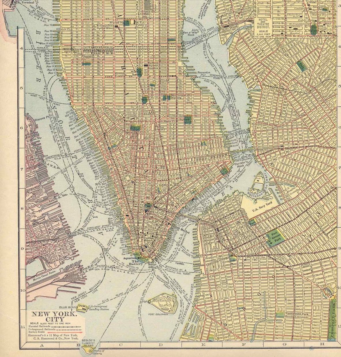
 ••• Here’s another vintage photo, courtesy OldNYCphotos.com. The site identifies it as Greenwich Street, with W. Broadway at right, in 1914. That would mean it was down near where the World Trade Center is now. Click on it to see it better, and you’ll notice sign for Smith & McNeil’s Dining Rooms. The only mention of its location online (that I came across) was an item in the Brooklyn Daily Eagle in 1883 that said Smith & McNeil’s was on Washington between Fulton and Vesey. (Of course, it could’ve moved.) OldNYCphotos.com also sells prints and posters, as well as commercial usage. UPDATE: See Safe as milk’s comment; I added the map he mentions below.

 ••• I came across a tutorial on how to pronounce “Tribeca.” While the first example (of three) has its charms, the last one is definitely the best.
3 Comments
Comment:
Medium rectangle #1 (top)

Right column rectangle ads


Restaurant guide icon


erik, good call on the location of the vintage photo. i went down the rabbit hole after you posted the earlier oldnycphotos.com photos, and this one really confused me. i found a nice map from 1910 which indicates that west broadway ended at about fulton street. there was an el station at barclay and greenwich streets which appears to be in the backgound of the picture. here’s the map:
http://archimaps.tumblr.com/post/29428797170/map-of-new-york-city-1910
I’m sorry, but as a Jersey boy who grew up in the 1970s, I cannot help but be reminded of the old Garden State Brickface commercials I remember from local TV whenever I walk past the facade of 12 Warren.
I am very sure that was not the effect intended by the developer. And yet.
The problem with 12 Warren is that stone works best when it is contrasted with a lighter material. The entrance is a case in point – why pile stones up over someone’s head when they’re walking into a building? It looks dangerous, threatening, like…yeah…the rocks are going to fall on you (which at some point, given time and erosion and lack of proper maintenance over the years and so forth, they might.) Stone can be beautiful…but if you go nuts with it (as in this example at 12 Warren) you wind up with something that looks like a parody of design, straight out of The Flintstones. It’s a shame, because the stone itself is beautiful and portions of the exterior are really lovely.