
Left rectangle ads redesigned

History of Tribeca Buildings

Solving the Mystery of 111 Murray
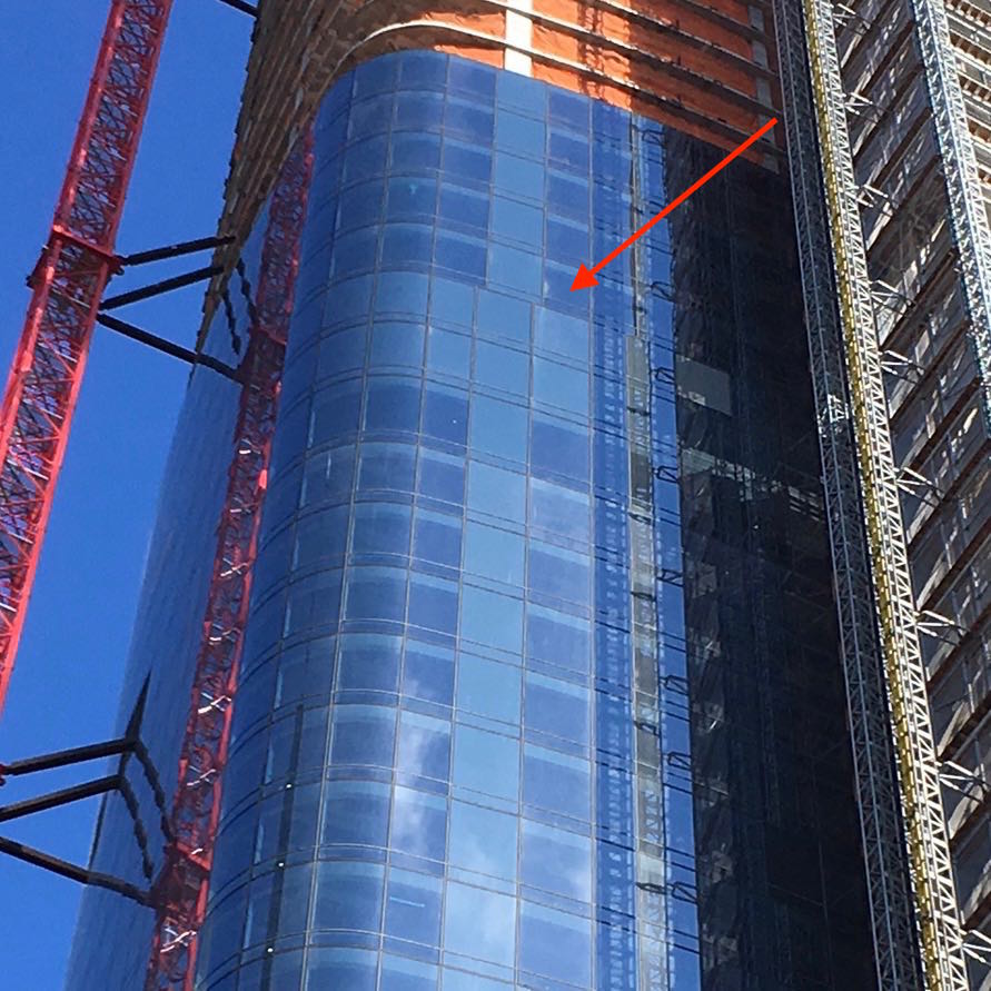 If the misalignment on the east side of 111 Murray is intentional, then what’s the intent? I reached out to KPF, the architecture firm that designed it, but I didn’t hear back. Then I noticed it happens again, further down the building:
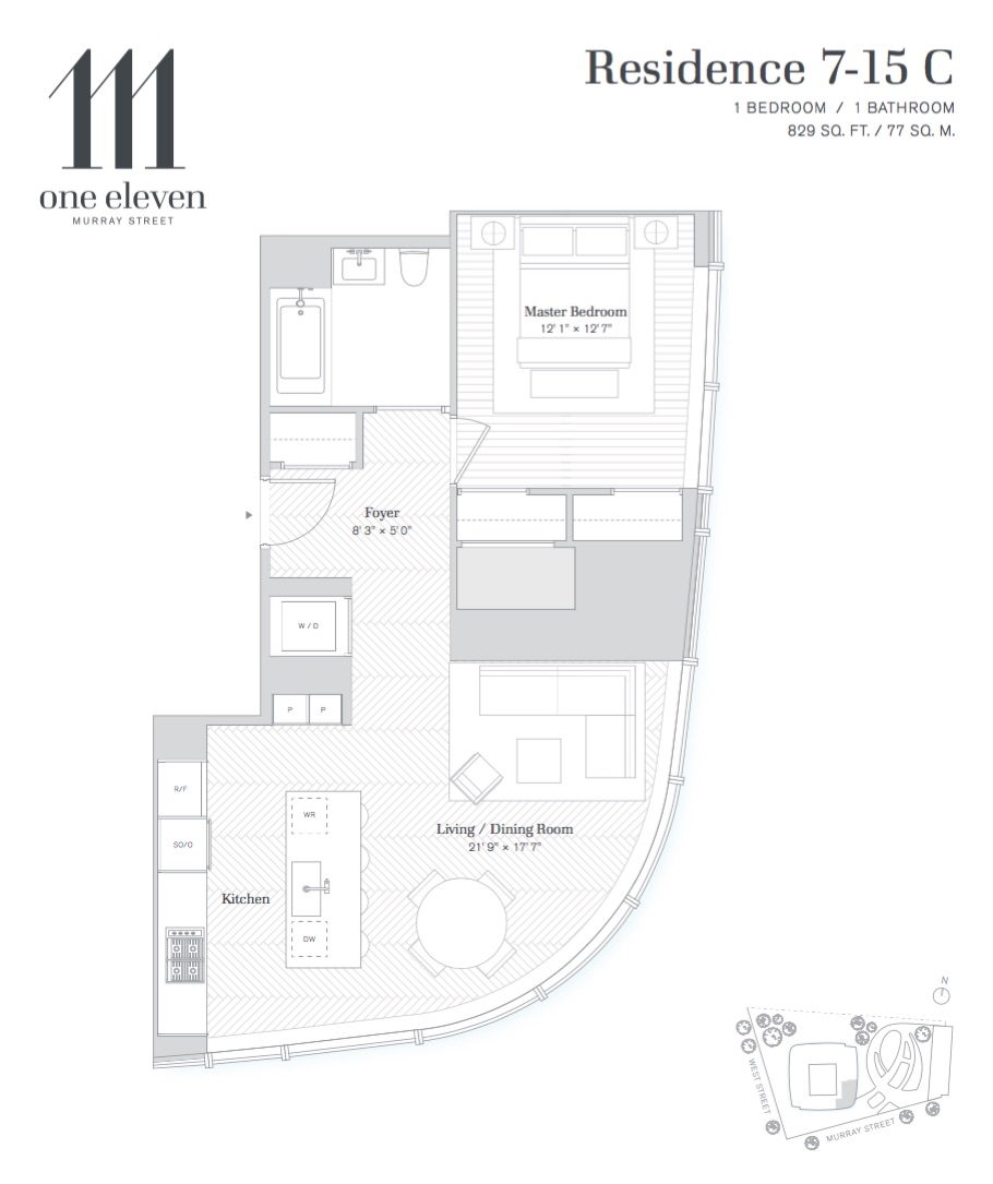
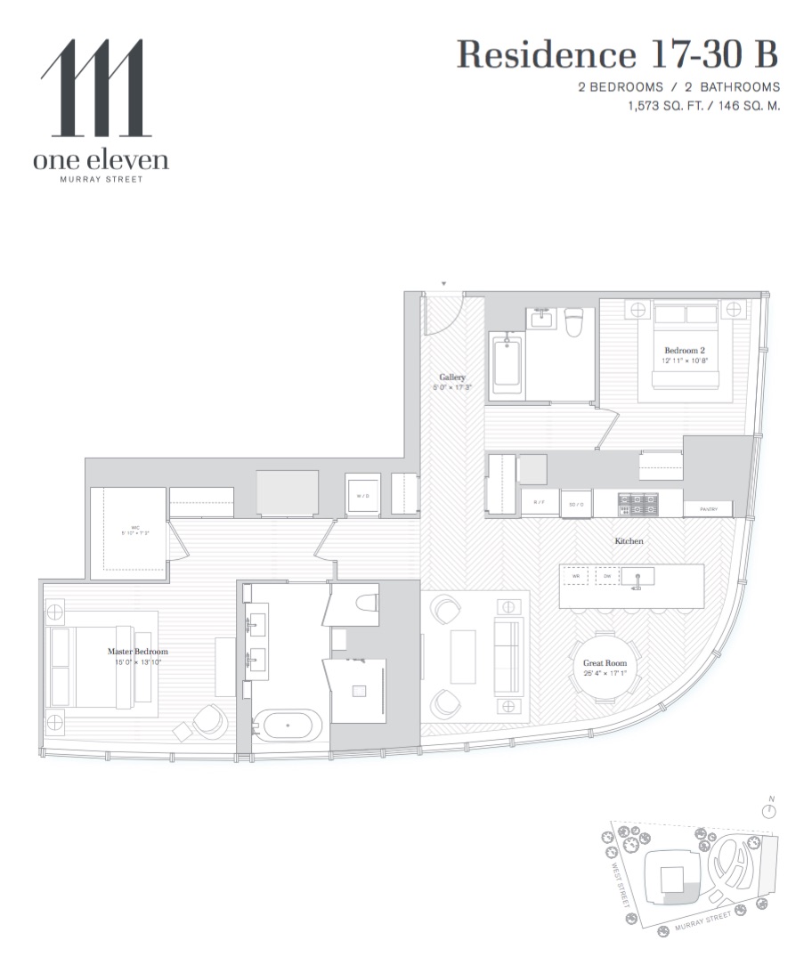
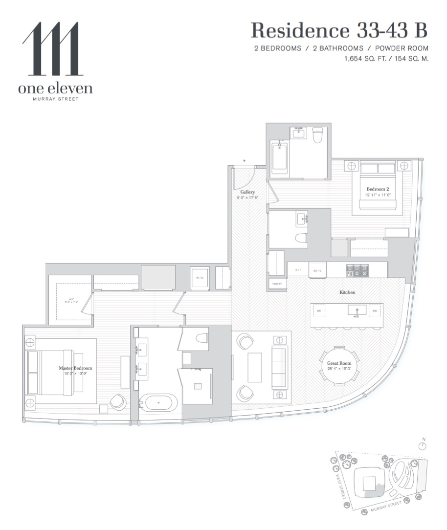
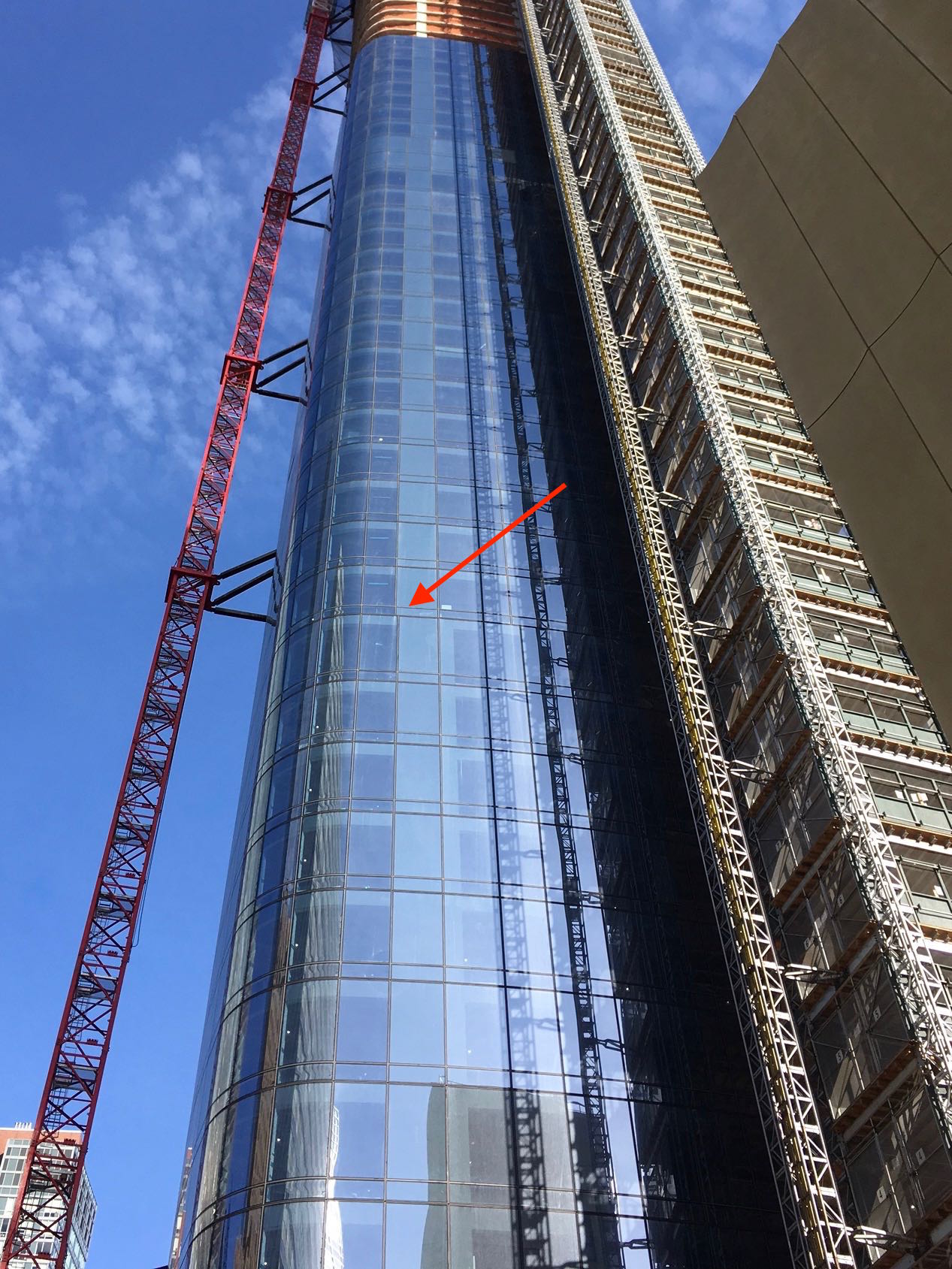 So I asked Douglas Moss, an architect who lives in Tribeca. “I can only speculate,” he said as a caveat. “As you know, the building slightly curves out as it gets taller. I first thought the slight misalignment was to begin compensating for the building splaying out at the top. But that theory doesn’t hold true because your images show the curtain wall steps out and then back again. My second theory is that the apartment floor plan changes on these floors and they require different size spandrel glass panels. (A spandrel glass panel is a piece of glass with a solid wall behind it.) Look at the floor plans of the apartments and you can readily tell where the solid walls are (with spandrel glass panels) and where the clear glass panels are located.”
Lo and behold, the misalignments occur where the floor plans change. Compare the shaded areas at 3:00 in the following diagrams:
 (Floors 31 and 32 appear to be devoted to mechanicals.)
JP sent a photo of the west side, which shows the actual windows vs. spandrel glass panels. “The windows appear to be less mirrored than those below the problem,” wrote JP. “Big portions of the building lose the mirrored look in many lighting conditions and just look bad, but that was probably unavoidable.”
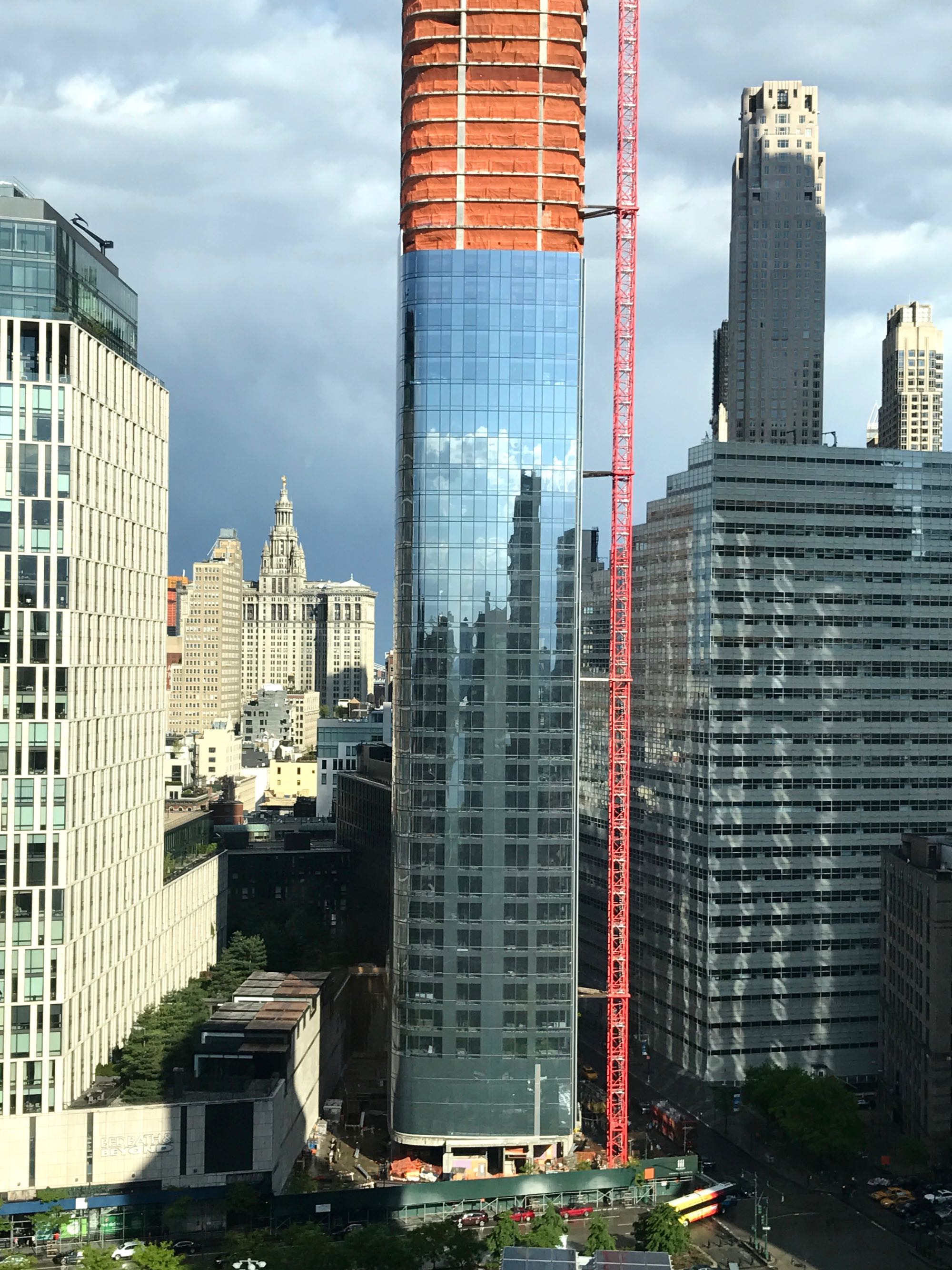 I asked Moss what he thought about the curtain wall. “The renderings for this building look like a gorgeous, expensive, beautifully detailed glass curtain wall,” he replied. “The actual implementation of the curtain wall looks pretty basic and something that may have gone through a lot of ‘value engineering’ (architect speak for cost-cutting).”
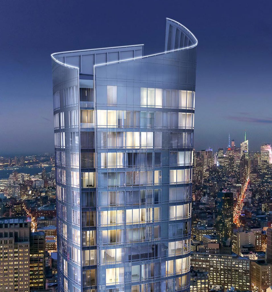
Some of the renderings have been more transparent, so to speak, about the skeleton behind the glass, such as this one of the top, which I don’t think I’ve run before. Also of note: That certainly looks like a lighted rim.
2 Comments
Comment:
Medium rectangle #1 (top)

Right column rectangle ads


Restaurant guide icon


It’s pretty sad that they tried to cut corners with such a prominent and expensive building. The “value engineering” is definitely in play as I also recall reading how they designed it so that the curved walls are all the same size, which makes it much cheaper to build.
Compliments on your research (as always). This building has troubled me from the first. I think I recall commenting here that the professionals involved are formidable, but the results produced are not up to their talents. Everything you’ve uncovered here supports that, as well as Mr. Moss’ modestly dismissive “pretty basic”.