New Building Report Card: 5 Franklin Place
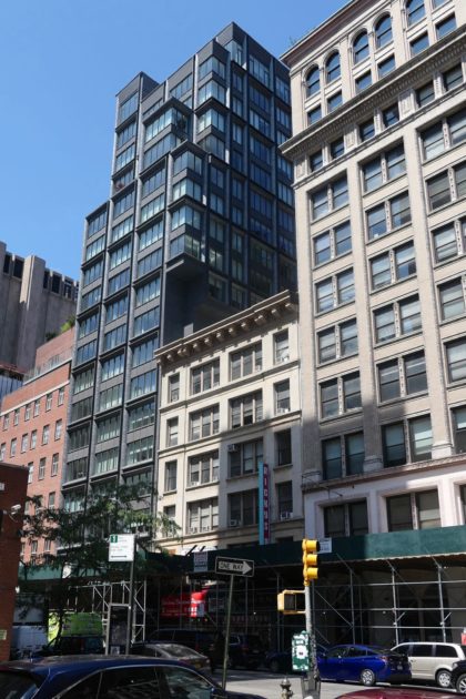 Only residents may care how new buildings turn out on the inside, but we all have to live with the outside. So let’s review the new condominium at 5 Franklin Place. The building was developed by the El Ad Group; the architect is ODA. Please don’t let the fact that you’re not an architecture expert (either) stop you from weighing in.
The design in general
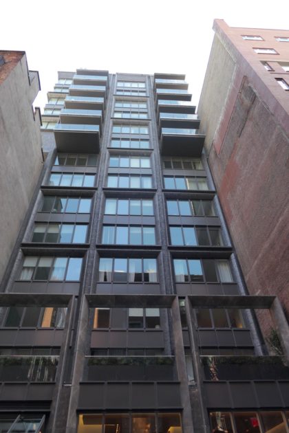
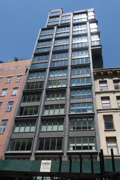
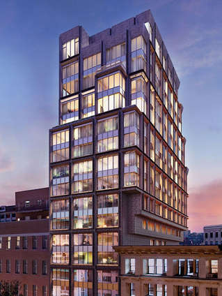
The 20-story building is very similar to ODA’s 15 Renwick, in that it’s somewhat unremarkable in the middle, but interesting at the street level and the top: The entrance is on Franklin Place, a privately owned alley, and the top half of the building is cantilevered over 373 Broadway to the north.
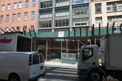
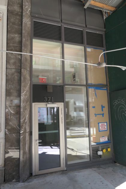
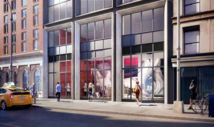
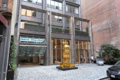
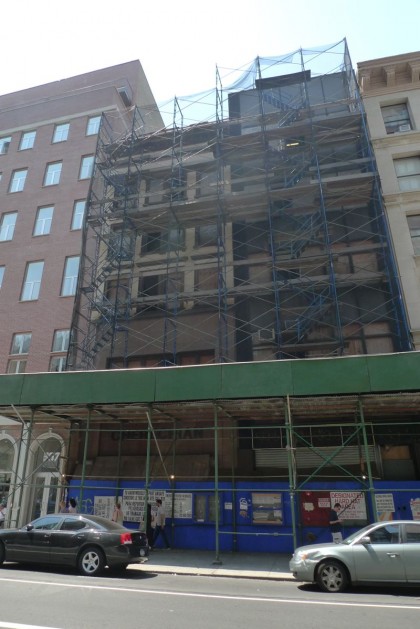
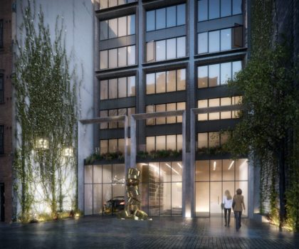
Heaven knows what the Broadway side looks like. It remains covered in plywood and an ugly sidewalk shed; there’s a glimpse of marble framing the retail space, which should end up adding gravitas to the block, if it ever gets rented. (Note the rendering below.) The Franklin Place side, meanwhile, has a lot going on. It’s set back off the street, creating a nice, cobblestoned courtyard, with plants climbing up the adjacent walls. Marble arches on the second floor are a folly meant to mirror the retail space on Broadway. The crown sculpture is a missed opportunity.
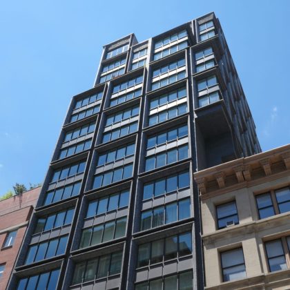
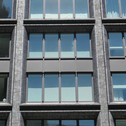
The building appears well-made enough, and the texturing of the façade—as seen in the photo directly below—turns what could’ve been a cookie-cutter condo into something more substantial. The nitpicker in me does wish that the very top of the building, protruding on the east side, didn’t have different windows. The problem with strict grids is that any deviations will really stick out.
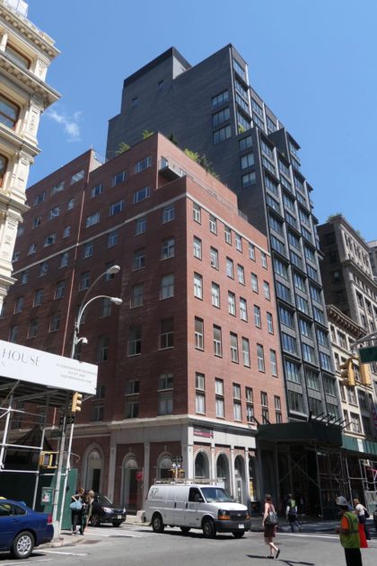
As striking as the cantilevering is, it raises questions. The asymmetry draws your eye to the north, and then to that weird dark nook directly above 375 Broadway. (If there couldn’t be windows one of the walls, couldn’t there have been art or something?) And the rest of the façade is divided into four-window-wide grids, so the two-window cantilevered part looks like it was sliced off halfway. Compare the top with 56 Leonard, which uses cantilevering to dramatic effect; this seems like less of an aesthetic decision than a financial one, a way to get more high (i.e., expensive) apartments with windows. The south side, meanwhile, is the usual lot-line shrug, and the west side has ungainly balconies that wandered over from some other condominium.
 Is the building an improvement?
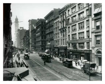
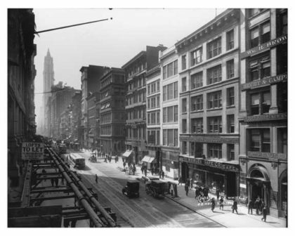
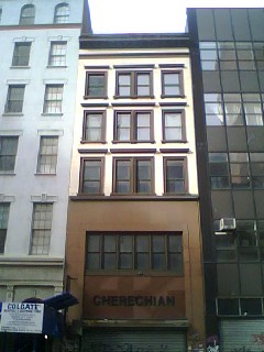
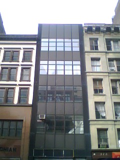
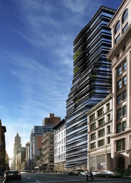
I don’t recall the two five-story buildings that were demolished to make way for 5 Franklin Place, and the only photo I took of them is from 2012, after they had already been covered in mesh. A reader who knows that area well sent over the second and third photos, from 1912 and 1913, respectively. But as you can see from the fourth and fifth photos—from a 2006 post on Wired New York, they had been ruined some time before they were demolished. Also worth noting is a design by Ben Van Berkels that the previous developer had planned for the site; it’s more cohesive than ODA’s.
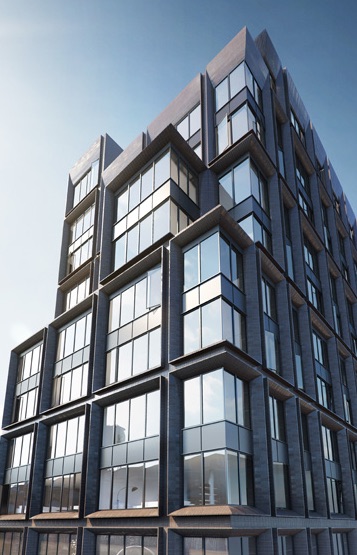
There weren’t many renderings to compare the finished building to—just of the top and the entrance. They seem to adequately represent the finished building.
Pass, but until that Broadway shed is taken down, El Ad gets a major demerit for poor citizenship.
Previously in this series:
••• 30 Park Place
••• 15 Leonard
••• The Sterling Mason (71 Laight)
••• 15 Renwick
••• 456 Washington
••• 11 N. Moore
••• 290 West
••• The Reade Chambers (71 Reade/87 Chambers)




Ugh….. (sorry)
Looks like an exercise in how to optimize internal square footage with very limited consideration given to surroundings or context.
“Adequate” would be extremely generous for this one.
I can’t work up much more than a “meh” for this structure…certainly, aesthetic considerations weren’t driving things.