
Left rectangle ads redesigned

History of Tribeca Buildings
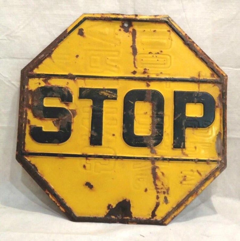
Where in Tribeca?
Where is this yellow stop sign? And while you are noodling that one, read below for a quick history of the stop sign. The photos — and the hunt — created by Sonia Stock, the “Where in Tribeca?” master.

1922: The American Association of State Highway Officials selects a standard design for stop signs — a yellow octagon with black letters. The idea was to choose a shape that even drivers coming from the other direction would recognize. Yellow wasn’t the first choice, red was since it also meant stop on traffic lights, which were invented in 1912. But all the red dye faded over time.
1954: Sign makers begin using a fade-resistant porcelain enamel. That year, the Joint Committee on Uniform Traffic Control Devices declared that stop signs from then on would be red with white lettering.
2 Comments
Comment:
Medium rectangle #1 (top)

Right column rectangle ads


Restaurant guide icon


From “The Evolution of MUTCD,” about the selection of shapes in 1922-1923
“These pioneers devised a plan to classify sign shapes according to the level of danger represented by highway situations. For example, round signs warned of approaching railroad crossings, which even then represented the most potential danger to the driver. The octagon advised of the next level of danger – the need to STOP for intersections. Diamond signs indicated more ordinary conditions that required drivers to be cautious. Rectangular signs provided direction or other regulatory information. All signs were black letters on white background and were limited to 2 feet (0.6 m) square – that was the maximum width of sign-making equipment. Because round and octagon shapes required the most cutting and wastage, they were chosen for the fewest installations. These shapes made sense because there was little illumination of signs and the rationale was that drivers would respond to the shape of the sign even when they couldn’t see the letters.”
https://mutcd.fhwa.dot.gov/kno-history.htm
James, great information which I was never fully aware of, thank you, Sonia Stock.