
Left rectangle ads redesigned

History of Tribeca Buildings
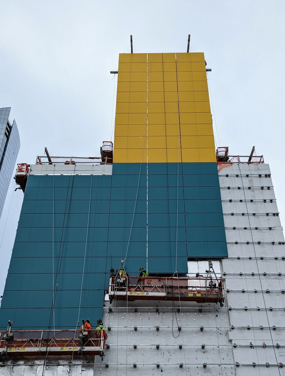
Warren Street Hotel is getting colorful
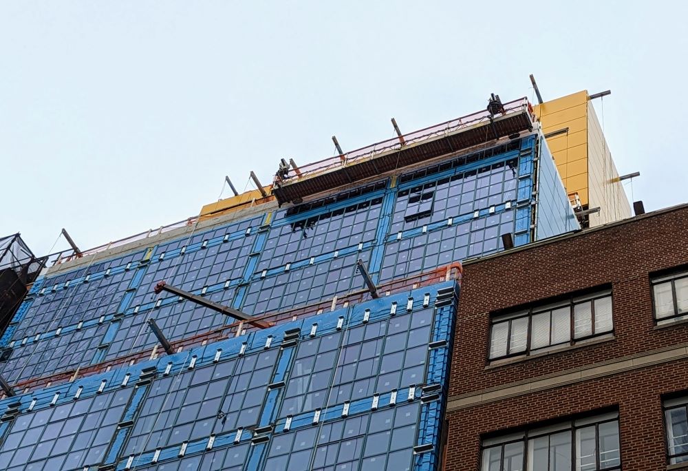
The Warren Street Hotel, the boutique property from the British firm Firmdale and decorator Kit Kemp, is getting closer — and getting colorful. I always thought the rendering had to be an artist’s interpretation, but for sure the window frames are now an aqua-ish blue, and the panels on the side are that same color PLUS a stretch of ochre reaching up to the top of the setback.
I am not sure what to think… I love the industrial oversized windows; I think I would have preferred black, and how it looked in the original rendering. But here we are.
You can’t see much of the yellow from the street side on Warren, even from the southside.
The hotel is on track to finish in September or October of 2023; the façade should be finished soonish. There will be 57 rooms and suites and 12 residences at the top for rent. See more of the backstory here.
View this post on Instagram
10 Comments
Comment:
Medium rectangle #1 (top)

Right column rectangle ads


Mega rectangle

Restaurant guide icon


The colors/hues in the renderings were lovely: understated and elegant, designed as a nod to the neighborhood’s industrial past.
The IRL version appears to take its design cues from public housing in Scandinavia. What a shame, as it’s otherwise wonderful to have another boutique hotel in the neighborhood.
The Warren Street hotel is staying those colors? Unquestionably awful.
Unfortunately you can see the yellow “ochre” enclosure from a pretty long ways up Greenwich by like Tribeca Grill. I assumed it was some kind of temporary covering. What an eyesore for that to be permanent.
It’d look fantastic if it was just painted black. The windows and structure work well. It looks beyond cheap now—like a children’s toy.
I cannot get over how ugly that color scheme is.
What an eyesore.
The original black looked great, this looks hideous.
Totally agree with all of the above comments––the original renderings (showing black cladding) looked SO good! Why would they go with these ugly, childish colors, or any color for that matter?!
The colors are horrific and they will NOT age well. It’s going to be a blight on the neighborhood.
Based on the comments I’m definitely the outlier here but I love color! As someone who has to look at this building every day when I open my front door (and has heard the construction workers loudly backing in vehicles before 6 AM many times and lighting up my living room with truck lights at 1AM) I’m glad to see something different than another “sexy”, black building.
I don’t mind variety either, but this hotel looks like an Ikea. Really doubt that’s the look they were going for.
Now that you mention it, it does look a bit like an IKEA haha!
I have been amazed, over the past 30+ years living here, by the things that changed then becoming so normal in such a short period of time. One day you think that building is never going to “fit” and then one day it does. “Change is…change,” a wise older friend said to me at my youthful age of 23 and I’ve quoted this phrase ever since.