
Left rectangle ads redesigned

History of Tribeca Buildings
Plans could enliven streetscape around 32 Avenue of the Americas
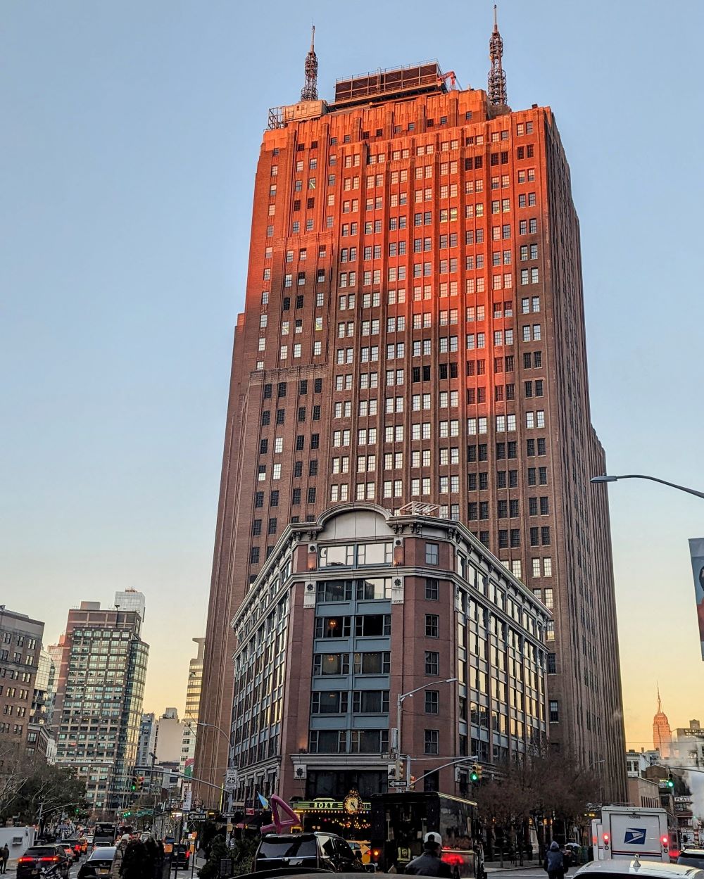
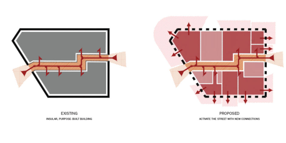
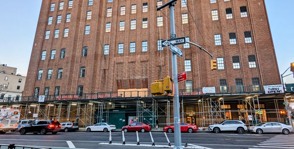
The owners of 32 Avenue of the Americas — the Ralph Walker historic landmark that takes up the entire block from Sixth to Church and Walker to Lispenard — want to activate the ground-floor facade of the building for retail by adding a triangular, one-story “pavilion” at the northwest corner as well as a lot more glass on all four sides to bring light in and out. They presented their master plan to CB1’s Landmarks Committee last month; the city’s Landmarks Preservation Commission will vote on the proposal on Tuesday.
The building is now 40 percent empty since a primary tenant — iHeartRadio — left when its lease ended last year, so owners Rudin Management are trying to “amenitize” it with retail to make it more appealing to tenants and neighbors — or as the architects said, make it much more “permeable and welcoming experience at pedestrian level.” The architects are the Tribeca firm Marvel, whose offices are on Hudson and Laight.
(Most of the images here are from the presentation to Landmarks, which can be seen in full here. The renderings are by Marvel.)
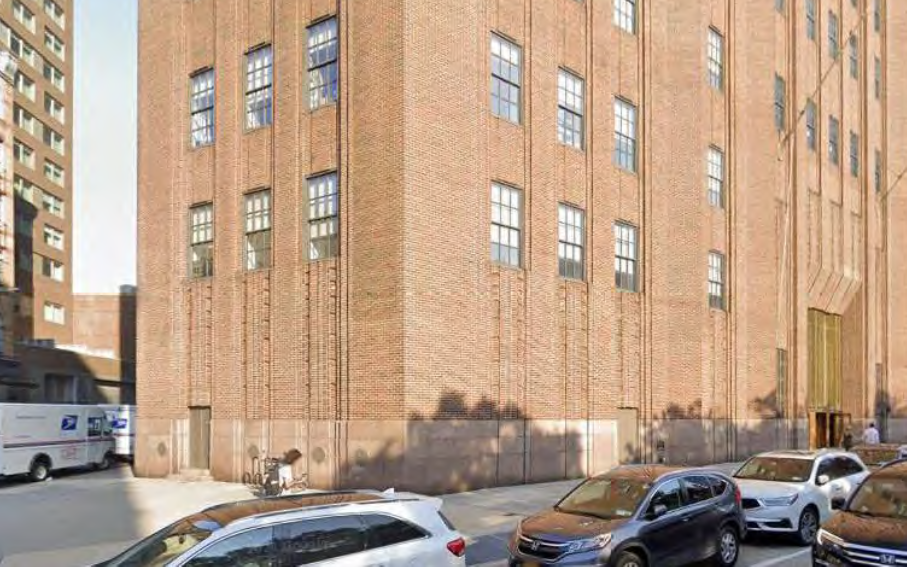
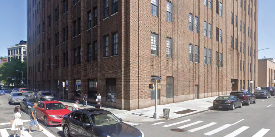
Northwest corner, current conditions.
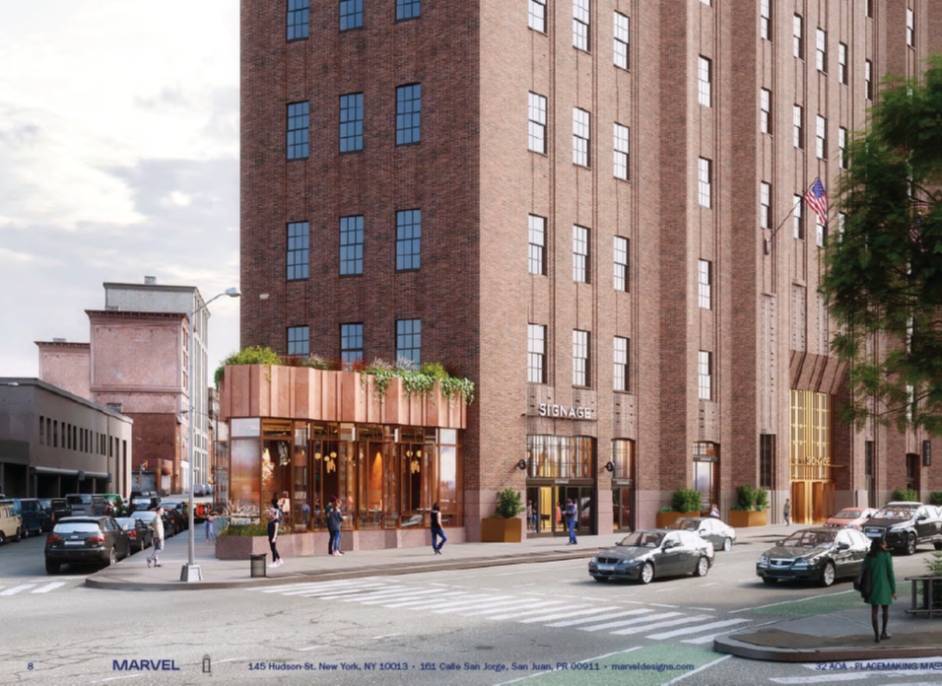
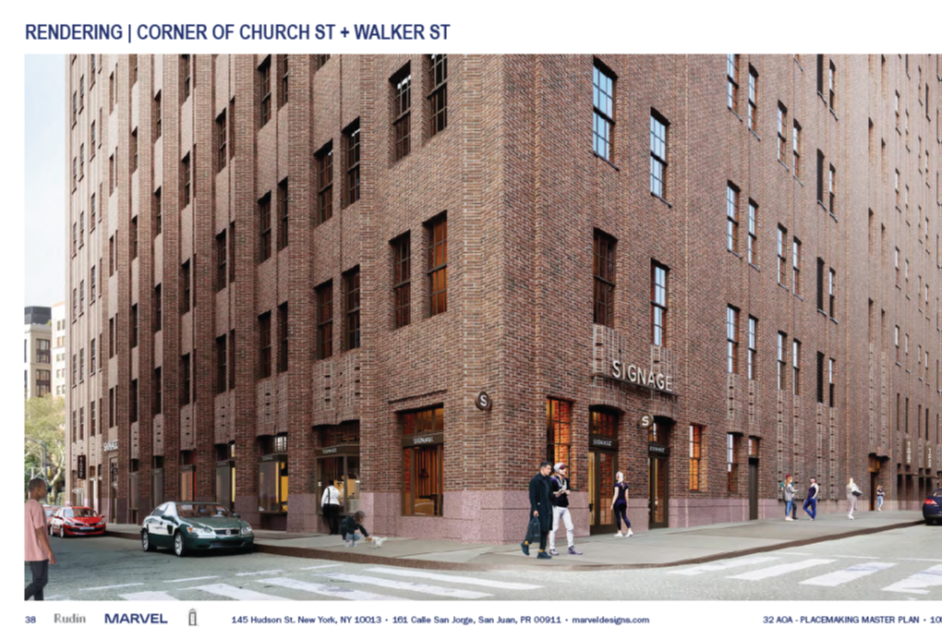
Northwest corner, rendering by Marvel.
CB1 rejected the plans last month — they called it inappropriate and “heavy-handed.” But I can’t see how this could go wrong, given how the plan largely just removes brick and uses Ralph Walker’s other buildings downtown as a guide. Currently, 82 percent of the facade at street level is solid. The other telecom hotels in the neighborhood — 60 Hudson and the AT&T Long Lines building at 33 Thomas — deaden entire blocks for pedestrians. I never walk alongside those buildings if I can avoid it.
Plus that stretch of Church, between the northside of the Roxy and the post office on Canal, is one of the most trash-strewn and unappealing areas of the neighborhood. It could only improve.
Southeast corner current conditions.
Southeast corner, rendering by Marvel.
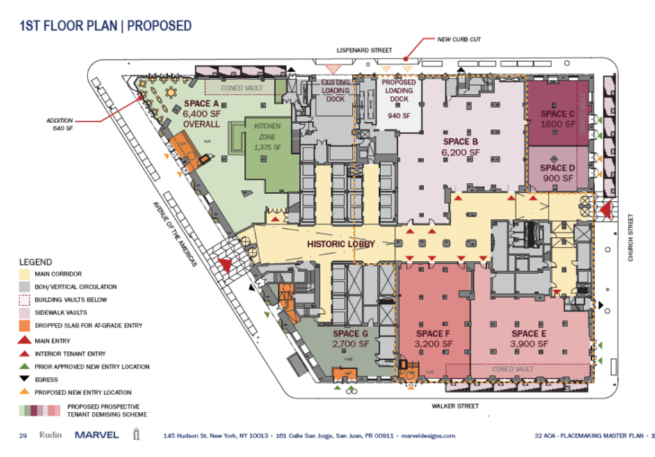
The LPC approved a master plan in 2013 that covered a lot of these changes, though this plan goes further by adding more and bigger windows and doors, and adding the pavilion on the northwest corner that would open into a bigger interior space as well. Here are the main additions, though they are better told visually:
- a new triangle one-story pavilion on the northwest corner, out of terracotta with a granite base
- metal signage, entry points, changing the structure of the windows to make them bay windows on Walker
- two more loading docks on Lispenard
- bigger and more windows on Church to make viable retail spaces
- signage to the current main entrance on Sixth Avenue
- a granite apron to the sidewalk within the property line to give the entryway more prominence
- increased entrances and exits from and through the lobby
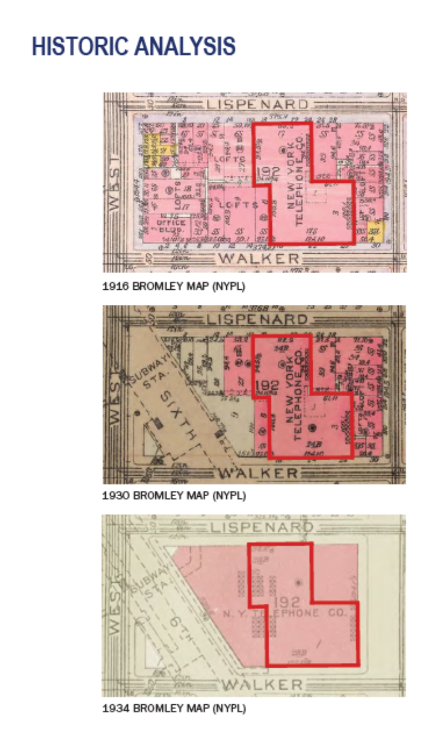
More than a century ago, the site had an original telecom building, constructed in 1916, that took up about a third of the current footprint. Walker was brought in to add to that structure and build out the whole block, completing 32 Avenue of the Americas in 1932. (The maps below show how the street grid changed between 1916 and 1934.) The Rudins bought the building in 1999, converting it from an exclusively telecom hotel to a mix of data and commercial tenants.
The building was landmarked by the city in 1991, as was its Art Deco lobby.

8 Comments
Comment:
Medium rectangle #1 (top)

Right column rectangle ads


Restaurant guide icon


This is such an obvious improvement, whatever our CB1’s view of an issue is, the right choice is almost always the opposite.
I’d love to see the top half converted to residential, although despite the stunning views and built in balconies, is suspect the floor plates are too large to make it work.
I agree. This is an improvement to the unwelcoming street wall that is there now.
If the new materials and designs match or complement the original structure, why not update this building to contemporary uses?
I have seen this iconic structure for more than 40 years of working in Tribeca. This building is best viewed from a distance; only then are the Art Deco roof spires visible and its brickwork and fenestration most dramatic. Up close, most of its ground level façade is “Meh.”
If architecture is “Art adapted to human needs,” as a portfolio of the now-defunct Emery Roth & Sons designs once stated, let’s adapt this particular building to a greater and contemporary purpose, without changing its essential character.
Regarding the trash: Why is this particular area so filthy?
It’s actually the area around the post office, more than around 32, that is a trash dump.
Does the US Post Office even care if it gets Sanitation violations for dirty sidewalks? Would DSNY even issue them to a federal quasi-agency?
Seems like a no-brainer. Would love it if something nice occupied that particular corner which is currently a no-man’s-land feeding into the wind tunnel that is the block with the back of the post office on it. Can’t say how many times I’ve stood at that corner hoping for the light to change
The CB1 response to this project is so silly that it feels like satire. In my view, CB1 is acting against the best interests of the community on this.
How do we write to CB1 to show support for this project?