
Left rectangle ads redesigned

History of Tribeca Buildings
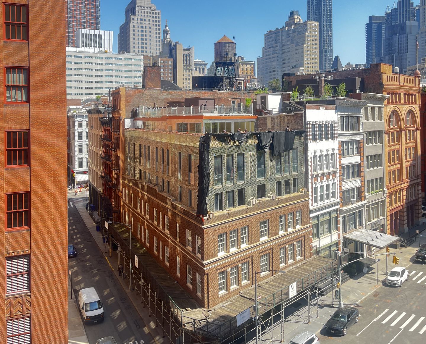
50 Hudson is finally revealed
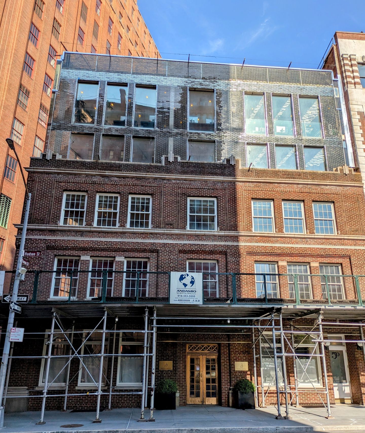
J. sent the first look as the curtain was literally pulled back on the new addition to 50 Hudson, on the corner of Thomas. What a stunner!
As J. said, looking at it from above: “What an amazing surface. Glass bricks but not too reflective. Has a gotham feel to it. I am excited to see it at night.”
Construction first started here five years ago, in October 2021, on the former paper factory — built in 1925. The late Tribecan and architect Thierry Despont designed an addition of three extra floors — only two are visible from the street — approved in the second iteration by Landmarks in 2017. It was then sold last year, according to the Commercial Observer, to George Yancopoulos, co-founder of the biotech company Regeneron. He purchased five commercial condo units and one residential unit (almost the whole building) through the entity GLT Hudson Holdings, paying $32.2 million all-in to previous owner Eric Schlagman.
The ground floor had J. Crew for years, and until recently The Lotus Method in its retail space; the listing said then that the lower floors are leased to commercial tenants.
The new structure adds 8200 square feet to the commercial building and the height of the facade went from 38 feet to 59, according to DOB records.
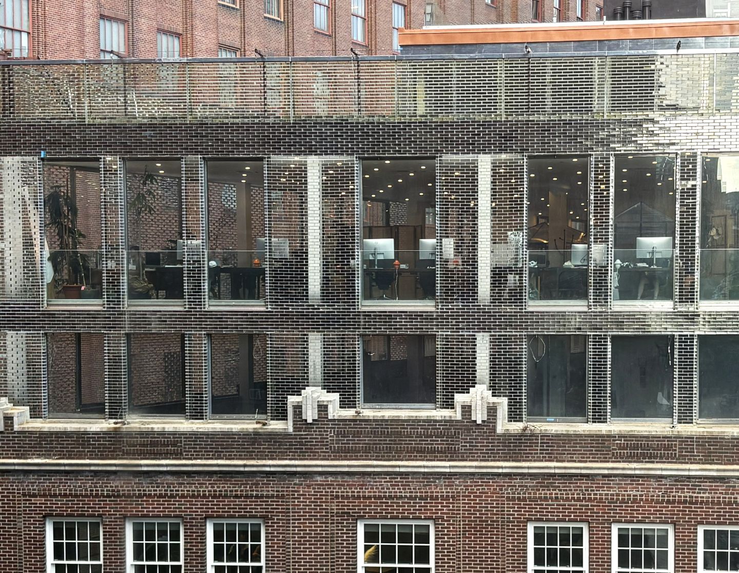
When the plans were first shown to the Landmarks Commission in July 2017, they thought it was *too* contextual — they asked that it be more of a departure from the historic part of the building. Despont obliged and it got glassier: the second iteration, approved later that year, removed the set-back, removed the greenery at the setback and made the addition a smidge taller and added glass at the corners and on the parapet.
3 Comments
Comment:
Medium rectangle #1 (top)

Right column rectangle ads

Restaurant guide icon


The first one of its kind with this glass facade in NYC. Beautiful!
This is absolutely stunning!
I want to like it.
As built, this addition is not the design Mr. Despont produced and presented to Landmarks in 2017. It lacks the finesse of his very refined attention to detail and is clunky at best.
There was supposed to be a hedge of greenery at the base of the new construction to soften the transition between old and new. (Perhaps it’s still coming.)
The parapet was to be shorter—thirteen bricks tall—with a tempered glass panel to meet code, and stepped back so that the glass brick stopped just above the windows. As built, the proportions are off, and the verticals in the parapet relate to nothing in the vertical order of the rest of the structure.
The openings were to have a metal surround trim, which would help them read better. The upper-floor windows also appear taller than originally designed, working against the historic proportioning and hierarchy. Whatever is happening at the window sills, behind the brick, reads as though it wraps up and around the sill—waterproofing, perhaps, or the proposed metal spandrel at the concrete slab?
The shiny metal infills between the addition and the buildings to the east and south look cobbled together and are antagonistically reflective, competing with the glass brick. They might be better painted black, or otherwise toned down, to let the form of the glass read clearly. There are also some odd horizontals that were not part of the original design and detract from its pure vertical lines.
I’m not sure what is supposed to be happening at the corner. The 2017 Landmarks presentation showed a simple corner. Granting that glass brick likely doesn’t cut the way clay brick does, it appears the designers and contractors didn’t know how to resolve the corner and improvised this after the fact. It makes no sense and competes with the purity of the original design.
Perhaps the most distracting aspect of the whole thing is that the interior structural columns are visible, and they read as spindly against the solidity of the verticals in the historic base. This is a design issue that wasn’t shown in the Landmarks presentation and may not have been considered. Now that they’re prominent, perhaps build them out and paint them black, or wrap them in mirror or glass. (I’d strongly suggest a mock-up first.)
The “sliding glazed panels”—the windows—need to be washed, and often.
I also wonder whether the brick wouldn’t read better with a dark grey or black grout. This is a clear brick in a location that sits in heavy shadow, given the close proximity and grandness of the surrounding buildings—unlike the blue-green of the Chanel flagship in Amsterdam, which catches far more natural light bouncing off the canal, and can support a white silicone joint.
Perhaps it’s simply unfinished. But as it sits, it is far from the elegance of a typical Despont design, and certainly not Chanel.