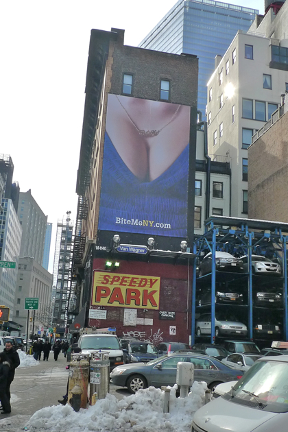
The “Bite Me” Billboard
 “Do you know anything about the new huge advertisement on the corner of West Broadway and Warren that’s basically a close-up of a woman’s cleavage?” emailed Hope Flamm. “It seems to be an ad for bitemeny.com, which says that it has something to do with Bon Appétit, but what and why? Furthermore, how can we get it removed so my two kids and I aren’t forced to look at a two-story high cleavage shot with no explanation or context as we’re walking to school?”
I called Bon Appétit’s media relations rep, Frederika Brookfield. “Bite Me is an ad campaign that we’ve launched. And as you can tell, it’s an irreverent and unexpected campaign.” She explained that if you go to the site being promoted and click on the image, the image pulls back to show that the breasts in question are not (necessarily) those of a tramp (that’s my word, not hers!), but of a woman hanging out with friends and enjoying a cocktail, and you can enter to win the necklace. There are two other images, neither of which is provocative (unless you’re provoked by the words “Bite Me”).
Bon Appétit has a new editor and a new publisher, and it’s trying to regain some buzz; last week the New York Times ran an article about the campaign (and why Bon Appétit, said to be performing sluggishly, might be craving attention). Brookfield seemed surprised that people might take offense. I told her that there might be lingering discontent over the Skyy vodka ad (which offended me), and she said she’d try to find out if there was a specific reason why the location was selected.
Leaving aside (a) the tastefulness issue and (b) the strategy of creating a new brand in order to promote an older one, what surprises me most is that the whole campaign (the ’90s necklace, the semi-crude phrase, the tattoos in one of the other images) is a little downmarket. Bon App is a fairly mainstream brand, granted, but I would think that if they see their competition as Rachael Ray and the Food Network mags they’d try to own the upper-middle ground. I guess they’d rather be young than rich.
Update: Brookfield called back: “The strategic reasoning behind the acquisition of that billboard is that it’s in a central location for several of the agencies and businesses that we wanted to reach out to—specifically, OMD, MPG, Wieden + Kennedy, and several others.” That may help to explain my confusion: The folks who often buy advertising (on behalf of other companies) tend to be young.


It doesn’t take much effort to realize that this area is surrounded by several schools and if Bon Appetit is using a sexual image to get people’s attention, it’s going to get the attention of children too.
I have been a longtime subscriber to Bon Appetit. If this is their new direction, then that’s one subscription I won’t be renewing.
I’m going to have to agree… it’s crass. While we can debate whether the cleavage closeup is provocative versus tasteless, “bite me” pushes it to a sophomoric attempt to sell an avant-garde lifestyle which, after visiting the web site, appears to be a play on culinary words.
Other Western cultures would call us Americans prudish for being up in arms the way we can be at times about the human form. However, those same cultures don’t use sexuality as a juvenile attention-getting device in the form of a two-story cleavage closeup to ultimately reveal a play on words. At best, this ad will attract people who would use daddy’s credit card to pay for dinner, and would get carded if they order a drink. Good luck with that demographic as you’ve lost mine.
Wow! Erik – we are so lucky to have someone like you in the ‘hood who is able to take the time to inquire about these things and really get answers! No matter how you feel about the ad, we should all really appreciate having such asset in our little corner of town. Thank you!
Love it. I wish the building was wider. I also just used daddy’s credit card and got a new subscription to Bon Appetit and got to 2 free gifts!!! Life is sooo good.
Overhead on Warren by a kid coming out of Church Street School for Music and Art earlier this evening asked the adult with him, wonder why it says “Bite Me.” I have to agree.
It is a stretch of the imagination to wonder how a “bite me” slogan is relevant to a gourmet food magazine, but it’s even harder to fathom what an obscene view of a woman’s bared cleavage can have to do with it. Oh yes, and a man’s tattooed bicep – but notice there are no overt sexual graphics with the male version.
The ad is vulgar, and absolutely degrading to women. As someone who lives in the neighborhood, I will avoid that block and any businesses associated with the building hosting the billboard. And of course anything related to Bon Appetit.
If that’s the goal of Bon Appetit’s new ad campaign, it’s quite effective.
Still loving this billboard. I am going to make a purpose to frequent all businesses associated with this building to try and make up for Julia’s boycott. I might just throw money on the sidewalks.