The Makeover of Hudson Square
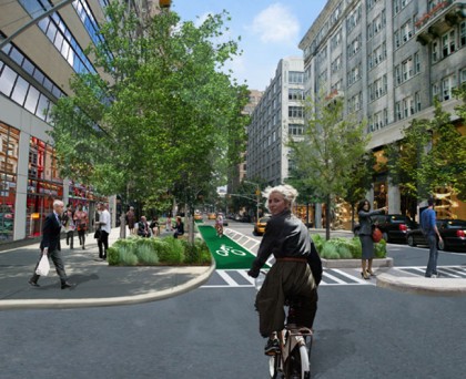
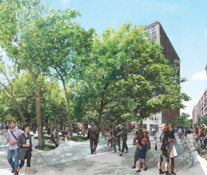 I got an email last week about an event promising the “Release of a $27 million, five-year master plan to transform Hudson Square into a green and sustainable neighborhood. The plan calls for pedestrian-focused streetscape improvements in an area that has been dominated by access points and entrances to the Holland Tunnel.” So I was intrigued, obviously. I couldn’t make the event, but I thought a friend, Mike, who lives near there would be game, and indeed he was.
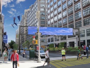
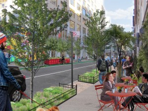 Then Hudson Square announced the plan early through the New York Times: It wasn’t about transforming the neighborhood (and there are plans for that) as much as transforming the streetscape. (The renderings are throughout the top half of this post. Drift over to see which streets/areas they are.) I blurbed the Times article, and that afternoon, I walked Howard up there to reacquaint myself with the various scraps of undeveloped land around the Holland Tunnel. A TV crew from CBS local news interviewed me about what I thought—more on that in due course—but what I thought didn’t mesh with what they thought, so they didn’t use me. Possibly they were annoyed that Howard tried to attack the correspondent.
Mike went to the event at 250 Hudson. His report:
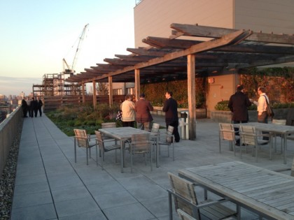
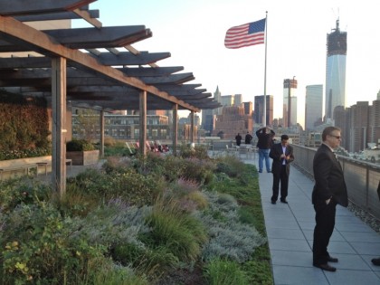
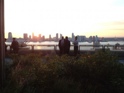
 Reception was in [PR company] Edelman’s penthouse office suite. There is a spectacular green roof and terrace with 360-degree views. Participants sipped white wine and munched on passed snacks as they waited for press conference. Here are rooftop photos. [They’re at the end of the post.]
There were no surprise on the media session. It was about the five-year $27 mm plan to beautify the neighborhood and making it more residential. They intend to make Spring the “main street” while widening sidewalks/pedestrian ways on Hudson while adding trees and greenery there. They also want to make Soho Square at Sixth and Spring the “gateway” to the neighborhood, ensure better pedestrian access and safety on Varick, and generally enhance greening, lighting, and public seating throughout the neighborhood.
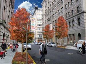 Well, they claimed they weren’t eliminating lanes on Hudson [I had misread the New York Times report. —Ed.] just narrowing existing lanes which are extra wide due the neighborhoods industrial heritage as a printing district. I guess they could have provided dimensions. Also, I’m not sure how much of the funding for their $27 mm five year plan is “public funds” as they cite a public/private partnership. Maybe they detail that somewhere, but it was not discussed.
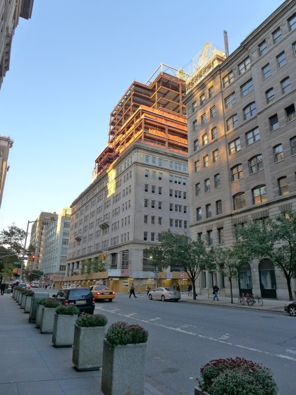 The most interesting topics about the neighborhood (or one to be) are zoning and preservation. Of course, this was not the meeting for either of those topics. But, while standing on the roof looking north, one got a view of the horrendous addition being layered on top of the building around Hudson and Charlton (I think) which feels like they have doubled the height of this lovely old building with its Juliet balconies. Supposedly for commercial space. [That’s 330 Hudson, pictured at right.] And, there was also the glaring construction of the garbage truck garage to the west.
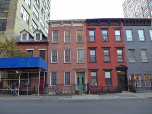 Since there was not much said to rouse a strong opinion from me otherwise, I will share with you one of my old observations about the neighborhood. One of the best buildings in the neighborhood is at Van Dam and Greenwich. You should walk by it sometime if you have never examined it. It is a large old brick warehouse with a gorgeous brick turret structure in the southeast corner. I think you would really like it. Would be wonderful to see that preserved and brought back to life. [I haven’t made it over there yet, but how about all the cute little buildings on side streets, such as the ones above?]
My two cents: 1) Some master planning is welcome. 2) I hope the bike lane pictured in the top rendering doesn’t mean our part of Hudson is getting one. 3) Historical preservation is crucial. 4) unlike the folks at CBS, I just can’t see how anyone could complain about turning remnant land into something park-y, even if its usefulness is hard to imagine at this point. Would you rather look at fenced-off rocks? As far as I’m concerned, the more the fences get pushed back from the sidewalks, the better. 5) I have long loved that area for its quietness and its big industrial buildings. I wonder, though, how much the relative openness of the area is part of the charm—and when the parking lots get developed, and they will, how much of the charm will be lost.
Thanks, Mike! And now, his photos of the roof at 250 Hudson:
Rendering credit: Mathews Nielsen Landscape Architects for the Hudson Square Connection








Like the idea but $27 million?! For trees and sidewalk…. Amazing.
Would love to see the budget figures for that.