
Left rectangle ads redesigned

Robert Ripps book
History of Tribeca Buildings
New Building Report Card: 12 Warren
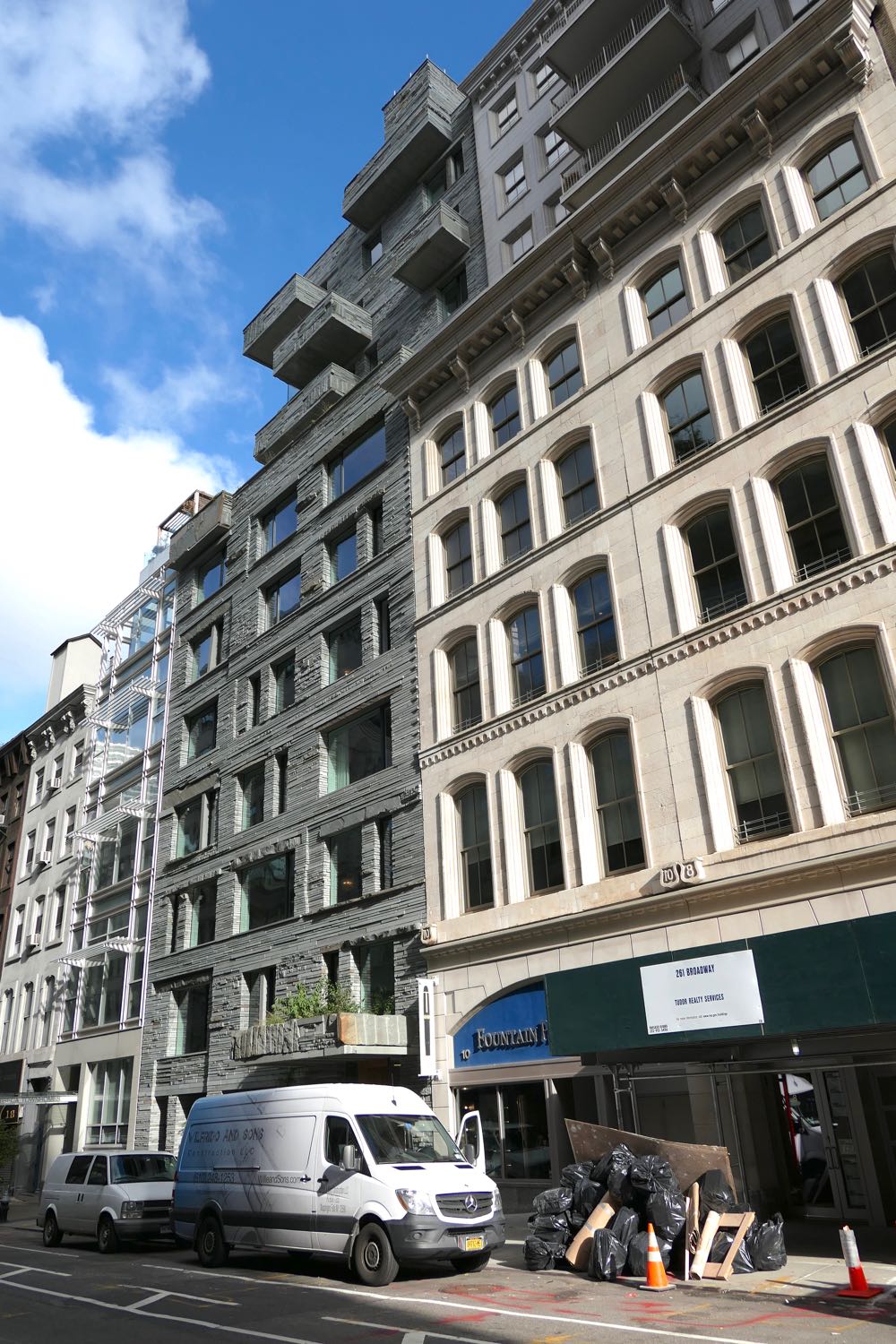 Please don’t let the fact that you’re not an architecture expert (either) stop you from weighing in on 12 Warren, a condominium developed and designed by DDG. Only residents may care how new buildings turn out on the inside, but we all have to live with the outside.
The design in general
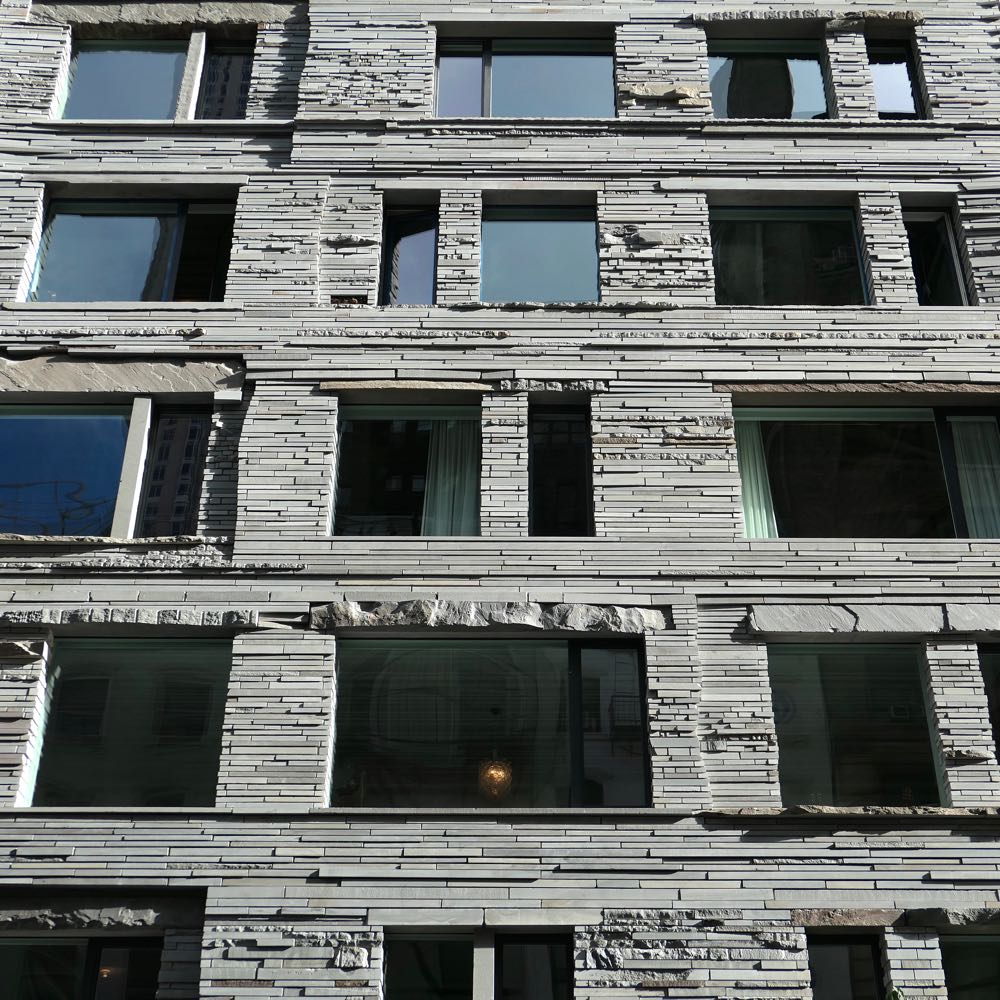
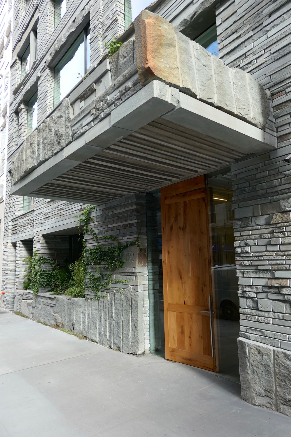
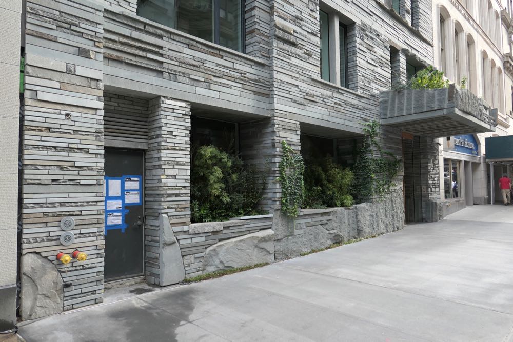
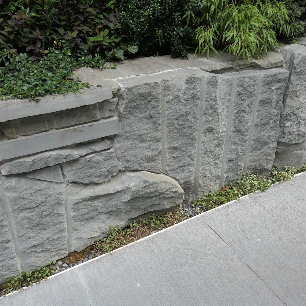
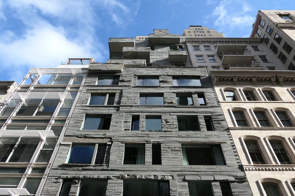
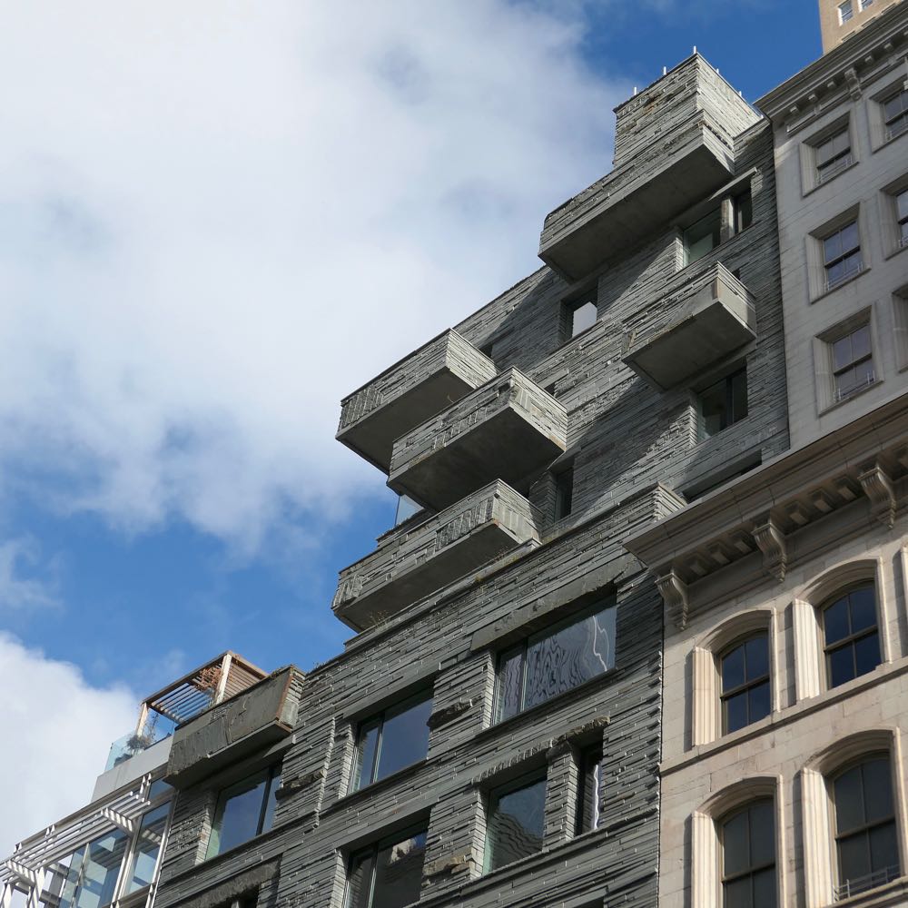
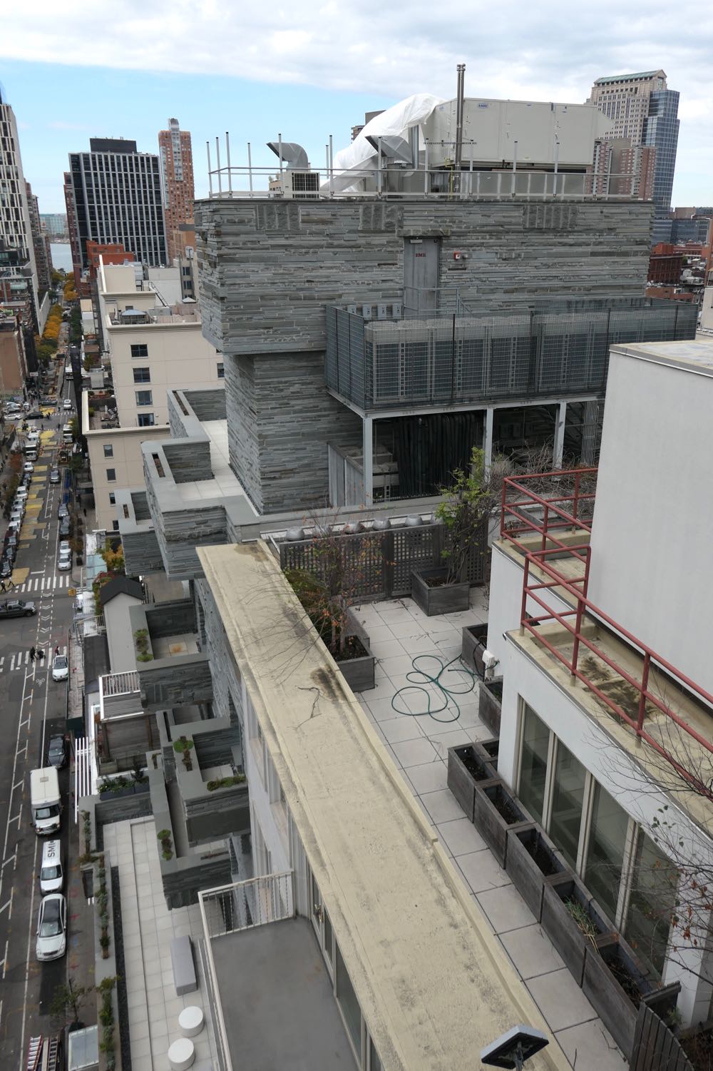
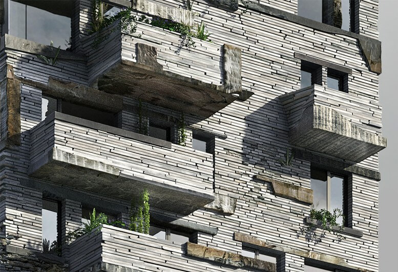
12 Warren is most notable for the curtain wall composed of irregularly stacked bluestone in various shapes, sizes, and textures. The first seven floors are flush with the adjacent buildings; above, six more stories are set back, with balconies of various sizes, and then there’s a two-story bulkhead. The windows, deployed in no evident pattern, come off as dark, inert voids; more metal framing might have helped give them a presence.
 At street level
The stone is surely not to everyone’s taste—I’ve received more than one “WTF?” email about it—but the mix of old and new architecture on that block has room for it. 12 Warren, however, would be more novel if it weren’t a few doors down from another DDG building clad in bluestone, the much more staid 24-26 Warren. DDG does get extra points for pulling the bluestone into the building: Take a look at the vestibule next time you walk by (and/or these photos).
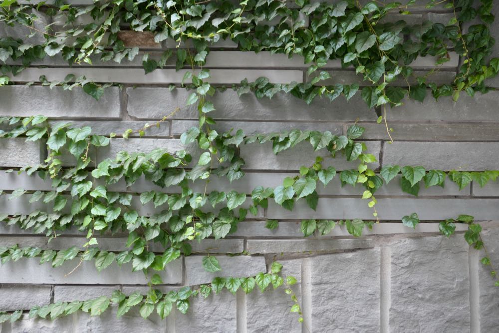
DDG often tries to grow plants on its facades, with limited success. Happily, the greenery on 12 Warren is thriving, at least at street level. There are also planters on the canopy and embedded into the balconies—whether those plants will flourish is unclear, as is the overall effect of sporadic moments of unmanicured vegetation.
 Upon closer viewing…
The building certainly appears well made, although I’d love to be a fly on the wall when the Department of Buildings inspector comes for the Local Law 11 facade inspection. Also, can those little plants at sidewalk level possibly survive the neighborhood dogs?
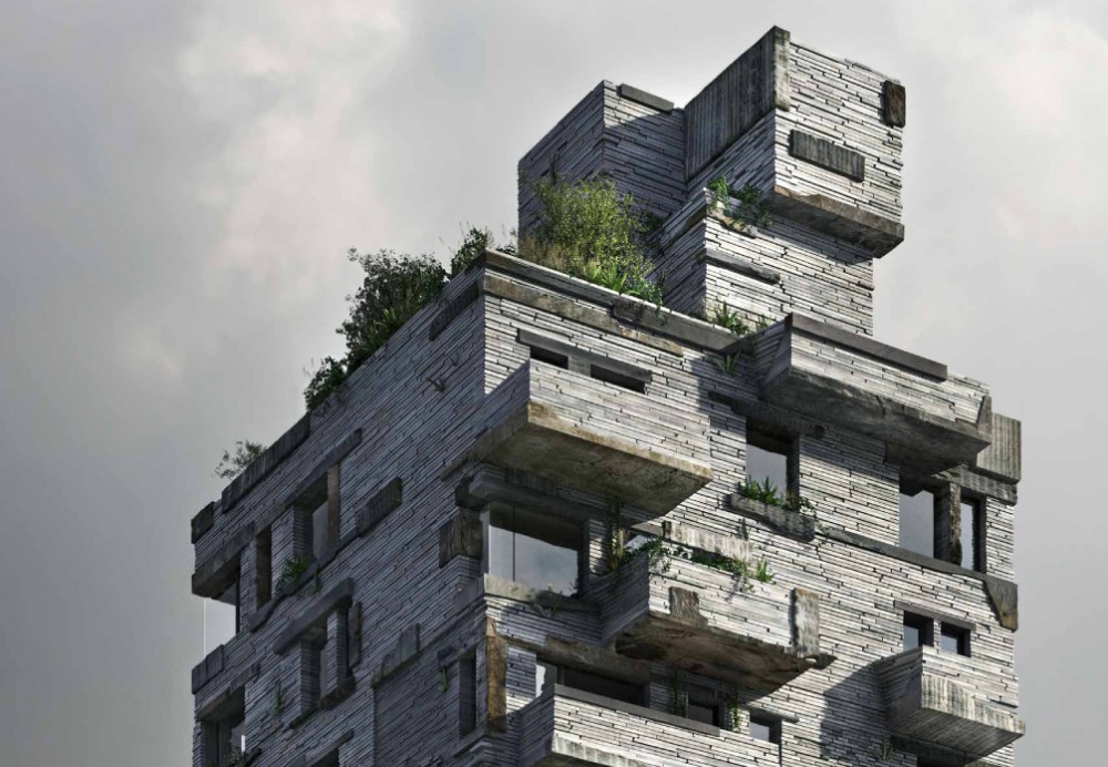
 And the top?
The building looks better up close than from afar, where your eye, traveling upward, has to make sense of a dramatic change. (This seems to be a popular choice in contemporary architecture; see 56 Leonard, 5 Franklin Place, 15 Renwick, and so on.) I wish the top and the bottom halves had more in common than just bluestone. The balconies are shadowed and clunky, and the lack of any pattern adds yet another layer of randomness (along with in the different shapes and styles of stone). Once greenery starts sprouting up, the disparity between the top and bottom will grow even larger. Too bad there aren’t window boxes on the lower half.
 Is the building an improvement?
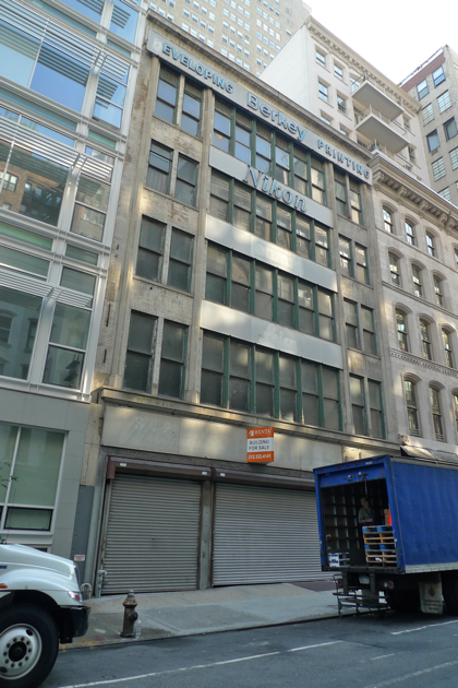
The old building had its charms—including a scale that suited the street—but it wasn’t exactly well taken care of. As I always say, if you’re going to replace an old building with a new one, the newcomer should feel like it’s meant to stick around for a while. 12 Warren does that.
 Rendering vs. reality
Usually the renderings look better than the building, but not in this case. The few renderings that DDG released were much more high-contrast—and therefore a bit scarier—than what got built. We’re fortunate that the bigger chunks of stone aren’t really that dark.
 Pass or fail?
Like it or loathe it, 12 Warren has personality to burn—and what a relief not to have another ersatz warehouse with faux-industrial motifs. Pass.
Previously reviewed:
••• 5 Franklin Place
••• 30 Park Place
••• 15 Leonard
••• The Sterling Mason (71 Laight)
••• 15 Renwick
••• 456 Washington
••• 11 N. Moore
••• 290 West
••• The Reade Chambers (71 Reade/87 Chambers)
19 Comments
Comment:
Medium rectangle #1 (top)

Right column rectangle ads


Restaurant guide icon


It is an interesting concept and I like it when architects try to design something other than glass boxes. I heard someone call this the Flintstone building which sounds right. The randomness and variation of stone size was overdone in my view. This also goes for the variation in the window openings and the upper portion of the building as Erik pointed out. Tighten these variations up and it would be a handsome building. Right now it is shouting “I’m different” which maybe was the intent. Pass for effort but ultimately it does not work for me.
I think it is hideous and will age poorly – look at how Brutalist buildings are viewed today. This has no grace or even interesting massing. I wonder what statement the architects and developer were trying to make. I think slavish devotion to contextual architecture often produces mediocre buildings – but this one simply makes no sense,
That little spot of brown granite at the very front of the entryway bothers. Did anyone involved actually look at this, or were the architects so in love with their abstract theory of the building that they failed to closely monitor its execution?
It has been interesting to look at how it is portrayed on its Web site. The initial renderings showed it emerging from a granite mountain, which was bizarre. The current site shows how the architects see the completed building http://12warren.com/
I’ve often thought about what LL11 will be like in the future – I wouldn’t want to pay for remediation.
Re: “I wonder what statement the architects and developer were trying to make.”
Something like:
“Sales, which are being handled by Corcoran Sunshine, are expected to begin next month, at prices averaging $2,100 a square foot, Mr. McMillan [DDG’s chief executive] said.”
https://www.nytimes.com/2015/12/27/realestate/new-condo-projects-dress-up-tribeca.html
:-)
I couldn’t agree more about the rusty spot on the canopy. I have to assume it was intentional, but I can’t imagine why.
DDG was unbelievably inconsiderate during construction, which seemed to have lasted *years*. They routinely worked outside of permitted hours and used the rear courtyard to do outrageously loud work early every morning including Saturdays, disturbing neighbors on Chambers. The developer never once returned calls to discuss. Oh, and the building is hideous, will only get worse with time, and is totally out of character for the neighborhood.
DDG is just as inconsiderate now at their Franklin Street project. They have “annexed” the southwest corner of 6th Avenue and White Street for their concrete and other subs to park and block the crosswalks, all without DOT permits. This forces pedestrians to walk into the vehicle traffic to make their way.
Keep 311 on speed dial.
OMG, its hideous and as said, wait until façade inspection time.
Floor to ceiling height is very low. They are fitting 7 when the adjacent building are just a bit over 5. Possibly the facade treatment is designed to distract from this.
In a bold truth mood this morning. This is the second dumbest new architecture experiment in the hood! (Guess what takes first prize….) Looks like kids found a boatload of blue stone slabs and built a fort…. Hate it & loved the old building which had light and air while this is sufficatingly grim…..
I like it. It has character, and its own beauty and charm. It would not be something to consider for multiple buildings, but for a one-off in the neighborhood, why not?
Looks cool. The haters are a bunch of uptight old farts
I kind of like it too. It beats those heinous tall glass towers.
I hope it ages well. If the greenery takes it could. At $2100
psf the pricing is competitive in this market bloated with new
developments and their high closing costs. I am going to give it a chance though I don’t have much choice anyway.
It definitely makes a statement but is incongruous with the neighborhood. I love stonework but this looks heavy & dark. When the greenery grows, if allowed to prosper up the whole building, it will add interest but also weight. Love the comments about the price but just because something is expensive does not mean it has value or will stand the test of time. Many will pay for the shiny, new and unique…especially for the address….that said, it’s better than a full glass tower.
Re: “just because something is expensive does not mean it has value or will stand the test of time.”
“Cecil Graham: What is a cynic?
Lord Darlington: A man who knows the price of everything, and the value of nothing.
Cecil Graham: And a sentimentalist, my dear Darlington, is a man who sees an absurd value in everything and doesn’t know the market price of any single thing.”
― Oscar Wilde, Lady Windermere’s Fan
Re: ” Many will pay for the shiny, new and unique”
http://www.nytimes.com/1990/11/24/world/fear-abates-among-chinese-but-few-find-cause-for-hope.html
The Government keeps promising that reforms will continue and life will get better, and it points to the shiny new office buildings and stadiums that give Beijing an ever more modern appearance. But ordinary people seem skeptical, and a popular saying reflects their distaste.
“Lu fen dan, biaomian guang,” they scoff: “shiny on the outside — just like donkey droppings.”
http://www.nytimes.com/2004/12/01/opinion/chinas-donkey-droppings.html
I love China, and I share its officials’ distaste for those who harm it. That’s why I’m angry that hard-liners in Beijing are presenting China to the world as repressive, fragile, tyrannical and backward. They are also undermining China’s long-term prospects by gagging its people.
China now dazzles visitors with luxury skyscrapers, five-star hotels and modern freeways. This boom is real and spectacular, but for China to be an advanced nation it needs not only spaceships, but also freedom.
Otherwise, all that dazzle is just a mirage. The Chinese leaders might recall an old peasant expression, “Lu fen dan’r, biaomian’r guang.” It means, “On the outside, even donkey droppings gleam.”
Pretty bad and pointless but not as dreadful as 325 West Broadway (“XOCO”), the new condominium apartment building just above Canal (diagonally across the street from the SoHo Grand hotel). It is hands down the ugliest apartment building to arise in our town for many years . . .
325 is also a DDG creation.
I’m not crazy about the entrance – it feels unsafe, like you’re walking beneath a big pile of stone that could fall on your head. If I were visiting, I think I’d hurry in and out. Otherwise, it isn’t bad – maybe mostly a missed opportunity to do something like that a bit better.
It’s the cantilevering of the canopy over the entrance – doesn’t seem substantial enough to support all that stone. And the stone isn’t secured with mortar, so it looks like a big chunk could roll off and squash you if you’re not careful.